Style Conscience: Old materials and fresh ideas in an eco-friendly home
“Sustainability” is more than a lofty concept for Dyke Nelson. It’s what drives the architect’s personal passions and his professional success.
As owner of the firm known as DNA Workshop (the initials stand for, you guessed it, Dyke Nelson Architecture), Dyke’s mission is to help commercial and residential clients “improve the built environment in a way that does not do harm to our local and global community.” His handiwork can be seen in projects ranging from renovated historic buildings in downtown Baton Rouge to corporate offices in California. His own firm’s headquarters sit in a converted fruit and vegetable warehouse complete with recycled windows and low-energy lighting.
It should come as no surprise, then, that this green-conscious architect’s own home exemplifies his eco-friendly ideals. What is noteworthy, however, is how this unassuming abode manages to be so chic at the same time.
Dyke and his wife, Rebecca, had been Baton Rougeans for less than a decade before they found themselves on the hunt for a new home. Transplants from the vibrant atmosphere of San Francisco, they were feeling isolated in a subdivision that seemed far removed from the city’s happenings. “We wanted to move closer in and to find a more architecturally diverse neighborhood,” Rebecca recalls.
After searching “forever,” Rebecca and Dyke zeroed in on the Walnut Hills area, with its varying home styles, large lots and mature trees. Here they found just what they were looking for, though friends and family were initially skeptical. The 1958-built, two-bedroom house may not have seemed quite right for the Nelsons’ growing family—which now includes three children—but its potential practically called out to them.
“Dyke had a vision,” Rebecca says. “I said, All right, I trust you.’ But everyone thought we were crazy.”
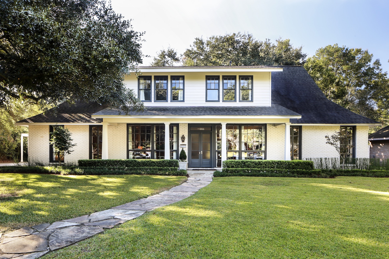
That vision involved revamping the house to fit their family while keeping it on its original footprint. They would build upwardbut not in such a way that the renovated space would look like a monster among its more minimalist neighbors.
“We tried to be restrained with the design and to be respectful of the scale of the existing neighborhood,” Dyke says. “That is why the second story is in the roof line, and the fact that we have a pie-shaped lot that opens up in the back helps the house to appear modest, but to really open up once you are inside.”
With the couple essentially serving as their own contractors, they plunged into the renovation process. Dyke seized the opportunity to gain a new point of view seldom experienced by an architect. “It was really good for me to use our process on myself so that I could have a first hand perspective of what my clients go through,” he says. “Rebecca constantly challenged me and questioned my ideas, and I did the same. I learned a lot about what worked and what did not work with that process and have since adjusted it based on this experience.”
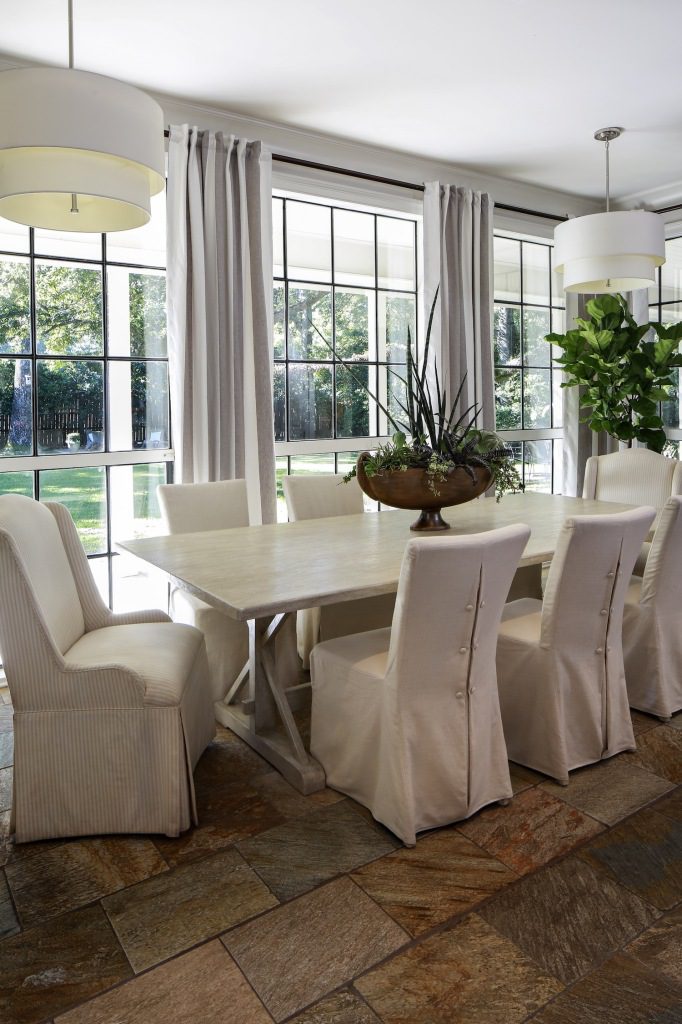
When working with outside clients, Dyke says he always recommends avoiding changes once construction begins, but when a unique opportunity arose after his own renovation began, he decided not to take that typically sage advice. A batch of windows from the historic Cinclare Sugar Mill near Brusly became available, and suddenly Dyke knew exactly what to do with them. “We discovered the windows after we had already started construction and changed the design of the house to accommodate them,” he says. The new design would prominently feature those dark metal windows both on the front and back walls. “They really give a lot of good natural light,” he says.
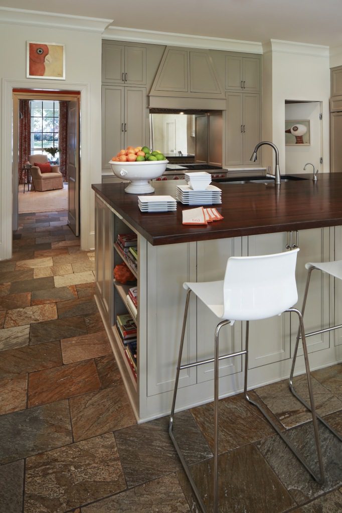
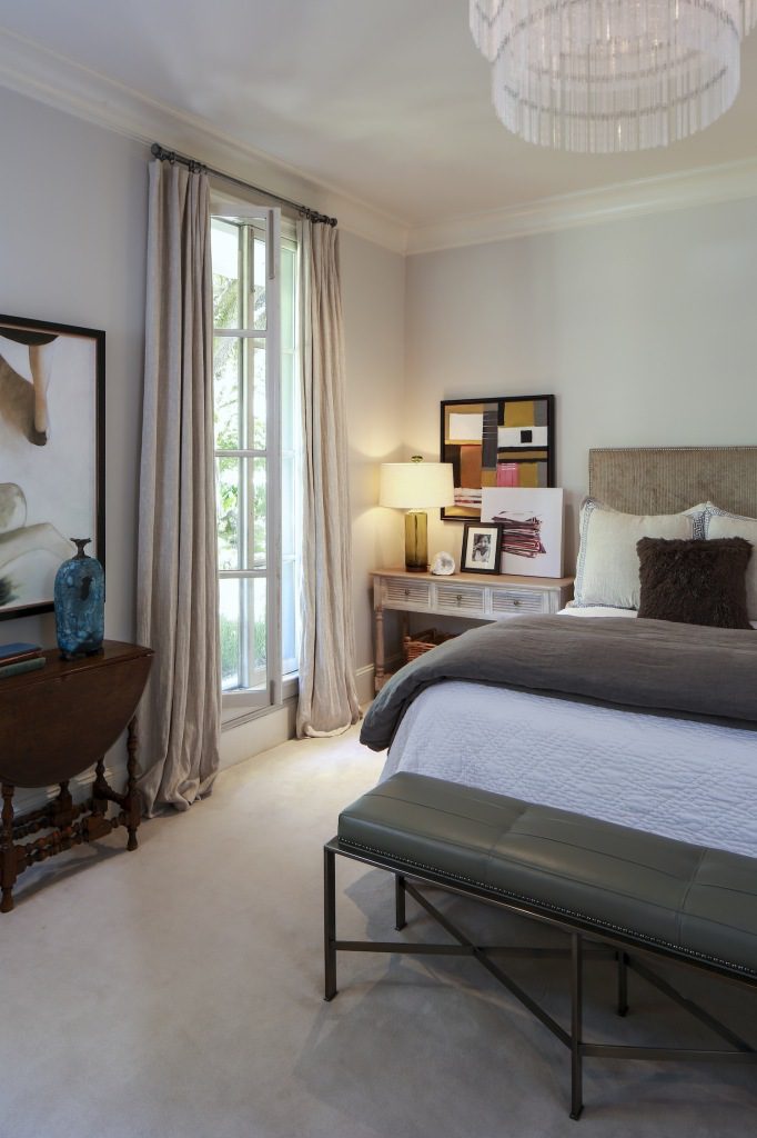
To further increase the usable space, the couple chose to transform the original carport into their new master suite. The bedroom is accessed via a “blind door” in the kitchen that, when closed, seamlessly blends into the wall. From the inside, there are no traces of the space’s former life.
Dyke found ways to be mindful of both the environment and his family’s budget throughout the renovation process. As original brick walls were demolished, he and his young son Jake meticulously scraped off old bits of mortar so the bricks could be reused. Plumbing was kept in its original locations to avoid major upheaval. A new carport, the only addition outside of the original footprint, was crafted of salvaged materials. Throughout the house, Dyke selected eco-friendly elements, including spray foam insulation, a solar hot water heater, and a highly efficient multi-zoned air-conditioning system.
What the couple could not fully predict were trials complicating the process. Hurricane Gustav in 2008 was only one of the hurdles they encountered once construction began; poor-quality drywall work and painting had to be repeated, and they went through three plumbers before the project was complete. A tankless water heater was stolen; and before they discovered its loss, water drenched the kitchen ceiling.
“As anyone who has experienced a home renovation will attest, it challenges you mentally, spiritually and financially,” Rebecca says. “We learned a lot about how important it is to use good craftsmen on all parts of a project and to always choose quality over price. In some cases we overcame our challenges by doing work ourselves, and in other cases we spent more money.”
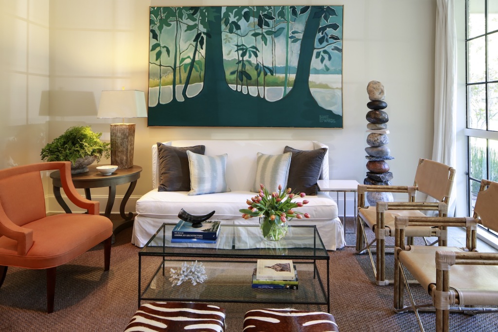
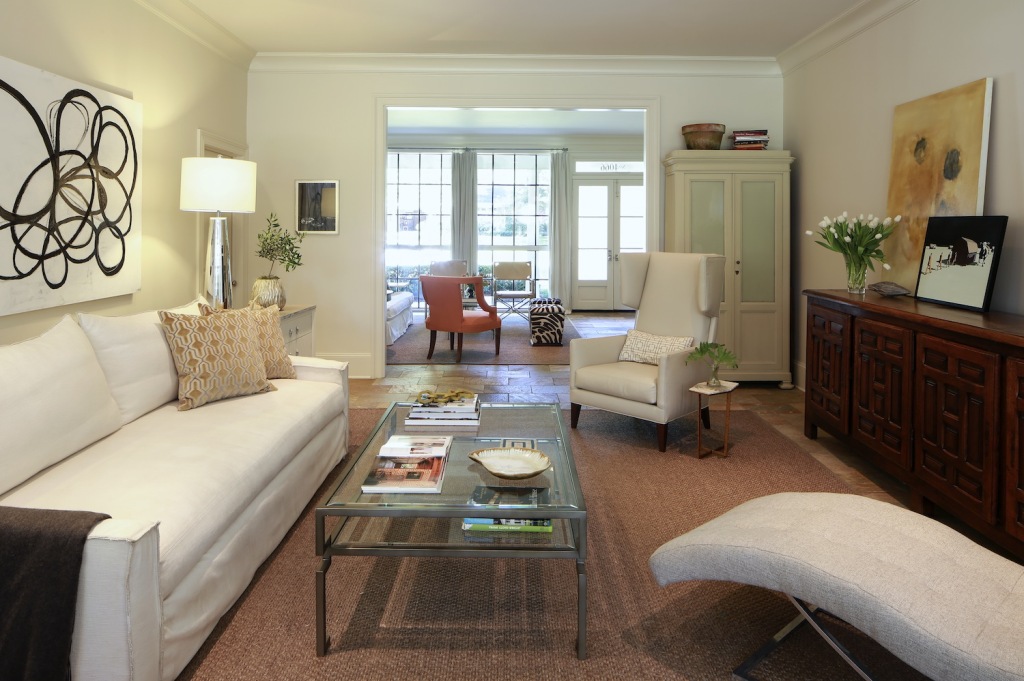
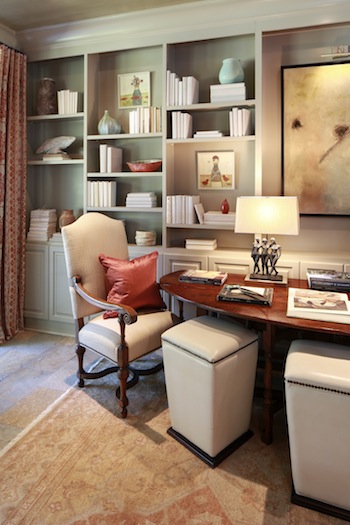
The difficulties during construction caused a ripple effect when it came to the home’s interior design, prompting delays and a piecemeal approach to putting together each room’s overall look. The slow and steady progress has had its benefits, though, allowing Rebecca and Dyke to find just the right furnishings and accents instead of rushing to assemble them en masse. With help from interior designer Anne McCanless and other talented friends, the couple has set a stage that is “slightly funkier than traditional,” as Rebecca describes it. “I tend to gravitate toward clean lines and simplicity, but I enjoy some traditional elements as well,” she says. “And we love pieces—and art—with a good story.”
Despite the drama along the way, the couple, along with their son Jake, 13, and daughters Ellie, 11, and Virginia, 7, have found the final result to be just what they had hoped for: a comfortable space for sharing everyday moments and making special memories.
“It is a perfect house for our family, as the openness of the living spaces allows for lots of togetherness,” says Rebecca. “We truly use all of our spaces, which was our intention—hence the library/dining room and eat-in kitchen. We don’t have any for-show’ or entertaining space. It’s just a lived-in, family home.”
Dyke says the home’s “little bit of an edge” and eclectic blend of materials suits his family’s lifestyle. “Clean lines are interesting sometimes, but our life is not about clean lines,” he says. “I tend toward design that has a certain level of texture that is created by a blend of new and old materials. It provides more complexity, and I think it is more interesting.”


