Lighten up: Vibrant colors and new views give a home a fresh perspective
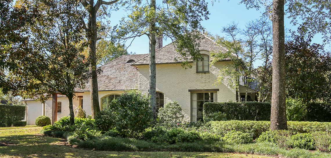
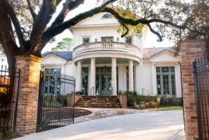
Aged bricks and cypress beams. These are two of the hallmarks of refined south Louisiana architecture. But when layered only with dark antiques and heavy draperies, these elegant interior elements can take a space from classic to claustrophobic.
That was the feeling Brenda Phillips and her husband Danny were experiencing in their Country Club of Louisiana home after living here for eight years. They had fallen in love with architect Al Jones’ original design, but they were ready for a thoughtful renovation that would preserve his traditional details while livening up the look of the home’s interiors.
“The house was just dated,” says Phillips. “It felt really dark. I wanted to make it a little more modern but to still be able to incorporate some of our antique pieces. I just wanted to give it kind of a facelift.”
Phillips knew exactly whom to trust with such a project: her close friend Marsha Baker, who had recently launched the decorating firm Envy Interiors with partners Stacey Davis and Stacy Johnson; and builder Todd Normand of Bernhard Normand Construction, who had helped the couple with a previous addition of a master closet and gym.
“Brenda and I have been good friends for several years,” says Baker. “Regardless of that fact, I was still honored that she chose Envy and trusted me and my partners to guide her through a complete transformation of her home.”
There were a few specific areas that Phillips wanted to address in her home makeover. “We had spoken to Brenda for a while about making her current space more usable, increasing the size of the keeping room and adding a dining area that wasn’t closed off from the kitchen,” says Baker.
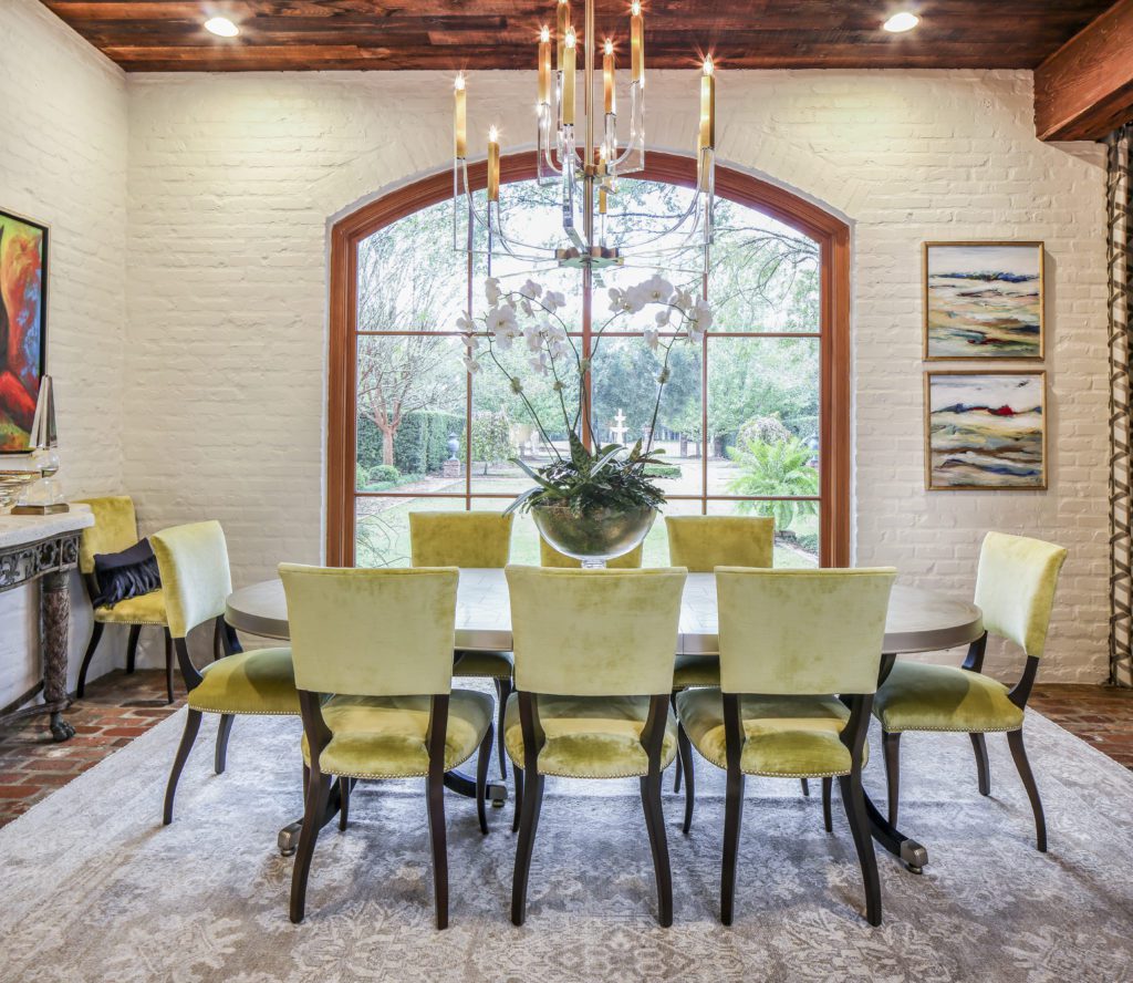
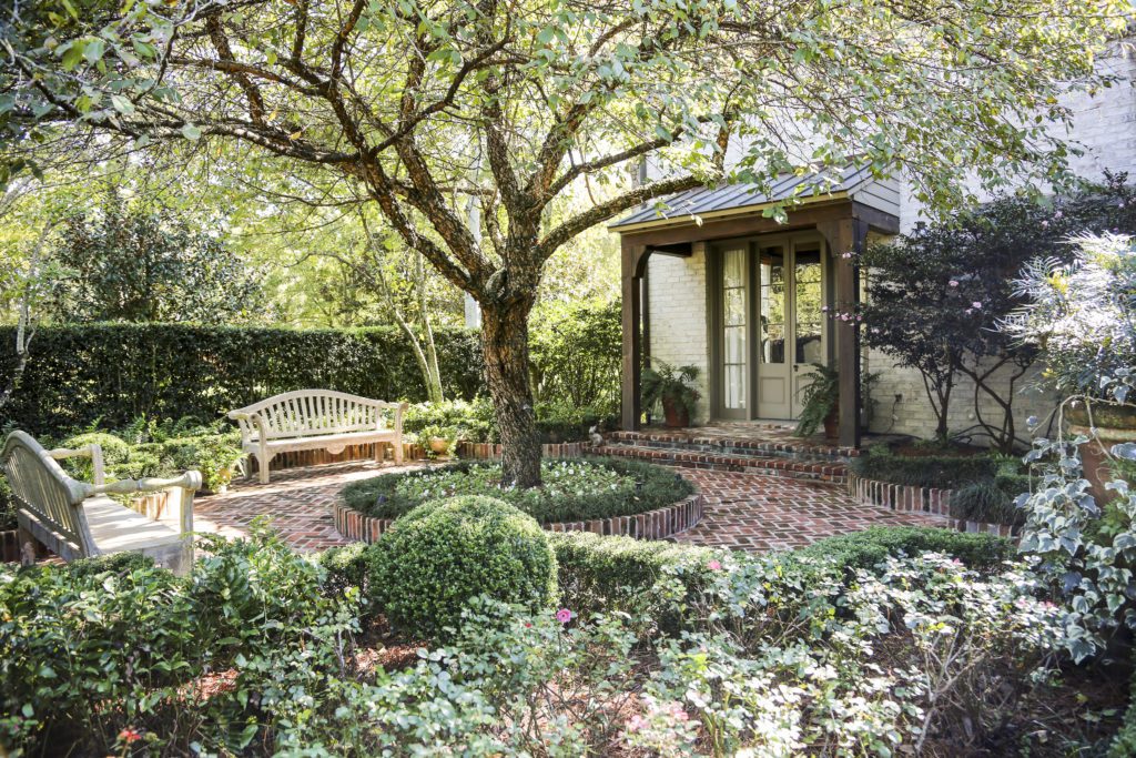
To accomplish these goals, the design and construction team closed in an existing porch and transformed it into a new breakfast area that opens up into both the living and keeping rooms. Eliminating the porch had the added benefits of allowing more natural light directly into the house and providing an unobstructed view of the formally landscaped backyard through a large arched window.
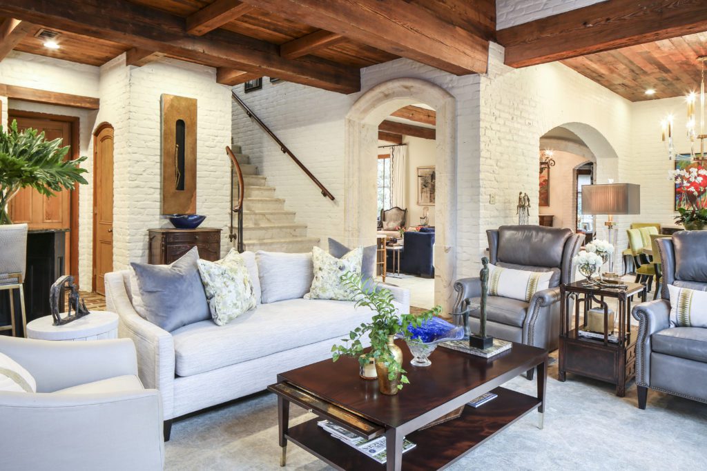
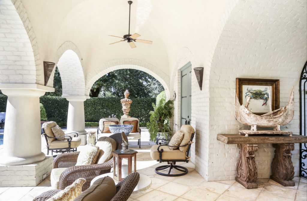
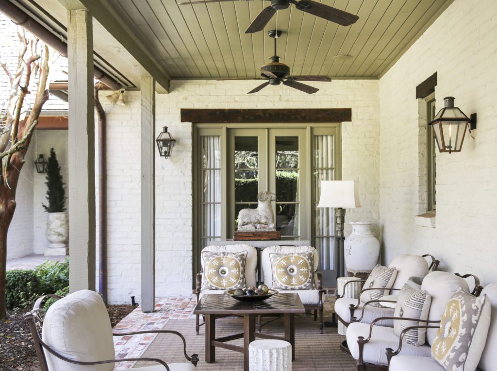
Once the structural elements were in place, one simple change served to create a brighter backdrop for new furnishings. “The walls and brickwork throughout the home were painted in Benjamin Moore’s ‘Ballet White,’ the perfect shade to lighten each area while still bringing warmth,” says Baker.
The newly serene setting provided a clean canvas for more contemporary seating and accent pieces. In place of burgundy and brown leather chairs, dark Oriental rugs, and swagged silk drapes, the Envy team chose new pale patterned carpets, chairs and sofas in cool-toned colors, and lighter-hued window treatments that wouldn’t compete with the exterior views through large windows. Heavy tapestries and paneled screens hung on walls were replaced with modern abstract paintings by Louisiana artists. But it wasn’t entirely out with the old and in with the new; Baker took special care to find homes for some of the couple’s treasured items.
“Brenda and Danny were involved in the process from the beginning, but after giving us their vision, they trusted us to make it a reality,” Baker says. “They wanted a more modern look overall but had several pieces that were special to them that needed to be incorporated into the new look.”
Those special items included a wide variety of paintings and sculptures that the couple had purchased on vacations or collected. Beloved bronze statues add interest in the keeping room, and a copper wall hanging that the couple found in California hangs beside the staircase.
A favorite Rhea Gary painting now holds prominence of place in the foyer, where it hangs over an antique sideboard that now feels less imposing after Baker removed its upper hutch.
“It was great to be able to keep it, because I love that piece, but we were able to find a way to change it up so it would look more up to date and less heavy,” Phillips says of the sideboard, which now wears a new marble top.
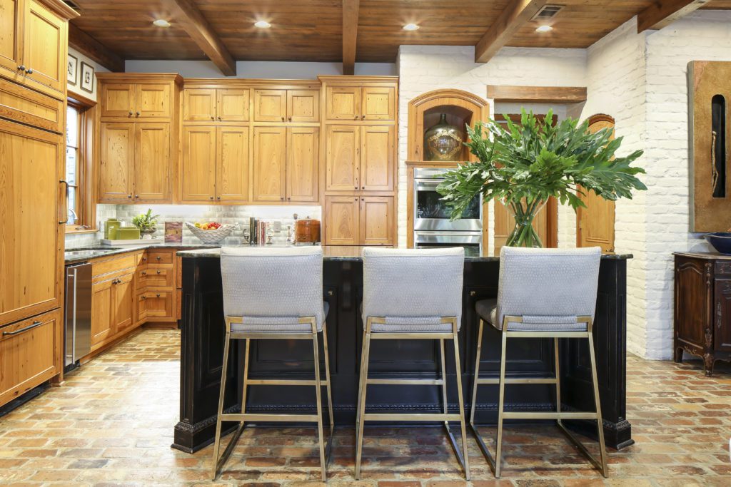
One prominent room warranted only a delicate touch to give it the warm-meets-modern feeling Brenda and Danny sought. In the kitchen, the couple chose to replace their backsplash with an elegant tile version, but to retain the warmth of their existing stained sinker cypress cabinetry.
“Everyone said we should paint them, but we wanted to let the beauty of the wood show,” Phillips says.
That focus on combining rustic natural details with more contemporary elements, says Baker, gives this house a timeless quality that ensures its design will suit the homeowners for years to come.
“We had a great time working together,” Baker says. “The goal was to update everything while keeping the overall style classic. In the end, the mix of old and new was the perfect combination for a modern yet warm and inviting home.”
Click on the photos in the gallery below for a closer look at this home:


