High contrast: Architect Mike Sullivan’s 1980s townhouse is transformed to let his collections take center stage
Mike Sullivan spends much of his working hours 30,000 feet in the air. He is away from home as much as he is in it. So this seasoned principal with Looney Ricks Kiss Architects craves a respite that doesn’t require a lot of extra daily attention. When he accidently drove beyond the office buildings on Wrenwood Boulevard and stumbled upon a grouping of quaint townhouses, he was instantly intrigued and made a few phone calls.
“This townhouse checked all the boxes I needed in a home,” says Sullivan, who was living in a 1920s house at the time. “The townhome was low maintenance, it had plenty of natural light thanks to three courtyards, and it offered easy access to both interstates.”
One of the first phone calls Sullivan made was to interior designer and friend Kenneth Brown. The duo already had a strong working relationship, so the collaboration on creating an appealing home for Sullivan was a natural one. Brown was familiar with Sullivan’s taste, and Sullivan had complete confidence in Brown to make the right decisions.
“Many people asked how I could let someone else design my home,” says Sullivan. “But Kenneth knows me. He knows how I live. Trust was not an issue.”
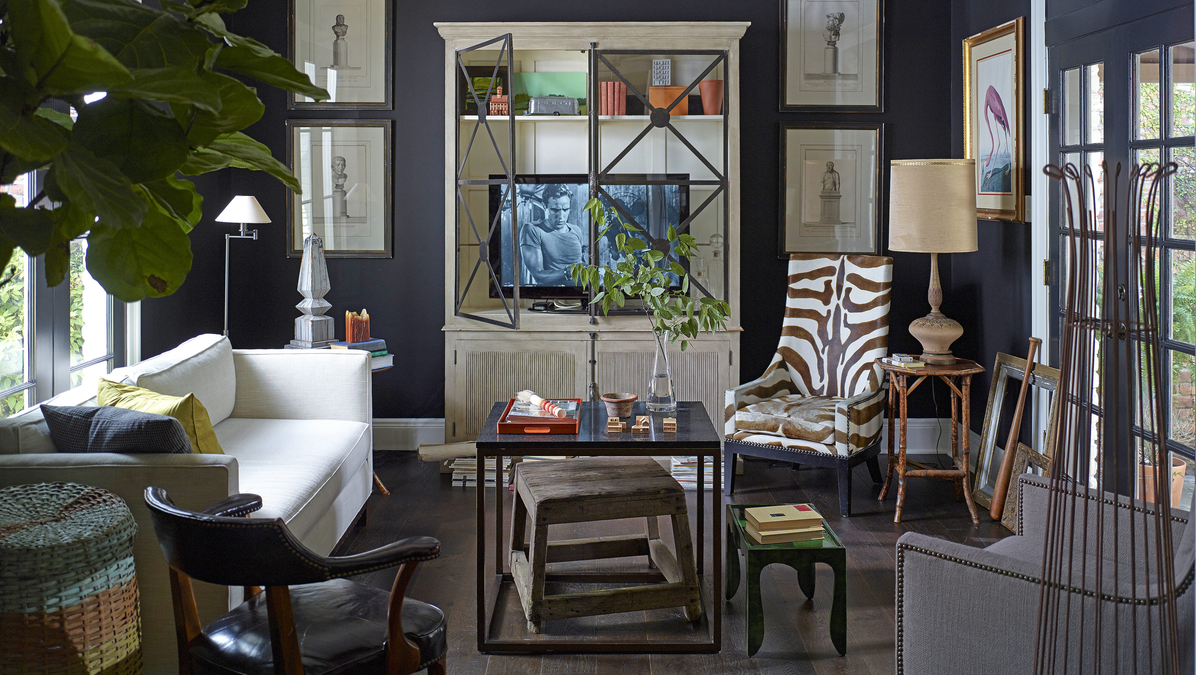
SLIDE BAR RIGHT AND LEFT TO SEE TRANSFORMATION: The former dining room was transformed into a TV room for Mike Sullivan. One of his favorite pieces, an elephant stool from a 1930s circus, has followed Sullivan from house to house for more than 30 years. It now rests comfortably below the coffee table.
Brown had long been enamored with Sullivan’s collections, including artwork and accessories that made Sullivan’s style unique. He wanted to create a distinctive home that would be a personal reflection of the creative homeowner.
“My goal was to answer the question: How do we peel back the layers of this dated house in a way that really lets Mike’s collections shine?” recalls Brown. “I love breathing new life into a space and giving it purpose.”
The first breath of fresh air came by ripping out all carpet and dated tile and replacing the floors with ebony-stained oak in a baked finish. Small windows were replaced with large French doors for more lighting. And openings through the house were raised from 7 feet to 8.5 feet.
“What really makes me happy is appropriate scale and proportion,” says Sullivan. “I am affected by scale and proportion over quantity of space.”
Kenneth Brown painted the cabinets “Kendall Charcoal” by Benjamin Moore, updated the counters with Carrara marble and installed handmade tile on the backsplash. The dropped ceiling was removed and new lighting installed. But one of the biggest changes was removing the center island and replacing it with an old farm table.
And although this two-bedroom townhouse isn’t grand in scale—it is 2,300 square feet—it lives large. Lots of oversized seating throughout the public areas trick the eye into making the rooms feel bigger instead of smaller. And color, played in the right way, makes a difference.
“Mike let me do black walls in the TV room, and it changed the space entirely,” says Brown. “People often think that dark walls enclose a space when, in fact, they make the walls recede or disappear.”
Brown checked with Sullivan on most significant decisions before moving forward. But when he couldn’t get Sullivan to respond due to inavailability, Brown made the quick decisions himself. This suited Sullivan just fine.
“One of the great things that Kenneth did, besides painting the TV room black, was painting all the doors black,” says Sullivan. “It added instant details to the rooms that simple construction could not have done.”
French doors replace smaller windows in the living room. In this space, Brown mixed textures to create interest. Upholstery is kept neutral, including the tuxedo-style sofa, while the large-scale painting by Patterson and Barnes infuses the room with color. This welcoming room is a gathering space for friends.
Like Brown, Sullivan lived in another state for decades before returning home to Baton Rouge. They both share an affinity for the city and a love of south Louisiana. This made for a good team relationship.
“Any good project is a reflection of the people who work together on it,” says Brown. “This house project tells the story of how Mike and I became even better friends through this work.”
Although Sullivan has an expert eye for design, he enjoyed the collaboration process. And he loved leaving the details to someone he trusted.
“It was nice for me not to be my own client this time,” says Sullivan. “I like things with spirit, and this home, with Kenneth’s help, now has spirit.”


