The bright stuff: Designer details help the Pierrottis lighten up their Santa Maria home
Before she selects a single piece of furniture, fans out her paint chips, or pores over swatches of fabric, Karen Giffel looks to the light.
In remodeling a home, the interior designer explains, the glow from lamps and overhead fixtures has a surprisingly large impact on the appearance of colors in each room. So one of her first tasks when taking on a new redesign project is to make sure every bulb gives off the same level of warmth.
“Lighting needs to be uniform in order to correctly assess the space,” Giffel says. “I prefer the light level to be 2,700 to 3,000 degrees Kelvin—what’s called soft white.”
That primary task couldn’t have been more perfect for the kickoff of Giffel’s makeover of the Santa Maria neighborhood house that Liz and Chip Pierrotti had called home for 16 years. After all, Liz’s main request was to make the house feel lighter and brighter.
“We had a French country look going on before, with a lot of dark wood and dark finishes,” Liz says. “We just needed something fresher.”
Liz says she knew she needed updated light fixtures, wall colors and furnishings, but she didn’t know where to start. “I was kind of changing things here and there, and it just wasn’t coming together,” she says.
That’s where Giffel came in. After meeting with both Liz and Chip, the designer presented them with a vision that captured the desires they had yet to be able to translate into reality. “She just had a plan for me from the start, and it was so easy,” Liz says. “She brought me choices that would all work well in our home.”
The designer’s plan did not involve any construction, as the couple liked their existing floor plan. Rather, it focused on presenting a cohesive look throughout the two major public spaces: one that combines the entryway and living and dining areas, and another that includes the kitchen, and breakfast and keeping areas.
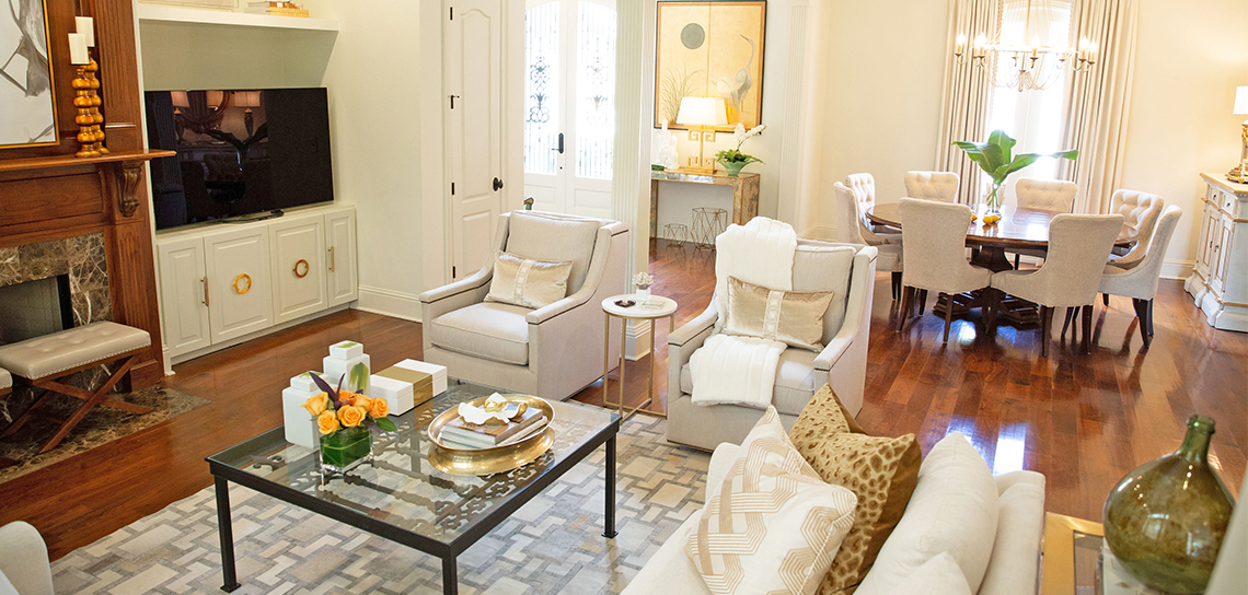
As the first space guests see when entering the house, the living area was a major focus of the project. While the first instinct might have been to paint the stained oak fireplace, Giffel instead simply removed a fancy French cartouche from its front façade and left the wood’s warm hue in place to balance with the new lighter look that she was implementing elsewhere in the room. A dark wood built-in bookshelf beside the fireplace was removed and replaced with a new white-painted built-in low cabinet dressed with a mix of round and oblong modern cabinet pulls, and over it, Giffel installed a floating white shelf.
The seating in this space was planned to accommodate a crowd—perfect for the couple’s five children, a grandbaby and countless extended relatives who often gather here during the holidays. “We decided to float the furniture in the room and put in a sectional and swivel chairs so it’s easy for them to watch LSU football and to have conversations,” Giffel says. If shouting at the screen during the games gets too rowdy, no worries—the seating is upholstered in performance fabrics, and even the rug is a patterned cowhide that’s easy to care for.
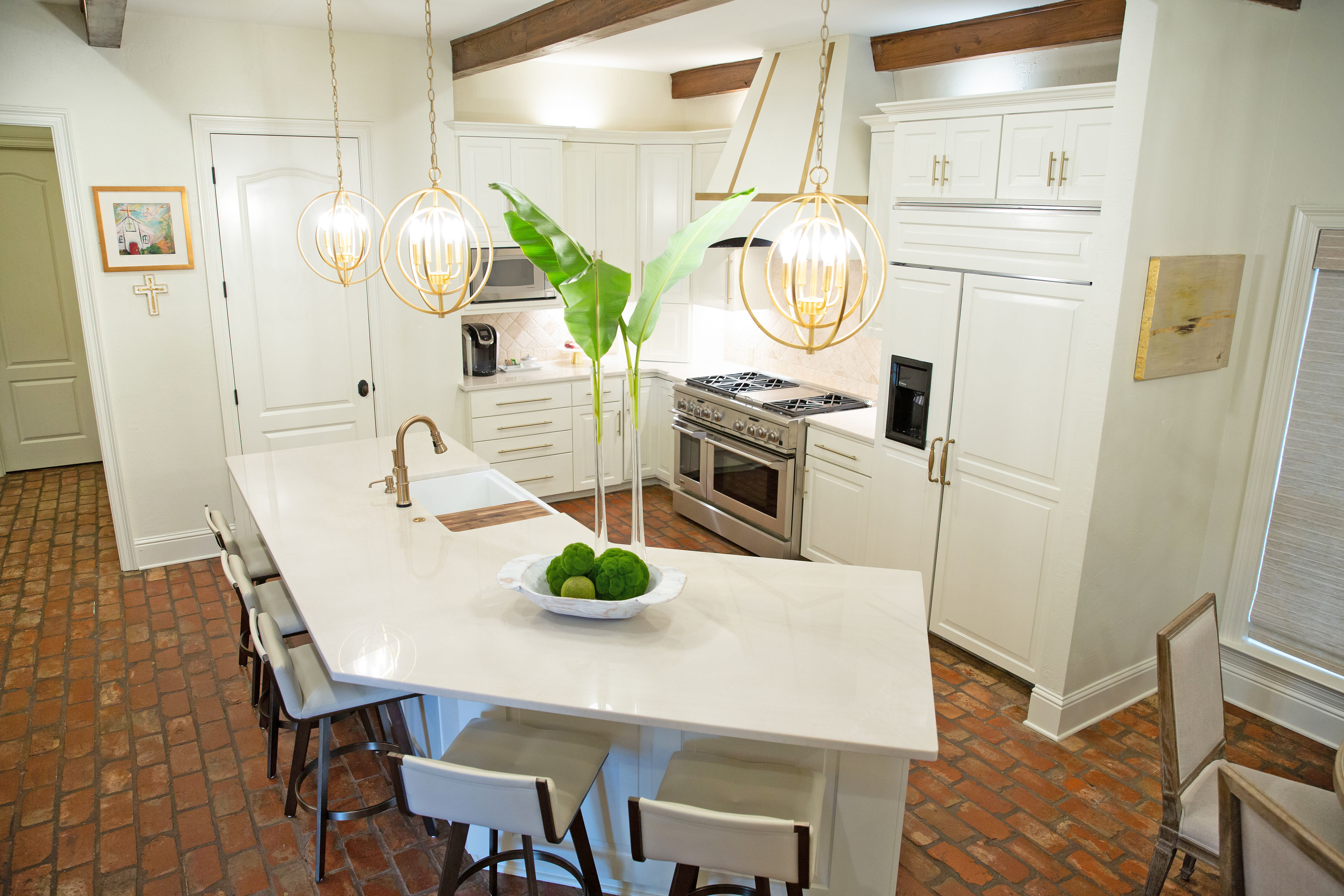
As much as this family likes to cheer on the Tigers together, they also love to cook together, so the kitchen was another area of focus for the redesign project. Liz and Chip are both Mamou natives, so they often serve up Cajun specialties, but they also enjoy making their kids’ favorite egg rolls and other family-friendly dishes like lasagna. “We all congregate in the kitchen and the keeping room,” Liz says. “When all the kids are here, we find ourselves crowding around this area.”
The first order of business in the kitchen was to ditch the original brown marble countertops—“the color was OK, but we had to be so careful with it,” Liz says—in favor of white quartzite. Glazed cream-colored cabinets were painted in a brighter solid hue, and even the range hood was transformed by removing a flowery decorative medallion and adding handpainted linear elements inspired by old-world brass straps. Around the island, new swivel barstools let visitors easily turn to watch the game on the TV in the keeping room.
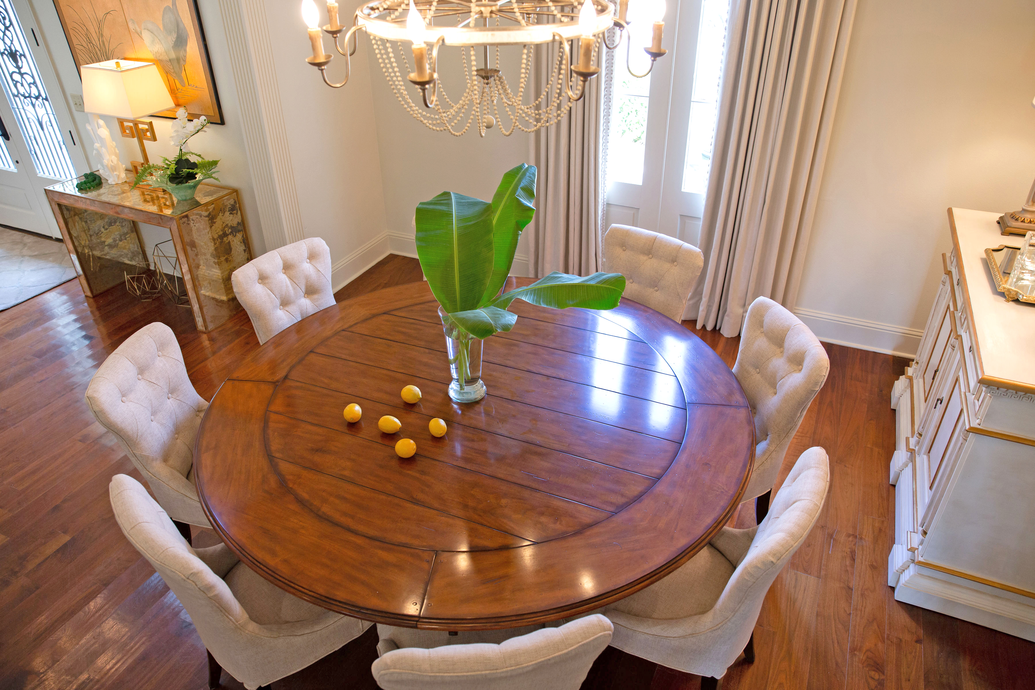
This dark-to-light home makeover was fittingly made complete with the strategic addition of new overhead fixtures in each room, along with the reimagining of others. Over the kitchen island, three new spherical pendants now hang where one large fixture once overwhelmed the space. A beaded chandelier is subdued but still special in the dining room, and a large bronze-tone light fixture in the entryway was repainted in soft silver and gold. “It’s really all about balancing the lighter elements with warmer, richer pieces that anchor the rooms,” says Giffel. “Those are the kinds of details that make a house feel comfortable and personal.”
See more photos from this home in our gallery below:


