[Sponsored] From Dark to Light: Local renovation combines natural charm with logical design
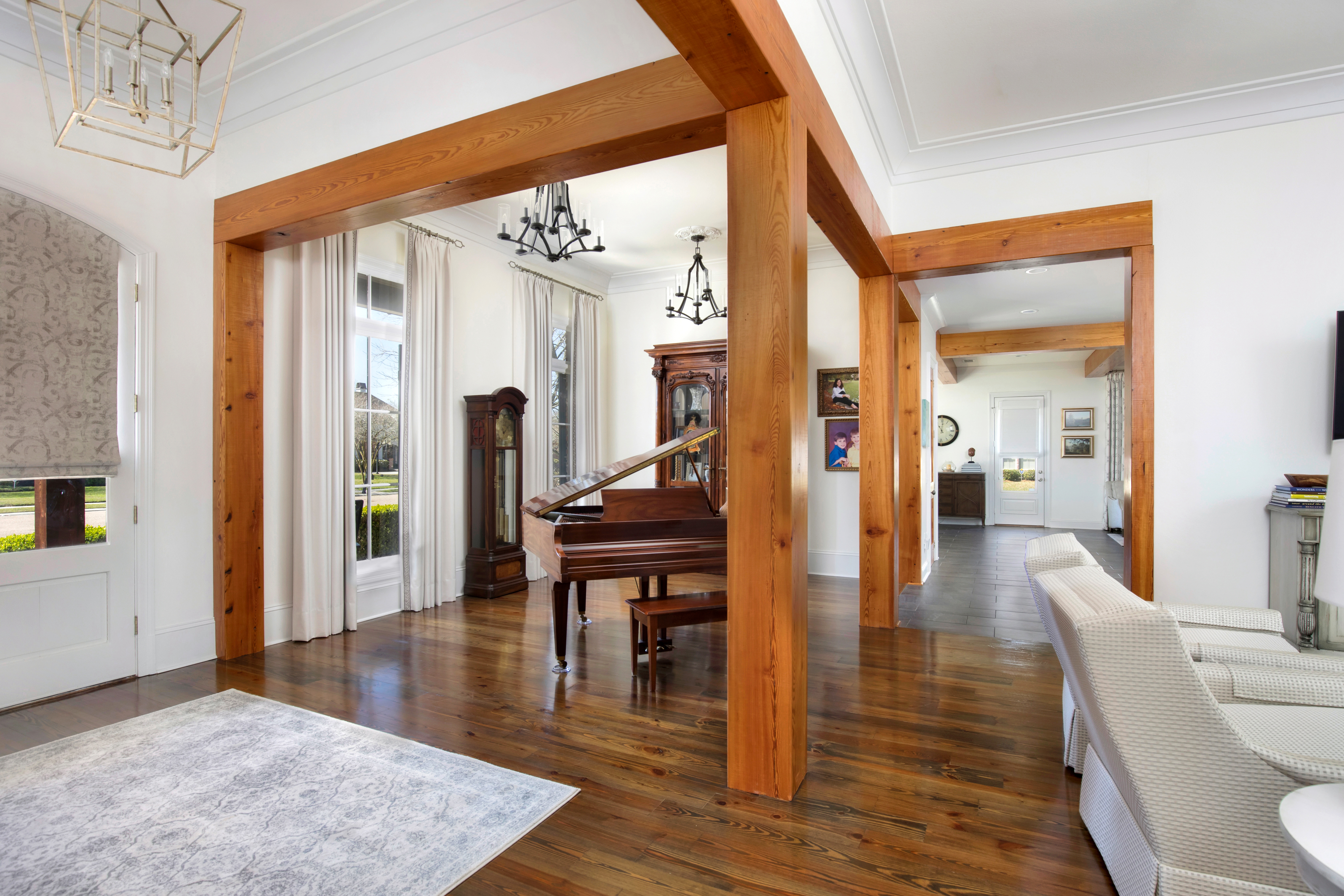
In homes today, formal dining rooms are used less and less—especially those disconnected by walls and shut away from the rest of the home. Ourso Designs treated us to a look at one of their dramatic before and after designs. In this home, rooms were compartmentalized and the formal dining room originally opened only to the living room. The foyer was used as a piano room. The design team created what now feels like an entirely new home.
It’s no wonder Richard Ourso and Logan Wheeler Ramirez are so highly sought after. They provide incredible custom features that make a home both beautiful and functional. Visit oursodesigns.com to learn how to create your own inspired space.
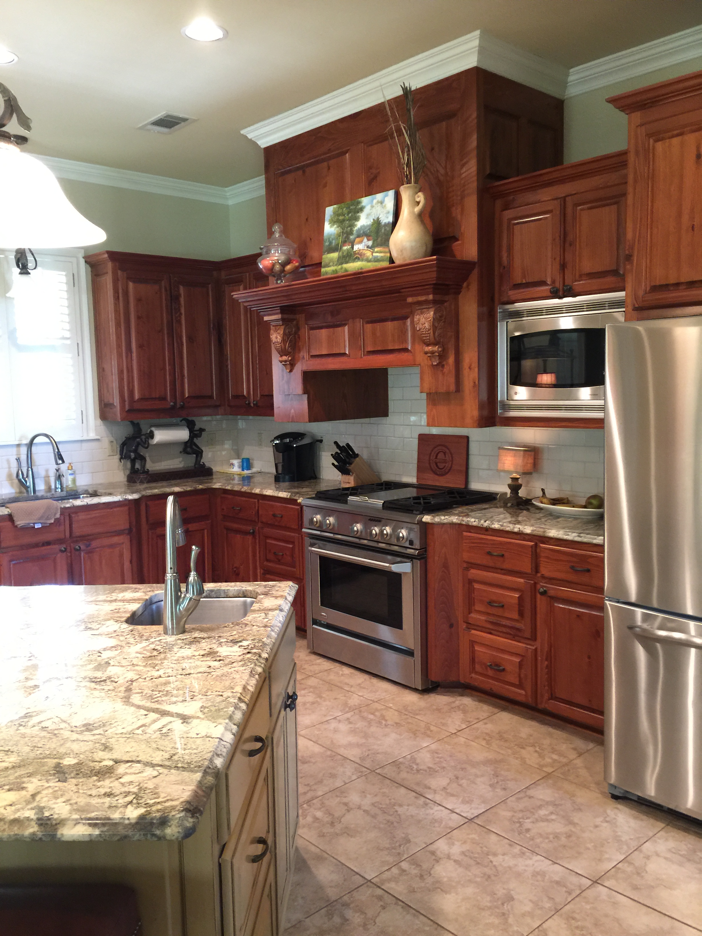
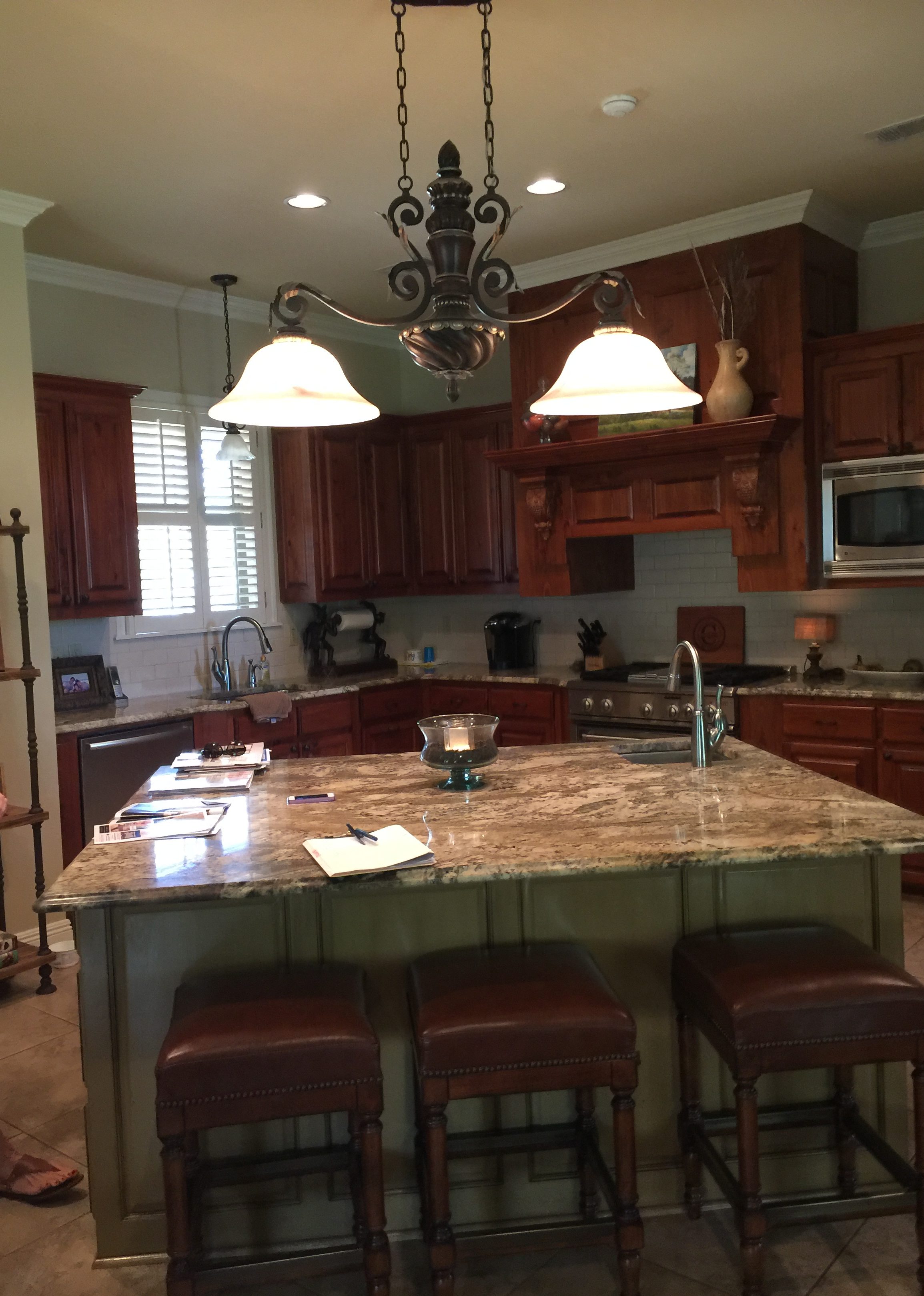
Before
—While the kitchen was very nice, its design and cabinets felt closed off and dark, and the angled island made navigating the kitchen difficult.
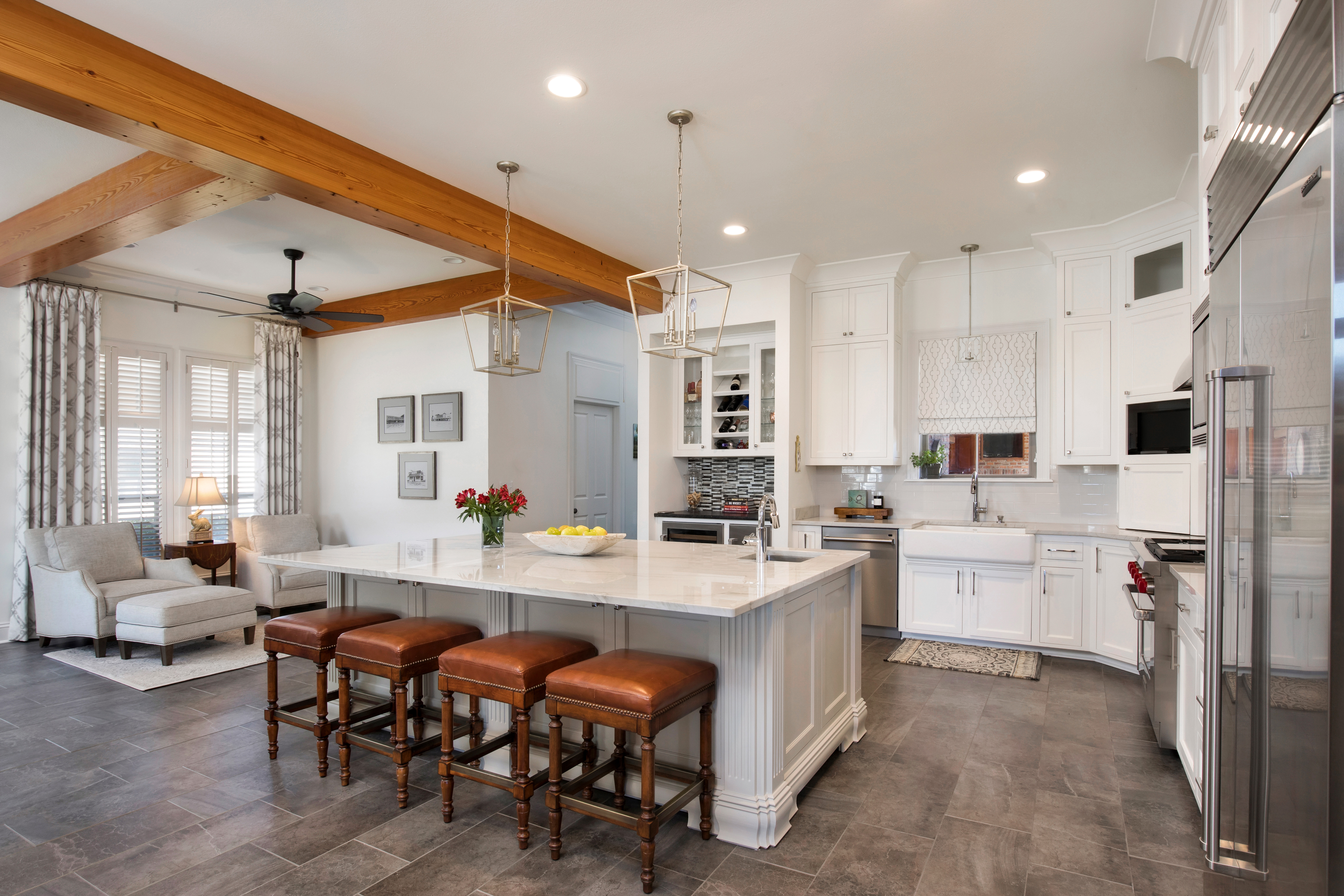
—In this case, the main goal was to lighten and brighten the space. A white-on-white palette can be seen through the house with a mix of natural elements in wood tones, natural stones, and bricks.
After
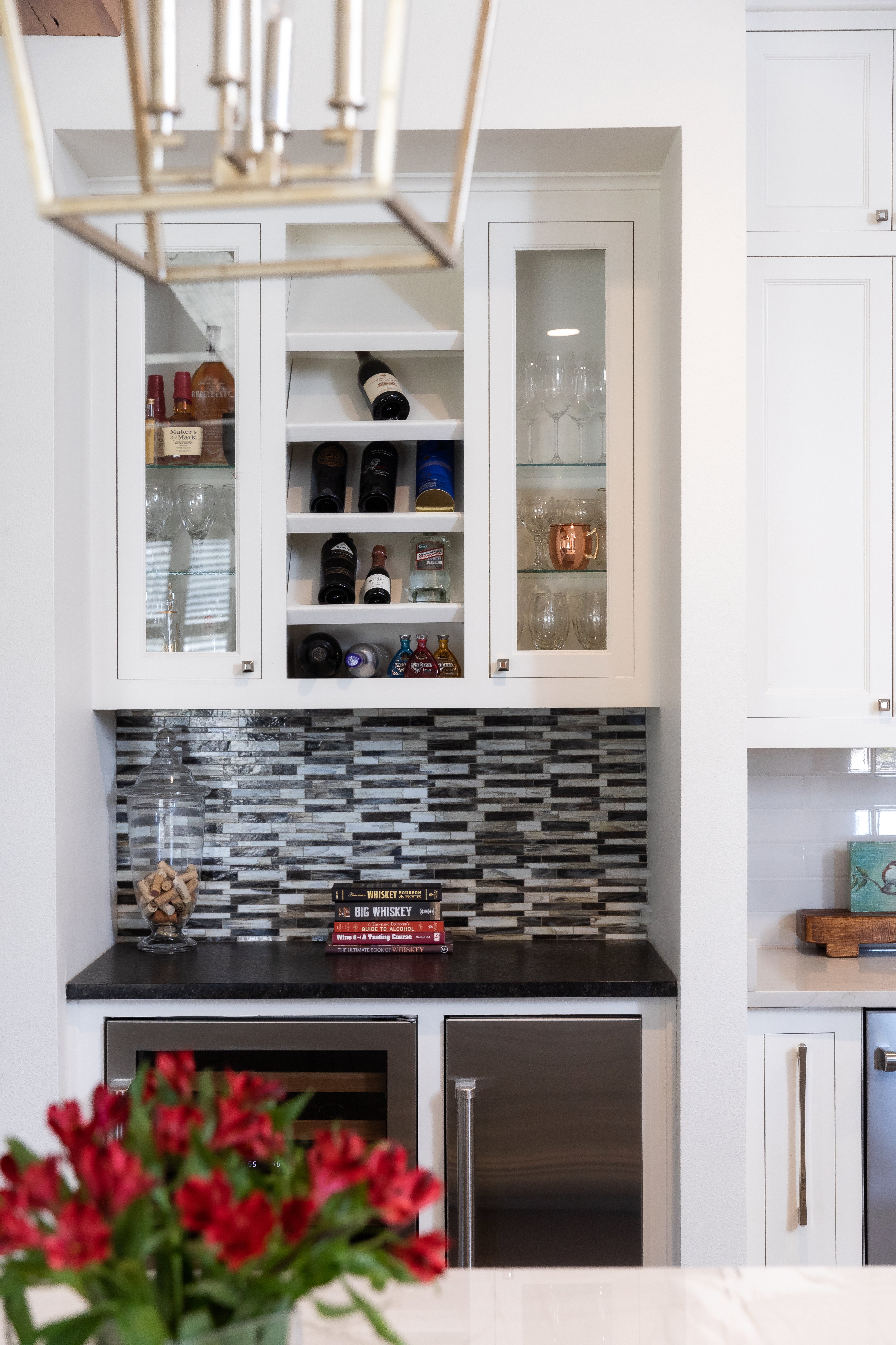
—Ourso’s designers reconfigured the island, allowing for a more open space. For easy entertaining, the clients added a bar nook with a built-in wine cooler, ice machine and additional storage.
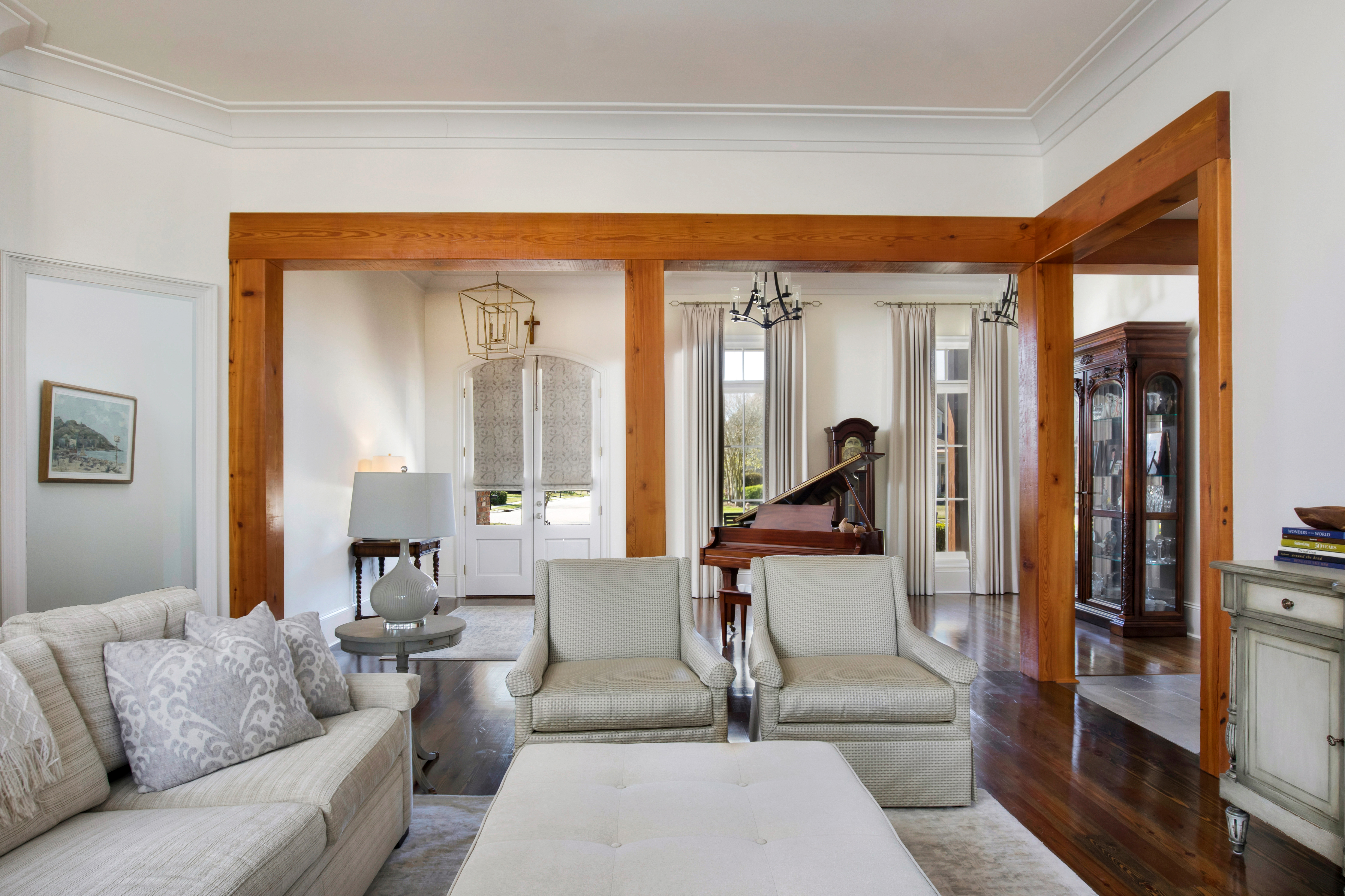
—The entire space opened up when Ourso’s team removed the dividing walls. To keep a visual separation between the spaces, the living, dining and kitchen areas were framed with beams, posts, and door headers from The Olde Mill. As walls were taken out and structural post put in place, the hollow beams beautifully concealed the structural elements.
“We maintained neutrals and warmer flooring throughout the home, which complemented the wooden elements throughout beautifully,” Ramirez says. “By reconfiguring the kitchen and replacing the dividing walls with the post and beam design, we were able to give the clients exactly what they wanted—an open and bright home to enjoy for many years.”
—Logan Wheeler Ramirez
Designer, Ourso Designs, Bachelor of Interior Design
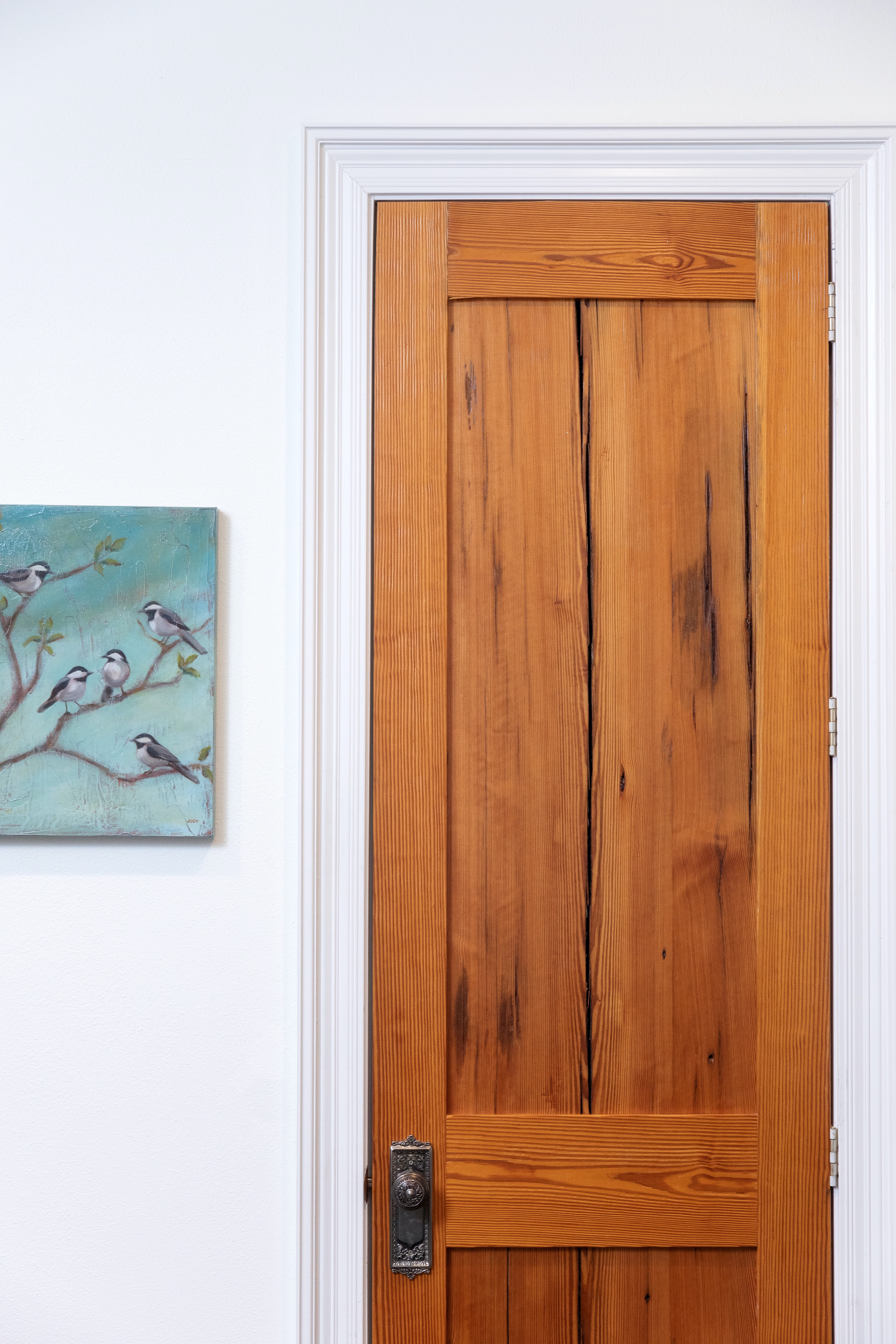
—Another special detail is the pantry door. It was on the same wall as a lot of the beam work, so Ourso had the beam manufacturer make a custom door from reclaimed wood for the pantry that looks antique and perfectly complements the other beam work
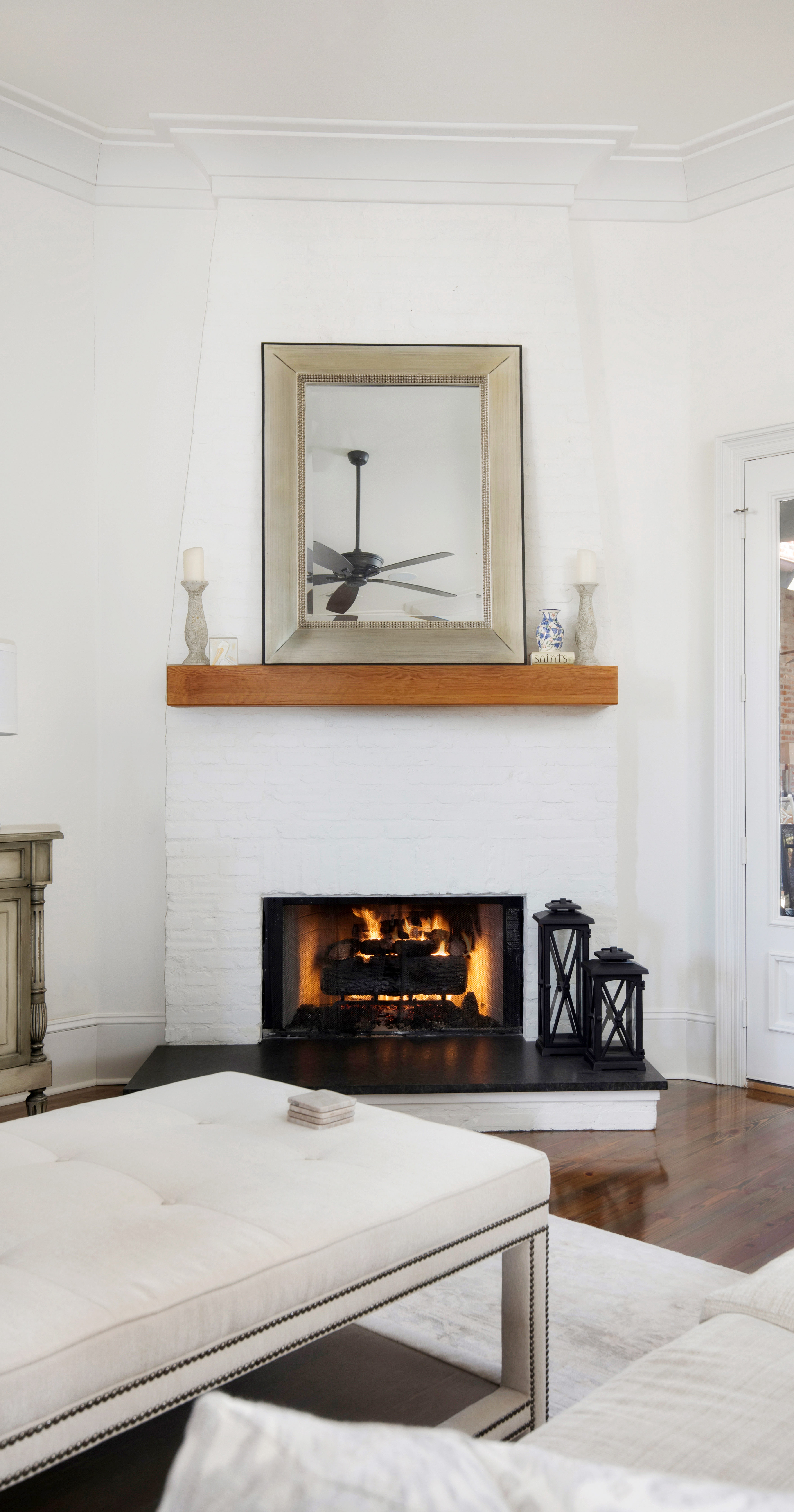
—The fireplace was a bit of a challenge. It sat on a diagonal, with an exterior door immediately to its right. It was pretty plain with only flush drywall and a fireplace insert. Ourso’s team added a slight brick bump that tapered towards the top, painted it white to brighten, and added a beam mantel.
Visit oursodesigns.com to learn how to create your own inspired space.


