Rooms with a view: A meticulous plan transforms the grounds of a home into something fabulous
This article originally appeared in the July 2019 issue of inRegister.
A blank canvas. That’s the ultimate desire of every artist. An untouched, untethered blank canvas from which to spin visions of grandeur, moments of musing, inspirational concepts and practical solutions that will reflect a scene. A vision. A view.
Thanks to landscape architect Ryan Cole, every room of this Jefferson Place home has quite a view.
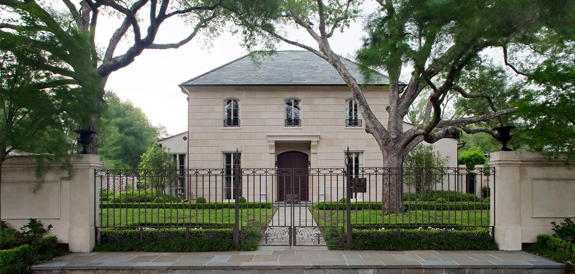
Cole started with a vision. He was brought into this project early—right after the homeowners bought the spec home under construction and desired to transform it to a custom abode. He worked closely with architect Billie Brian and created an entire master plan for the exteriors in keeping with the interior renovations. Cole noted the home’s strong bones, lack of a large yard, location in an established neighborhood, and he envisioned a French city house. One with high walls, lush landscaping, separate garden rooms and multiple fountains that could serve as a private retreat in the middle of the city.
“The art of the master plan was how to transition the garden to another place,” says Cole. “Take the exterior elements beyond utilitarian and create beauty. There was also a great symbiosis between me and the architect. This really worked in creating this vision and making it a reality. Doors and windows were adjusted with the gardens in mind.”
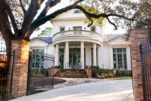
Cole worked with Brian on many elements of the exteriors, including the entire façade of the home. The front is clad in Indian limestone with no side joints—a technique Cole saw on an old French house in New Orleans—which gives a grand, horizontal design to the face of the house. As the home extends back, Cole and Brian changed materials to reflect what might be typical of a French house in the city.
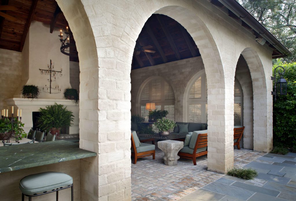
“The front is very formal, but as the house goes back the materials start to break down,” explains Cole, noting that old techniques were used, including hand-troweled stucco. “Weathered brick—brick with sacking over it—gives it an aged feel toward the back where the more everyday rooms, like the kitchen, would be.”
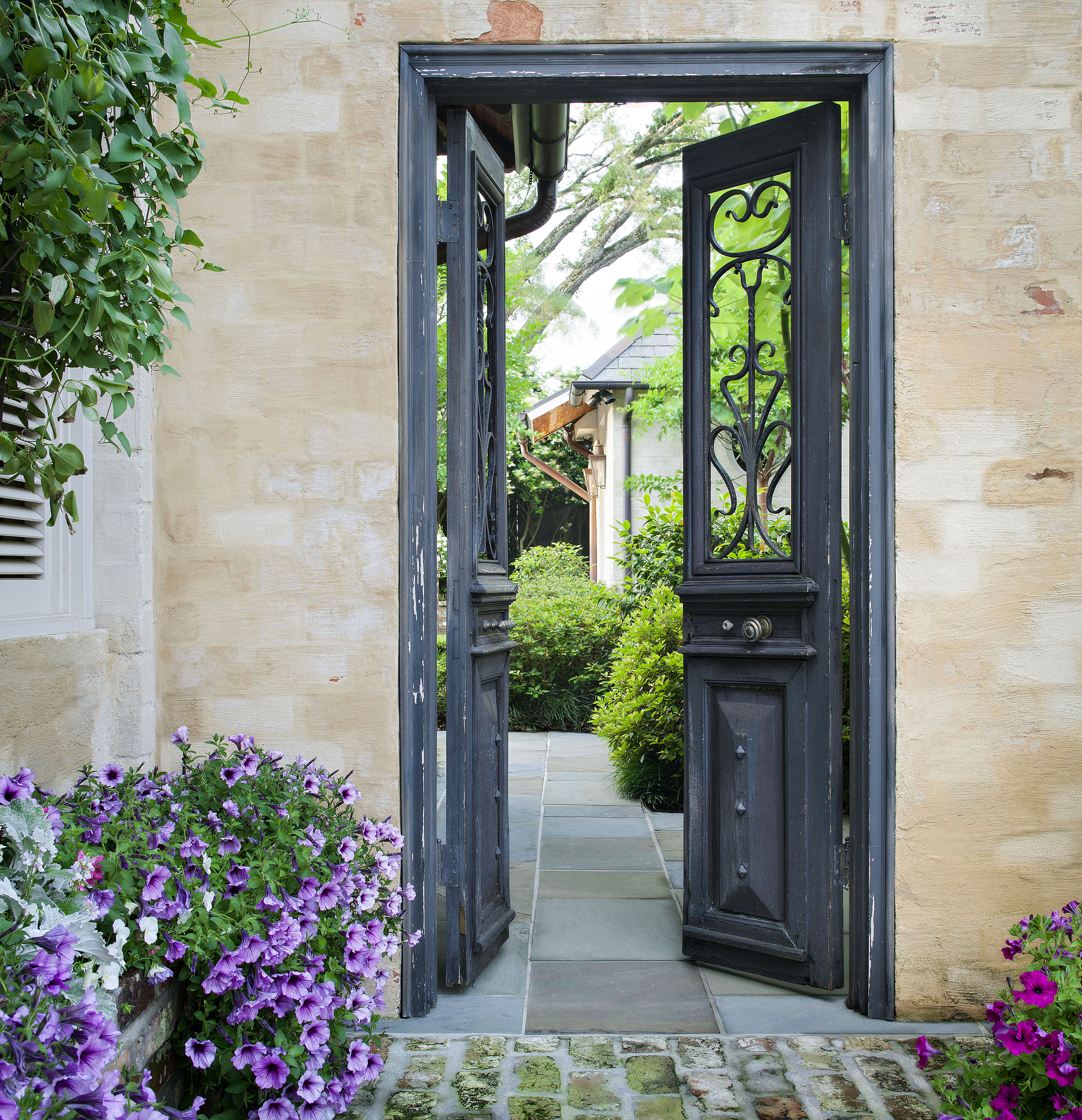
In addition to the change in materials on the home’s exterior, slate flooring gives way to weathered brick in the outdoor kitchen. The large limestone walls in the front transition to green walls (or vertical gardens) in the back, a choice that Cole says helps give the appearance of depth in a shallow space. Antique doors, aged urns, old ironwork and weathered fountains add more patina at every turn.
“This house comes off as truly authentic,” says Cole. “It looks older than its age. It is timeless and will transcend the years.”
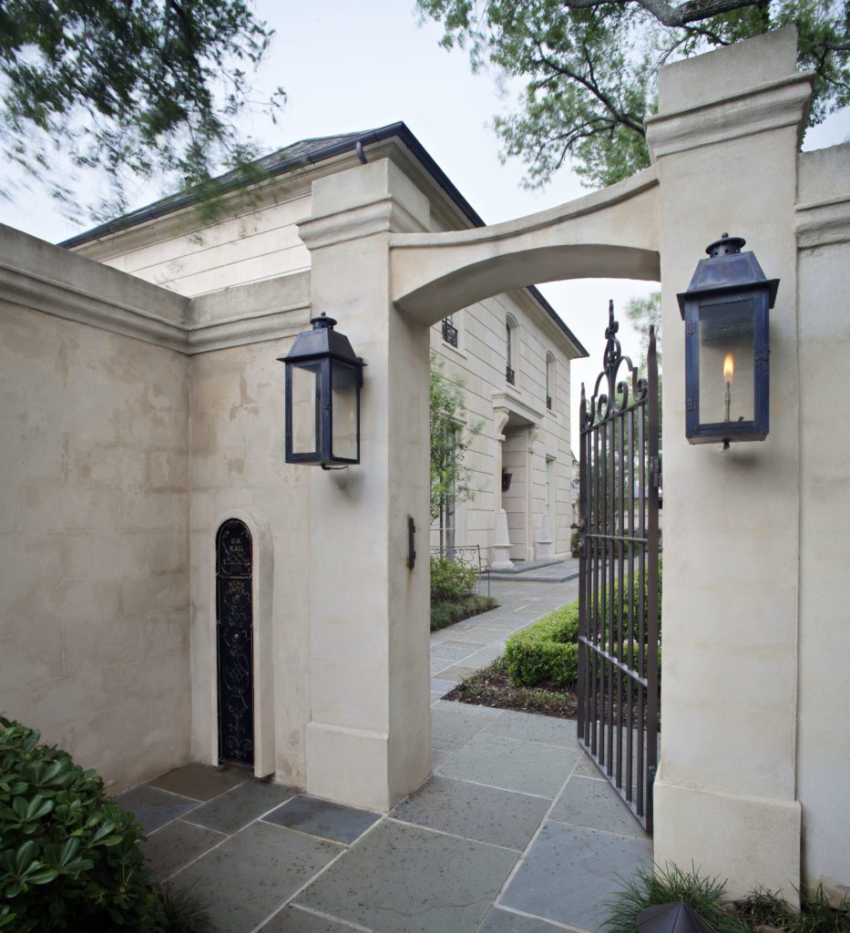
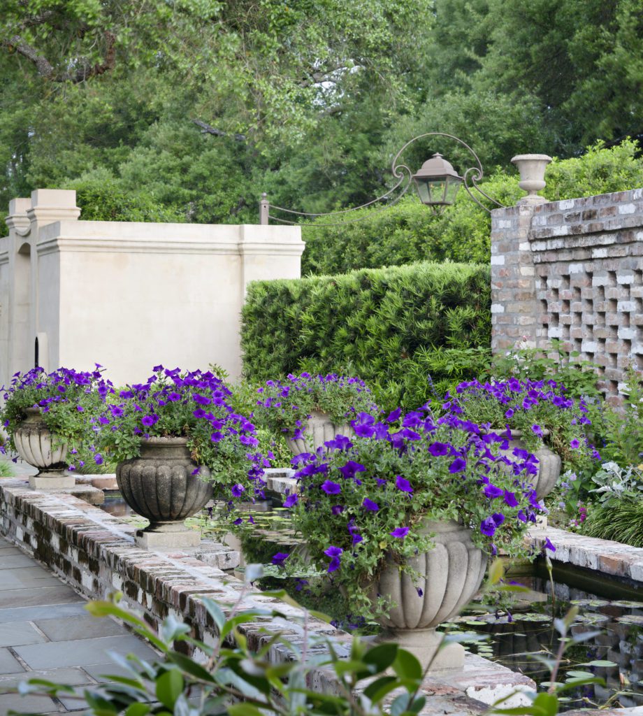
In addition to the hardscape, Cole created French gardens to complement the home. The front design, enclosed by walls, is formal “but not Versailles formal,” he maintains. In addition to boxwoods and a holly hedge, Cole also incorporated azaleas and other foliage to soften the scene. A walled side garden with a lily pond offers a pleasing view from the dining room. Even the driveway, with a pedestrian gate, received special attention with planning and foliage.
“In planting the driveway entrance, I kept to an everygreen planting palette—formal and classic,” says Cole, noting that he used standard Eagleston Holly to create green walls along the passage underplanted with monkey grass. “But in a French home, you would not be looking out the windows of the house at a driveway. Which is why the courtyard is so important.”
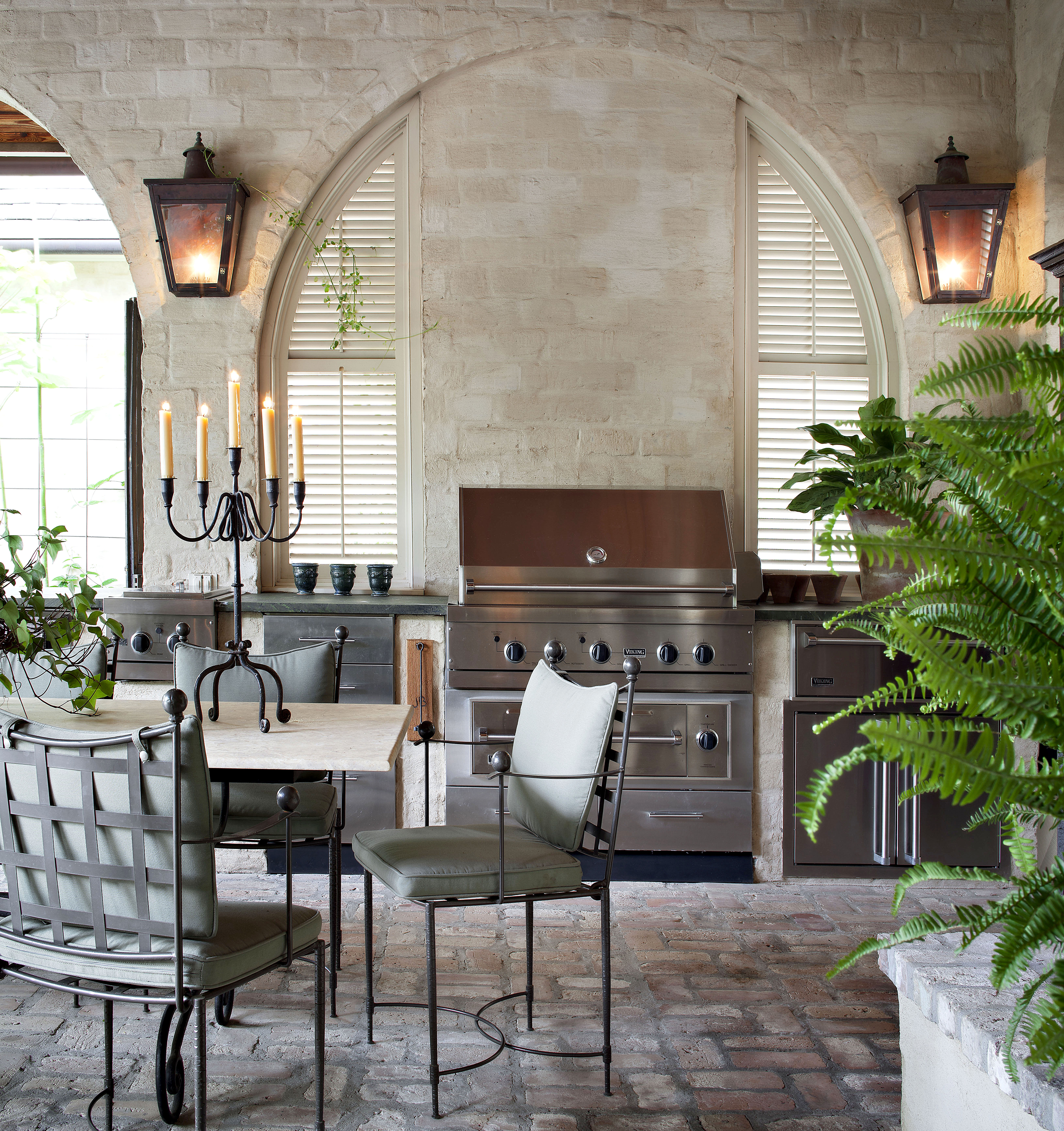
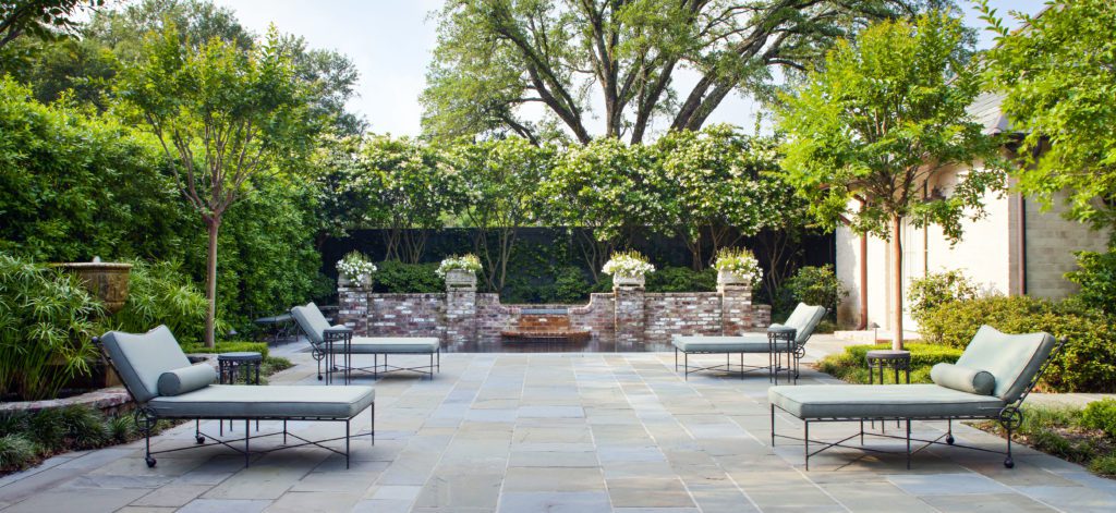
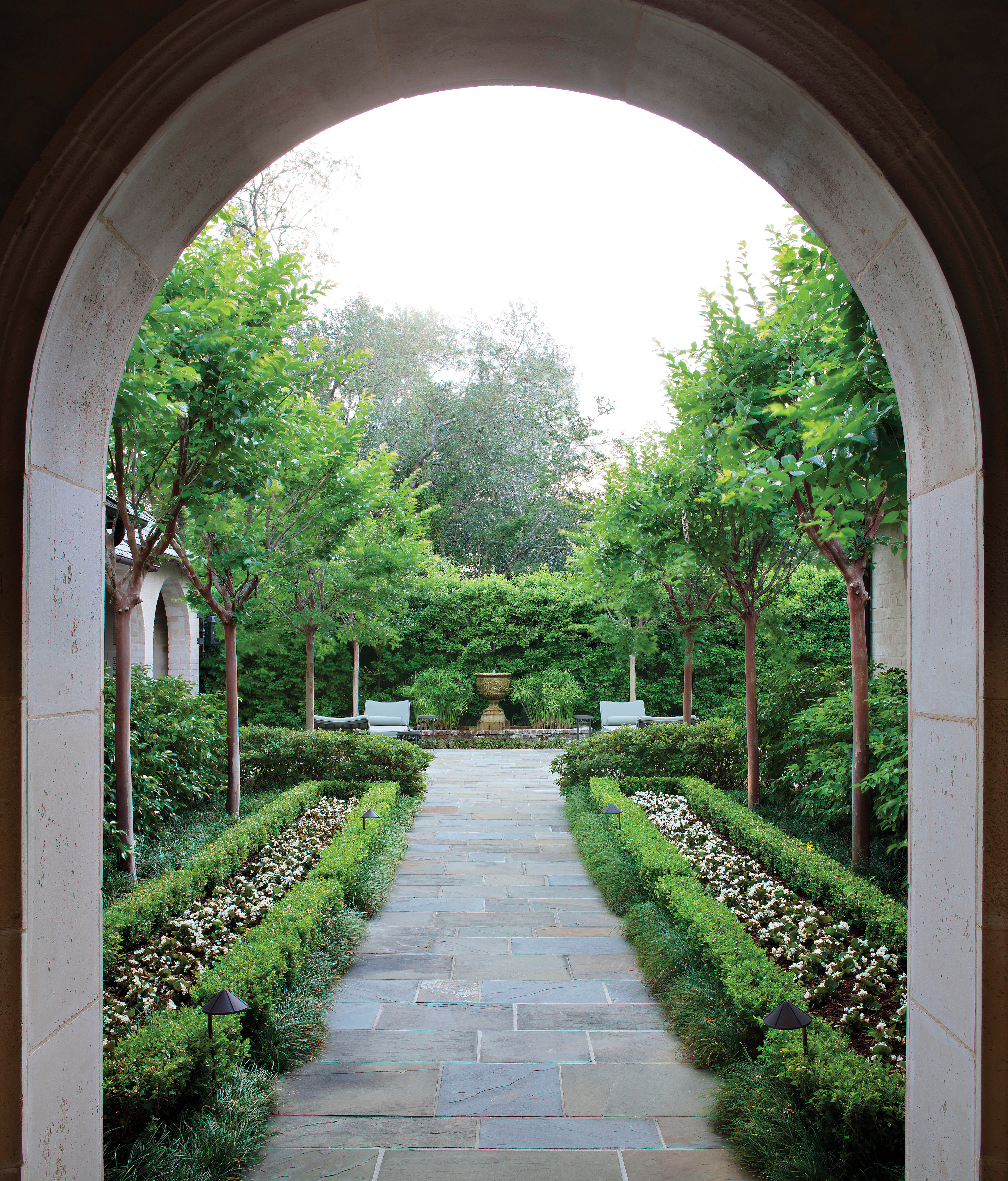
All of Cole’s exterior rooms are important and intrinsic to the design—part of his master plan—but the back of the home is where it is most apparent. The axial sightline from the front door through the rear porch informed Cole’s choices on extending the axis to the back of the property, ending it at a French fountain as the focal point. Here he developed a planting design of symmetry and formality, but he contrasted clipped hedges with loose evergreens to make it a bit more casual.
“The property is not big, so we played with proportions to extend the eye,” says Cole. “A skinny allée, overly narrow, gives the appearance that it is longer. Also, the walk is covered by trees but opens up to the garden room beyond, which plays a bit with depth perception.”
Every detail was considered—from the best way to conceal a spa to the color of the outdoor cushions to blend with the background. The goal, for Cole, was to make the rooms outside of the home as inviting as the rooms within. And he saw his vision to completion.
“It feels grand, but it is comfortable,” says Cole. “The end result is pleasing to the eye. But the untrained eye might not be able to pinpoint exactly why it is pleasing. That’s where the master plan comes in. It can take the exterior design to a whole other place and make every element enjoyable.”
Explore more exteriors in our gallery below:


