French twist: A new Texas home features a modern twist on New Orleans architecture
What happens when a Baton Rouge designer is asked to create a New Orleans-style home in Fort Worth? This mashup of municipalities was at the heart of one of Ty Larkins’ latest projects, with a result that managed to bring together not only disparate local cultures but also eras of history in a home fit for a family of five.
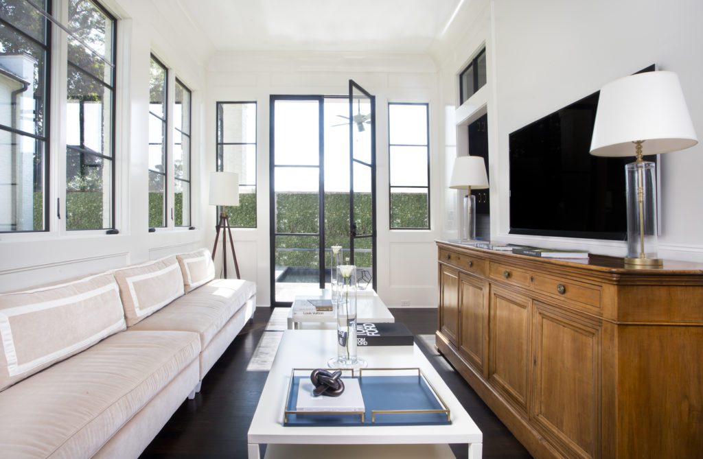
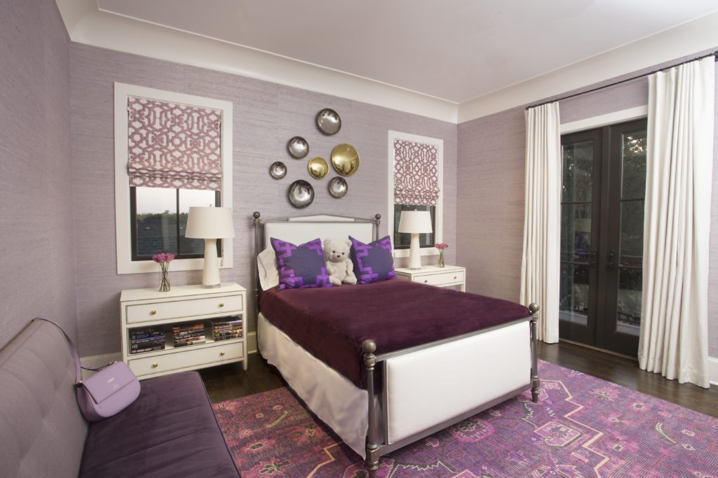
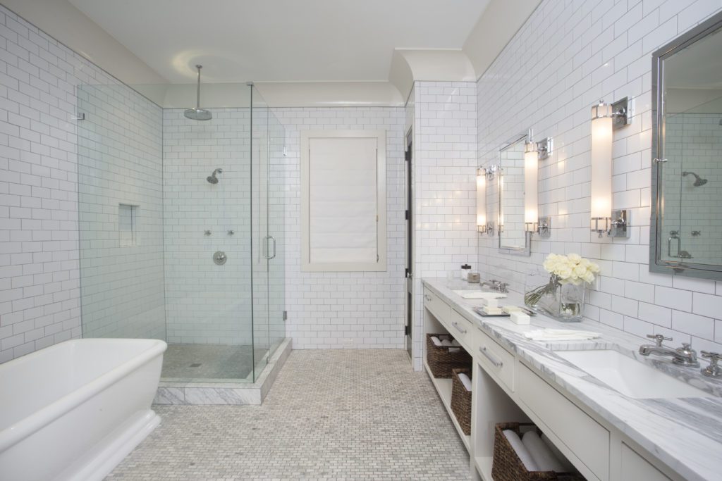
“We decorated this home with a mix of new custom-designed upholstery, antiques and vintage pieces representing our firm’s core design philosophy of layering periods and styles to suggest an interior that has evolved over time,” Larkins says. The clients, New Orleans natives like Larkins himself, asked the designer to take on their project from the ground up, a task that proved both exhilarating and challenging considering the 400-plus miles between his Baton Rouge studio and the job site. We asked Larkins to share some insight on this long-distance design undertaking.
You designed this home’s architecture as well as its interiors. How do you approach such an all-encompassing project differently from one where you are working in tandem with an architect?
Ordinarily, when a client who is building a home reaches out to us, they have already hired an architect who has created the “architectural narrative.” In this case, these clients—whom we had worked for on their previous home—already understood that we possessed the wherewithal to create the exterior architecture as well, so they relied on us to interpret their dream. Admittedly, I have only done a handful of these in my career, so I don’t get the opportunity to do many projects with such a broad scope. I jumped at the chance to wear both hats. The process of creating the interior as well as exterior architecture gives us greater control over the finished result versus when a client comes to us with a set of plans already prepared by someone else. There are pros and cons due to the fact we have more work on the front end when we have drawn the plans but less work on the back end because we don’t have to address interior architectural oversights created by an outside architect.
Tell me a little about the process of working with these homeowners. Were they very hands on or did they turn over the reins to you completely?
These clients advised us that they are very busy professionals without the expertise, desire or time to participate in all the minutiae that often goes into the creation of design. That’s not to say they didn’t tell us what they wanted, because they in fact were very clear from the start. Said differently, they told us what they wanted but not how to do it.
Did the homeowners bring in any special furnishings or have any unusual requests?
These clients had lived through their “Pottery Barn” phase of life and had reached a point in life where they wanted to invest in pieces of lasting value and quality. Their prior furnishings had outlived their usefulness, which gave us the opportunity to start from scratch. In fact, they literally brought nothing from their previous house other than box springs and mattresses to sleep on!
How did you go about finding a balance between traditional French Quarter architecture and an updated structure for 21st-century living? Tell me a little about your research and design process.
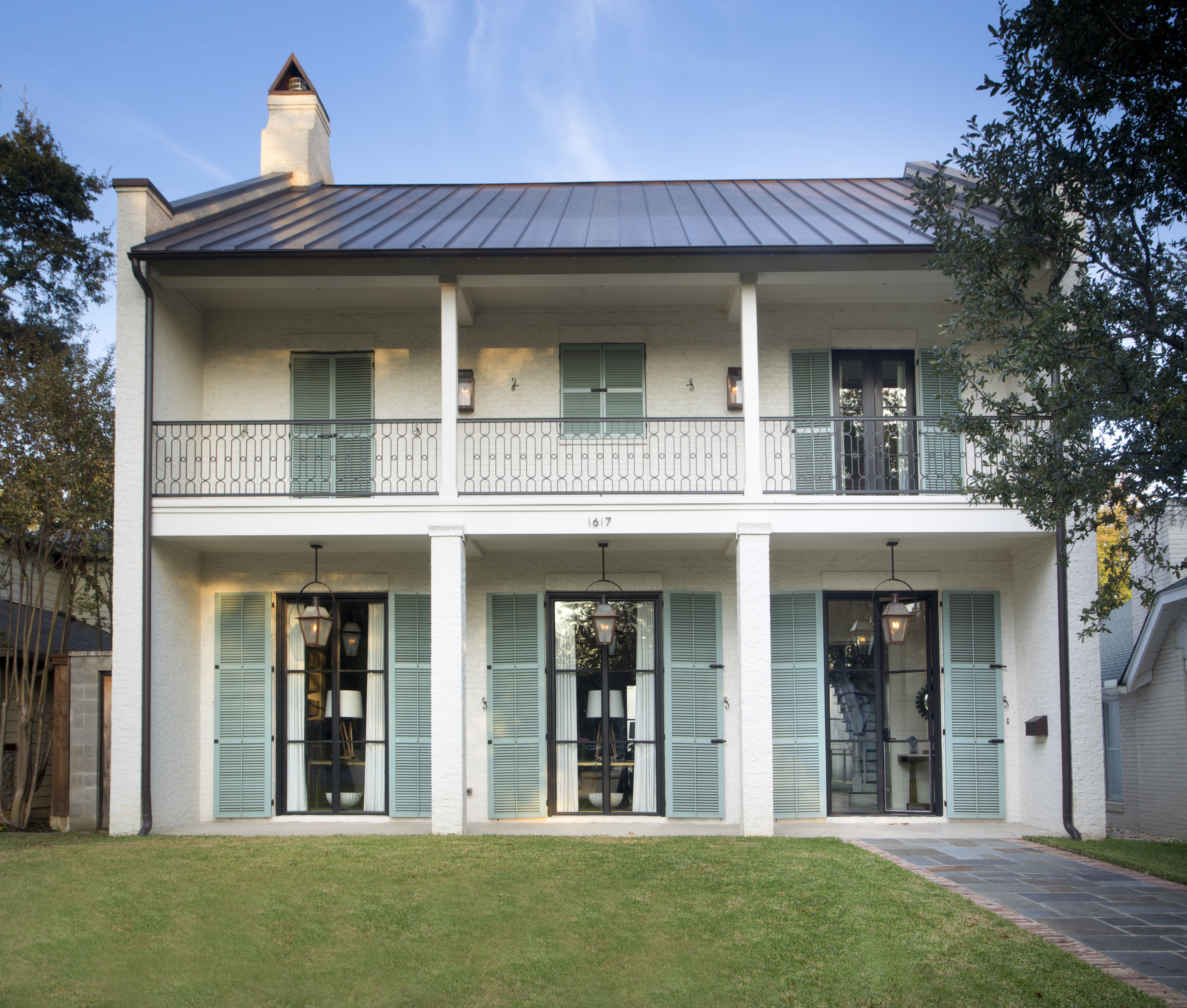
Having been born and raised in New Orleans, I was already intimately familiar with how these old French Quarter structures were designed. I did take several visits to the Quarter during early design phases, photographing and measuring as much as I could, including interior spaces. It soon became apparent that although these structures were provocative and enchanting, the scale and allocation of spaces would not work well for modern-day living. There have been many attempts to reinterpret this style, as in the 1990s when a slew of these structures became trendy for builders and developers. We wanted to avoid this sort of “cliché architecture,” so I suggested that we not create a replica of the French Quarter architectural style but rather a sort of evolved version of what a French Quarter home might look like today.
The footprint of the home is laid out in an L shape with both upper and lower floors designed to maximize views of the swimming pool, which is situated in an intimate private walled garden space like one might find in the French Quarter. We also decided to eschew the typical historically inspired exterior wooden doors in favor of custom-designed steel casement versions to give it a slightly more updated feeling.
What was your vision for the large open living area that also includes the dining and library spaces?
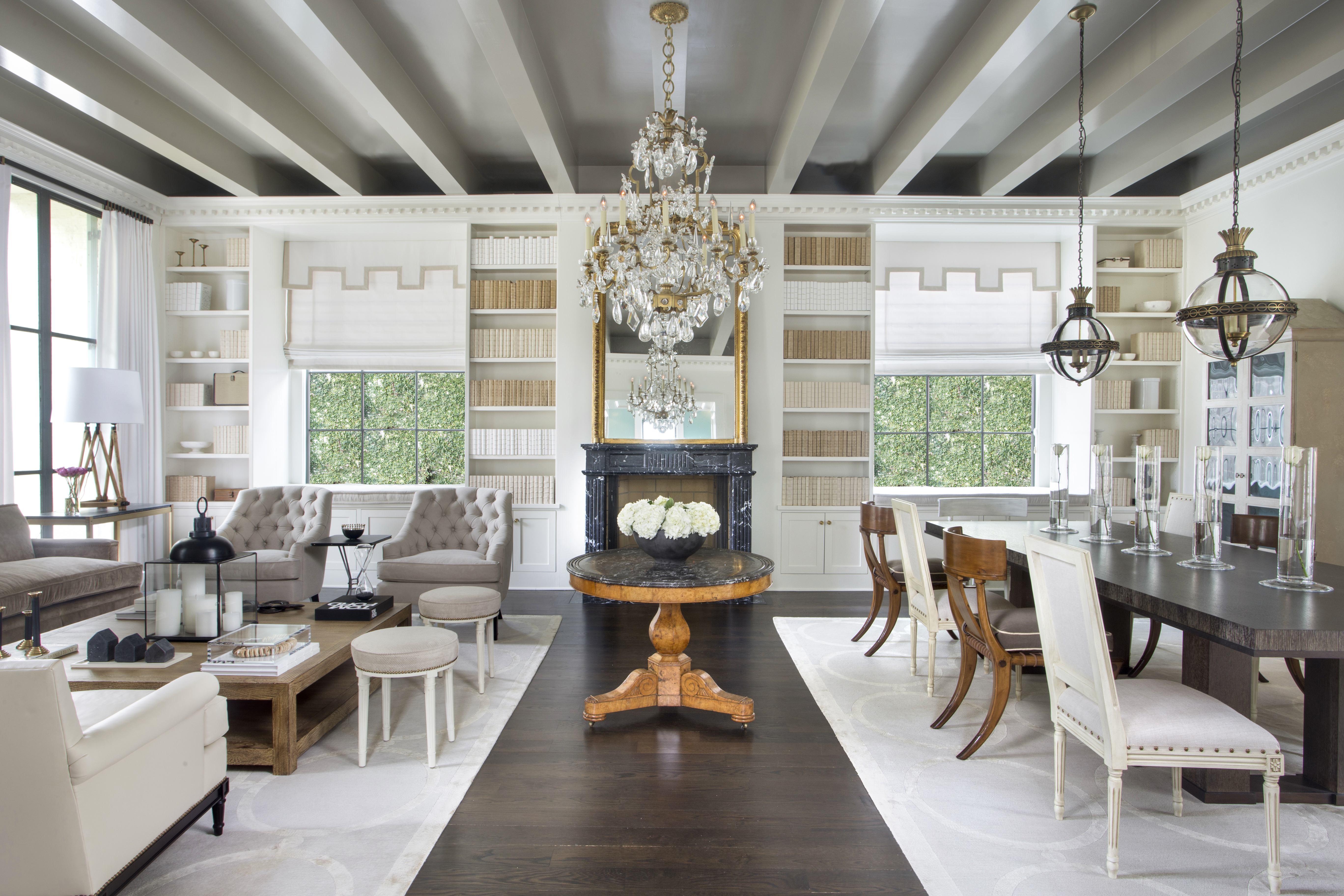
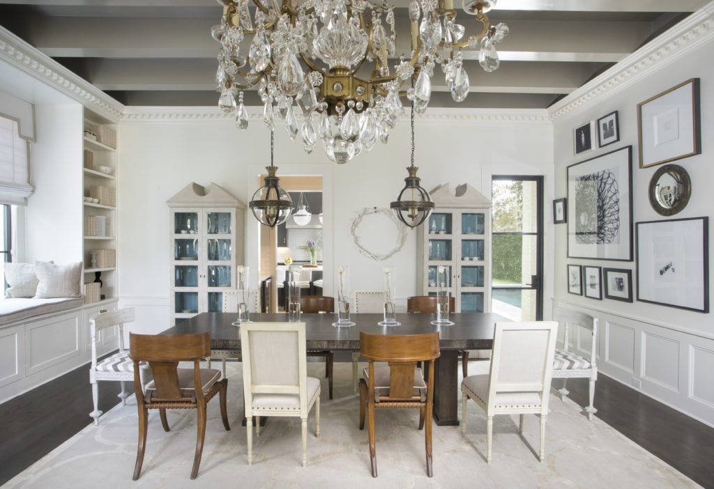
I am always searching for commonalities between the formal way people used to live and entertain versus the casual lifestyle of most people today. The large double parlor commonly found in grand mansions of the past in my mind’s eye bore a striking resemblance to the “open floor plans” sought after today. That became the impetus for arguably the pièce de résistance of the home, an oversized open living/dining/library room. However, we tempered the formality of the architecture by installing beams on the ceiling to exude the hipness of an open-floor-plan NYC Soho loft.
How did you tackle the logistical issues of working on a project like this that was far from your home base in Baton Rouge?
Providing construction oversight from a distance was a challenge. We did lots of texting of progress pictures and communicated by FaceTime and email. Obviously, we couldn’t make the sort of site visits we would normally make on a project in the greater Baton Rouge area. We attempted to space our site visits very strategically at critical stages of the process to make sure our presence would be most appreciated.
What is your favorite area of this house?
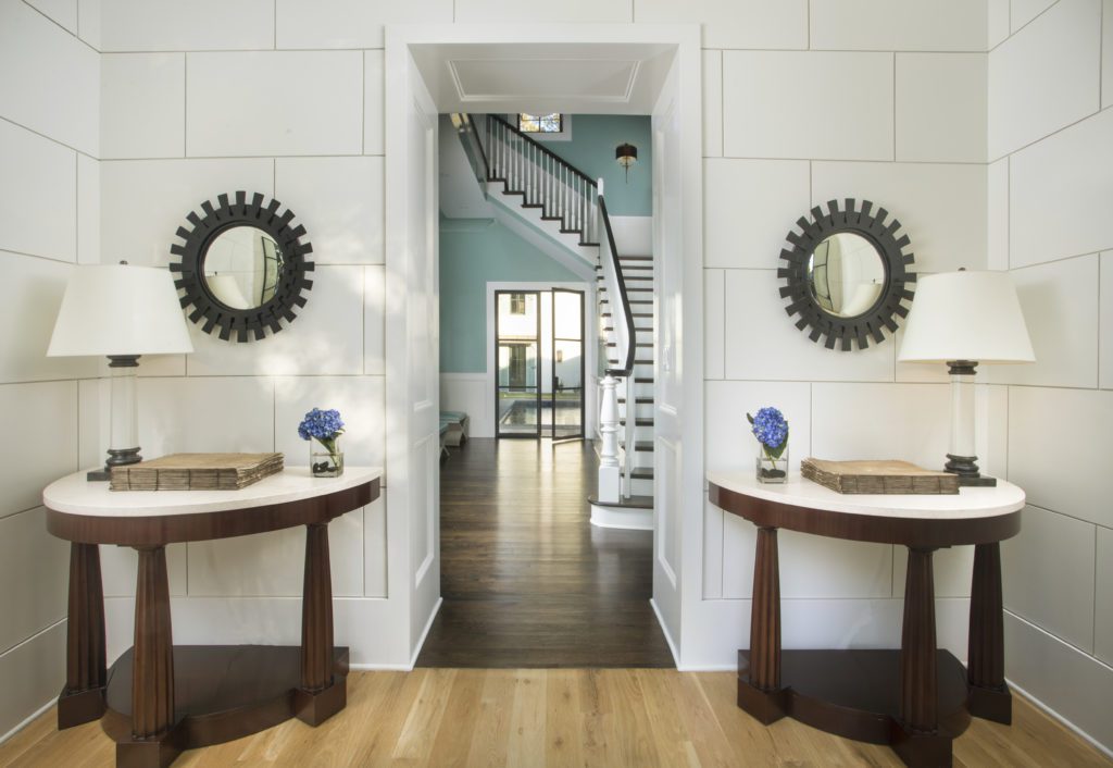
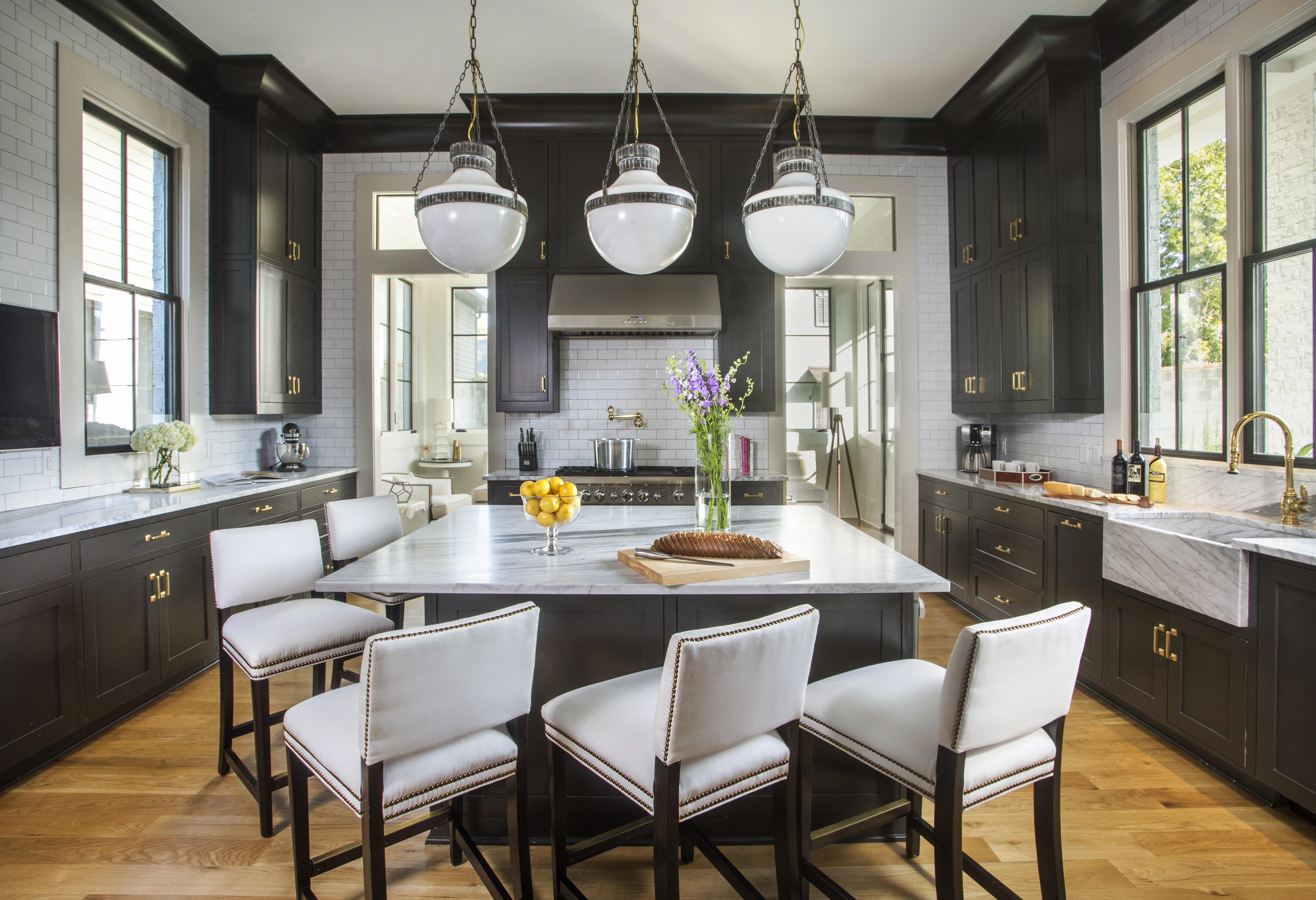
That’s really hard because there are so many really unique spaces. The living/dining/library space is a showstopper. The small entry foyer vestibule for uniqueness. The kitchen.
What was the most rewarding part of this project for you?
Finishing it, ha ha! We had worked on the plans off and on for five years before finally starting the building process, which took an additional 18 months to complete.
See more photos from this home in our gallery below:


