Designer tip: Ty Larkins on creating balance
Not everyone is able to build a brand new house to their own specifications. That means that, more often than not, some architectural details may get in the way of a layout in perfect balance with all existing furniture or aesthetics. Ty Larkins, owner of Ty Larkins interiors, has faced this problem head on in the past, and he has a few tricks up his sleeve.
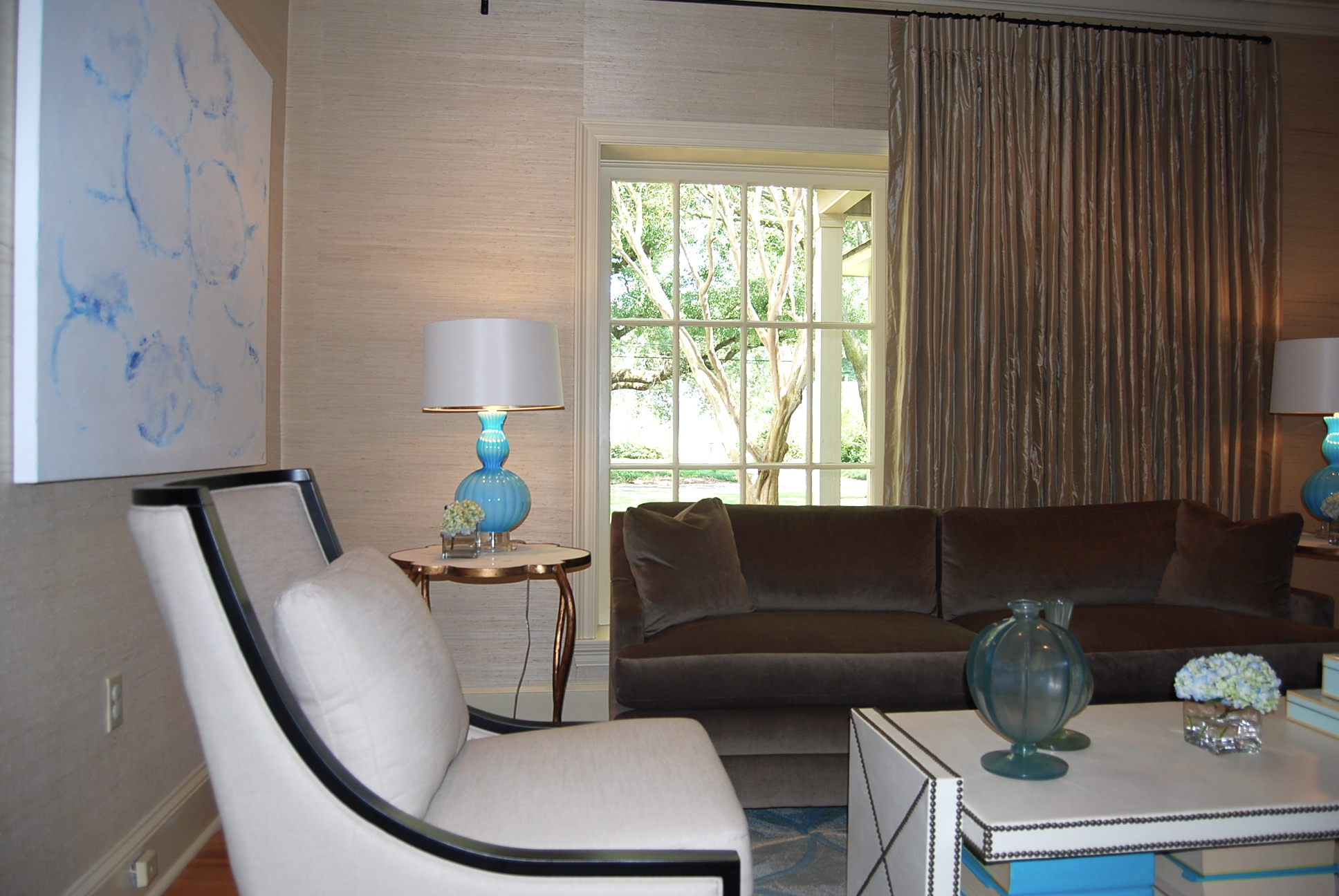
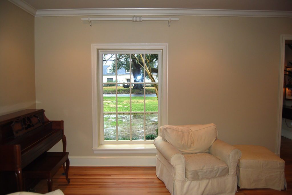
“The window in our client’s living room was not in the center of the wall, which made furniture placement problematic,” Larkins says. “We wanted to anchor a sofa in the center of the space to create a balanced seating grouping, but the window was located too far to the left on the wall and was creating an unbalanced architectural flaw.”
The solution? Fake it ’til you make it.
“In an effort to create the illusion that the window was in the center of the wall, we installed a wide curtain which extended far beyond the window’s right side to visually suggest that there was more window hidden behind the curtain,” Larkins says. “The stack of curtain folds then became the new ‘center’ for our client’s living room, thereby giving us a place to center the sofa and creating perceived architectural balance.”
To learn more about Larkins and his projects, visit tylarkins.com.


