Starting from scratch, a Webb Park home is custom fit for coming together
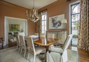
When designer David Coco chose the terracotta shade that covers the walls and crown molding in the dining room of this home in the Webb Park neighborhood, he was thinking of authentic Cajun cooking—crawfish étouffée, shrimp Creole and jambalaya, all of which share a similar shade. But he was also thinking of the gatherings that so often accompany these meals, from Sunday dinners to family parties, for which the home had been designed.
“This house was supposed to be a downsize,” explains Coco, who is part of the Dixon Smith Interiors team and had worked with this family on two previous residences. “It’s not a small home, but instead of a lot of rooms, there are big spaces that are better for family togetherness.”
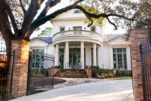
The transformation of this house into a home ready for get-togethers wasn’t as simple as moving in the furniture—although, in the age of the COVID-19-impacted supply chain, even that part had its challenges. Rather, it had to be built from the ground up after the demolition of the structure that previously occupied the lot.
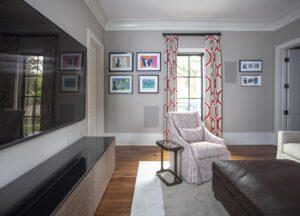
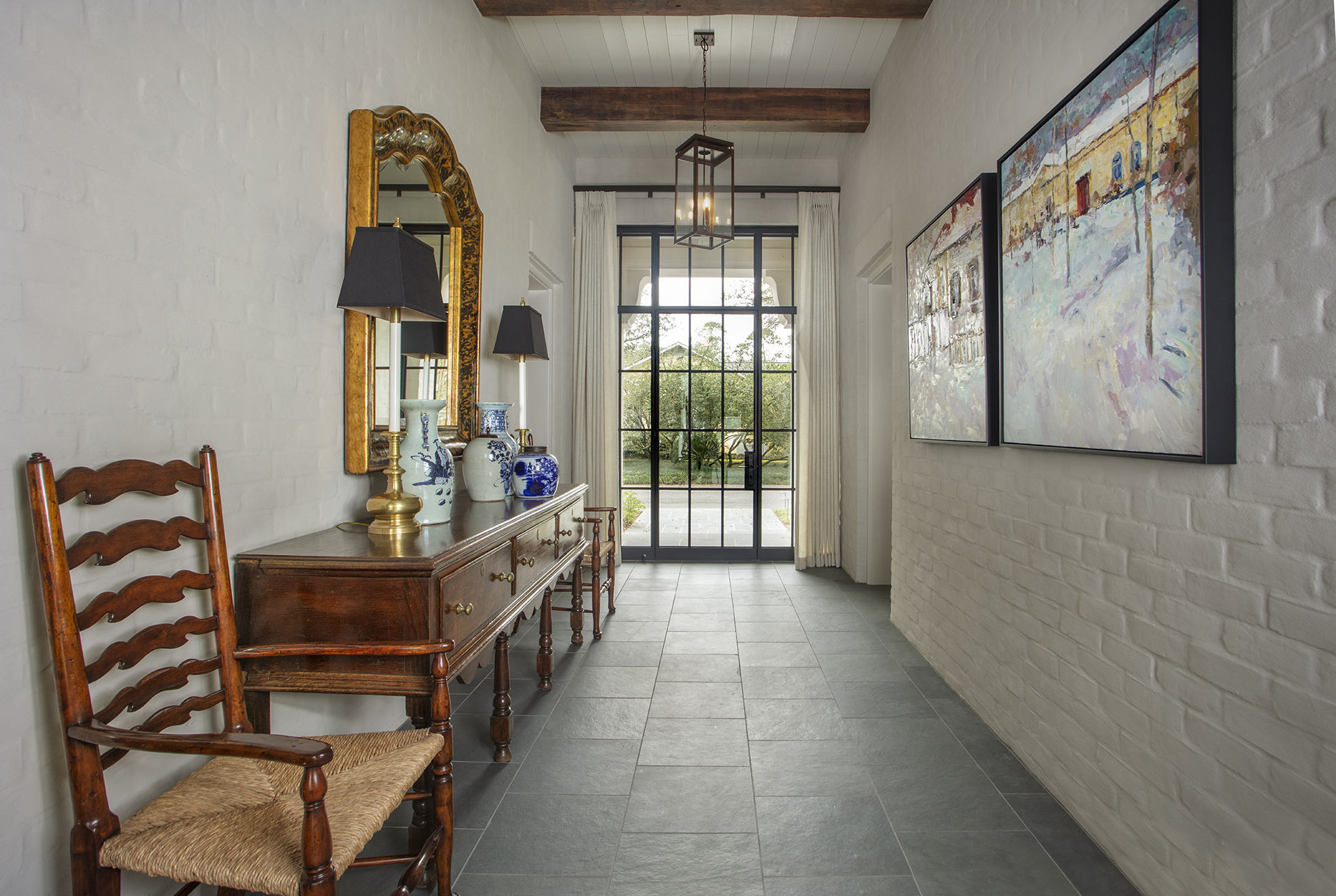
Enlisting the help of architect Rachel Dansky, the homeowners worked on a design that combined aspects from their past homes—such as a foyer that runs through the entire house, much like a carriage way—with features like large iron windows, expansive living spaces and even a guesthouse. The biggest priority, though, was that all of their needs—from an office to a theater room—would fit within the framework of a single-story home.
“They wanted everything on one floor since this is the home they plan to retire in,” Coco explains, noting that rooms like the blue-hued office were designed to one day convert into another bedroom. “Their old house had steep stairs, and it just wasn’t going to work for the long term.”
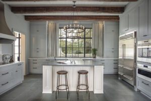
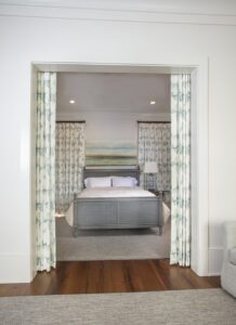
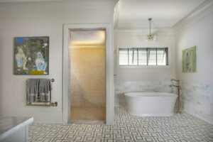
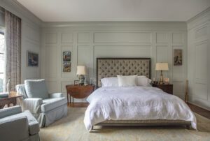
Bertel Cook Jr. Construction took on the job of bringing the design to fruition. No small project, this home is striking because of its attention to detail. Coffered ceilings, paneling in the bedroom (designed to frame the master bed perfectly), vintage-style bronze hardware, and wood floorboards handpicked in Maurepas all come together to create a custom look that speaks to the style of the homeowners.
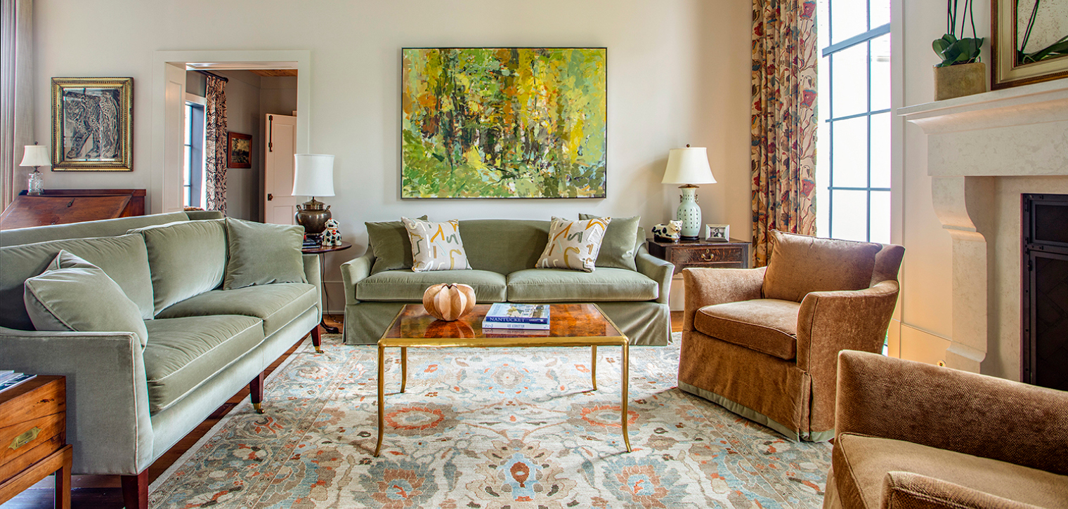
But, Coco notes, that style is not static. Working with them over the years, Coco has seen their tastes transform with the times. In this house, contemporary art covers the walls—much of which was sourced through Ann Connelly Fine Art—and more muted shades replace a previous preference for red.
“There’s a lot of new,” Coco says. “But there are still a lot of pieces in the home that were either reupholstered or reused. Not everything has to be brand new to give a house a fresh look.”
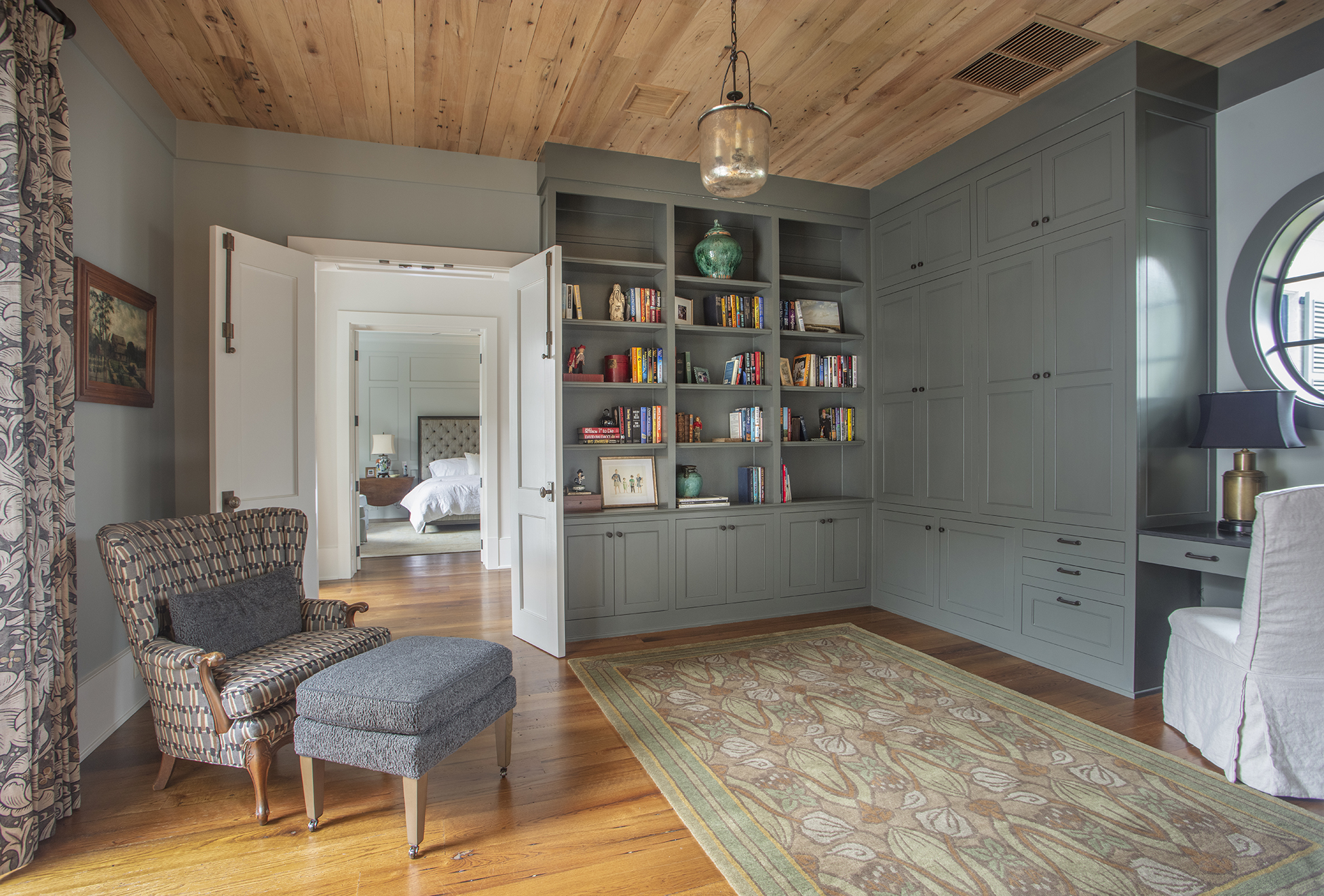
In the office, Grandma’s chair was given new life with a graphic fabric. An antique-finish teal bed in the guesthouse is accented by panels of blue-and-green butterfly fabric (a favorite of the homeowners and guests alike). And a pair of mismatched side tables finds a new home at either side of the new tufted master bed.
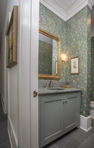
It’s the backdrop of updated and interesting colors that Coco says allows for the seamless coexistence of old and new, antique and modern. Benjamin Moore’s “Grandma’s China” covers the walls throughout the home, but pops of colors like Sherwin Williams’ “Silver Strand” in the master bedroom, Sherwin Williams’ “Unusual Gray” in the office, and, most strikingly, Sherwin Williams’ “Portrait Tone” in the dining room elevate each space. The statement hues are even carried to spaces like the home’s powder room and butler’s pantry with wallpaper in botanical patterns by William Morris.
“I knew we needed something in those spaces, and I love William Morris prints because they’re historical,” Coco explains, noting Morris’ impact on the Art Nouveau movement of the late 1800s and early 1900s. “The homeowner is not indecisive, and we knew these prints were it when we saw them.”
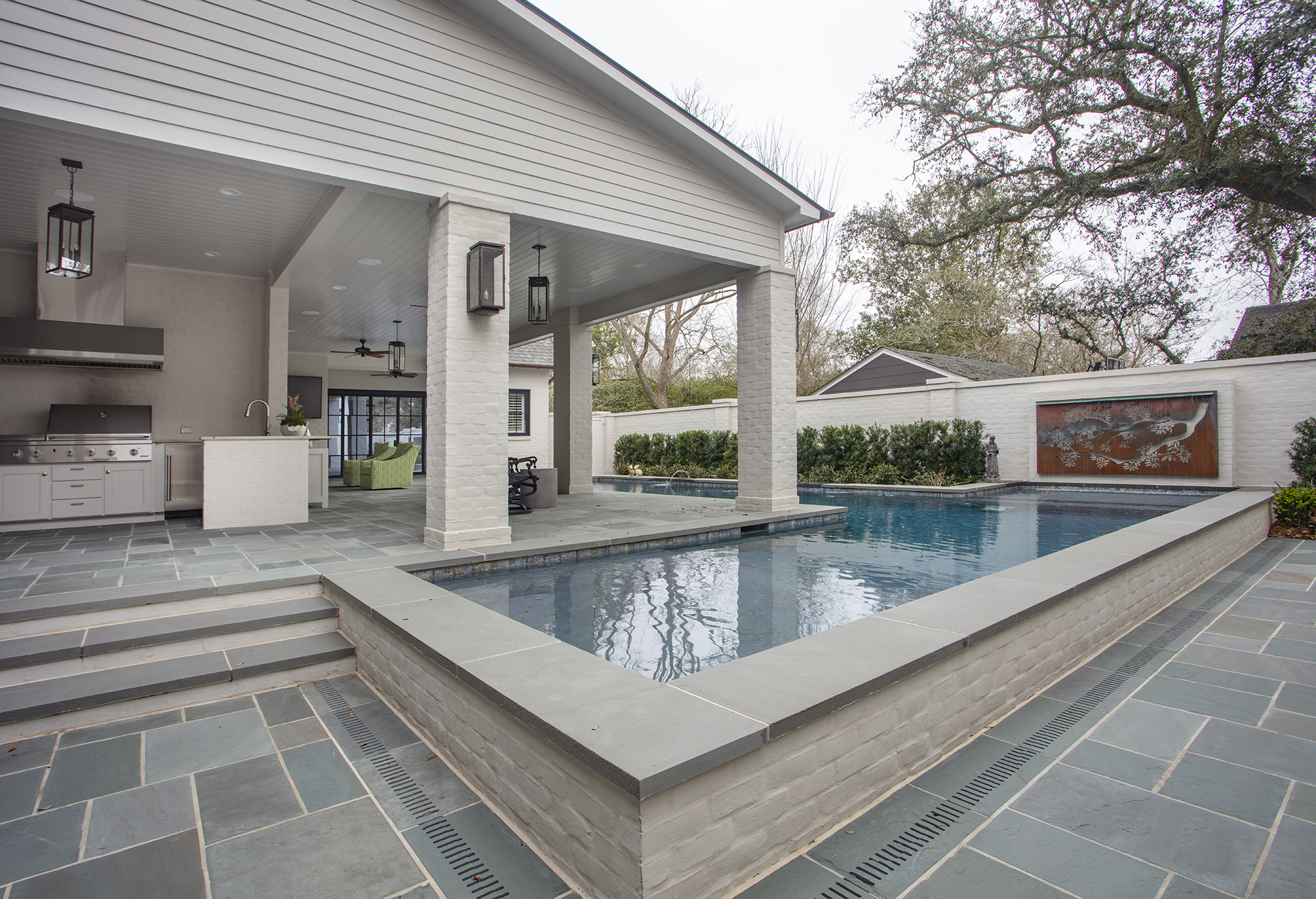
The orange-and-blue botanical theme is even carried outside, where a bronze fountain by landscape architect Ryan McKnight is like a piece of art over the pool by Russell Pool Company. Blue stone underfoot pulls the pool deck into the color scheme, and the large outdoor kitchen and expansive outdoor seating area hark back to the home’s main goal: entertaining. “The house is made for parties,” Coco notes.
And as those celebrations ramp back up, Coco says he’s excited to see the home the way it was intended: with friends, family and good food filling each room.
“Everything in the house is beautiful, but it was all picked with comfort, durability and functionality in mind,” he explains. “The homeowners never want someone to have to ask if they can sit somewhere. I call their vibe sophisticated casual, and that’s just the way they are.”
See more photos from this home in our gallery below:


