Room tour: A pitch-perfect parlor by Ty Larkins
Today’s open living spaces can make furniture placement and accessory arrangement challenging. How do you make each area feel defined and functional but still preserve the flow that makes these expansive rooms so desirable?
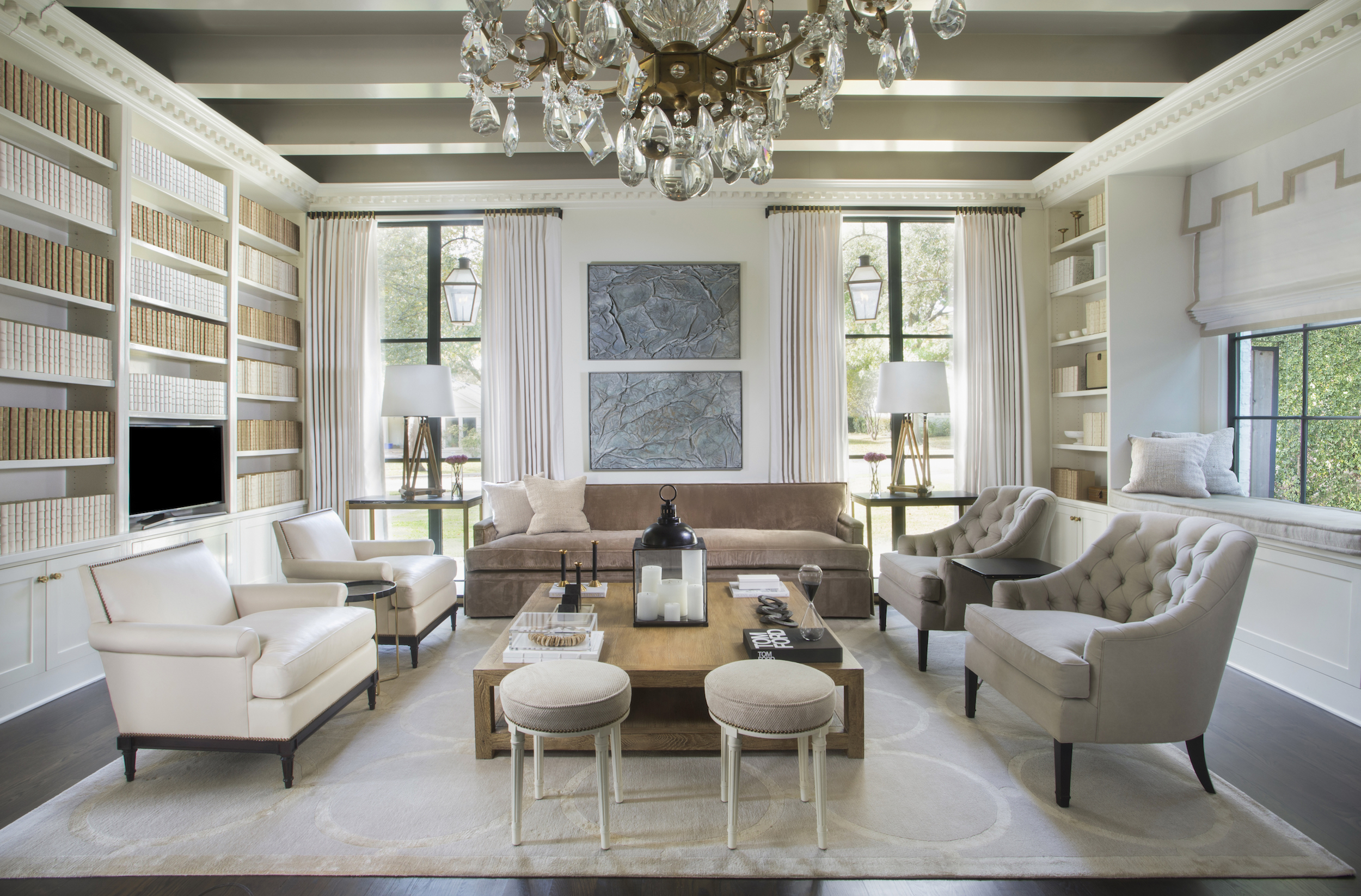
Designer Ty Larkins of Ty Larkins Interiors found the perfect solution for this large space by looking to the past. “We came up with the concept for this space by studying historic grand mansions with double parlors,” Larkins says. “We wanted to reinterpret our ‘grand, double-parlor space’ for a young family with three children who live very informally. The entire space would need to be large enough to accommodate a living room, dining room and old-fashioned library.”
Larkins outfitted the living area and library of this home with history-minded details well worth a second look:
1. Fine Lines
“Historically in such a grand space, there would have been a plaster ceiling in this room,” Larkins says. “So we fictitiously created the narrative that the original plaster ceiling decayed over time, eventually collapsing and exposing the previously hidden beamed ceiling. The exposed beams serve to temper the formality of our grand double parlor, while also suggesting the kind of raw organic-ness found in a downtown city loft.”
2. Bright Idea
“We selected a large formal crystal chandelier for this room to suggest it was original to the ‘grand architecture,’” Larkins says. “It was placed in the center of the room to visually divide the space, with one side for the living room and one for the dining room.”
3. On the Same Page
“The clients wanted a space that felt calm and ethereal with no jarring patterns or ‘visual noise,’” says Larkins. “It would have been difficult to fill this huge volume of bookshelf space without creating a lot of visual noise triggered by differing colors and sizes of books collected over time. We commissioned an artist to recover over 1,000 vintage hardback books I off-white leather, bleached parchment and white linen to create a uniformity of color and texture.”
4. Dressy Casual
“The seating pieces were selected for their timeless style, comfort and durability—not formal but not too dressed down, either,” Larkins says. “We custom designed the sofa in a taupe velvet and paired it with tufted lounge chairs in khaki linen, while 1940s-style French lounge chairs were covered in ivory leather. The space is formal enough to entertain with cocktails but casual enough to watch TV in as well.”
5. Ring It On
“We custom designed two enormous hand-knotted rugs that we had woven in Nepal especially for this client,” Larkins says. “I came up with the design from the plastic rings used to hold a six-pack of canned Cokes together, believe it or not! The background color and rings are two subtle variations on a creamy taupe color.”


