Mastering the accents of Pantone’s 2021 Colors of the Year
At the end of 2015, Pantone, the company known all over the world for its expertise in brand color management—be it for graphic artists or product designers (or just various Pinterest vision boards taking inspiration from its famous square swatches)—released its first dual “Colors of the Year,” breaking the single-color tradition the company began in 2000. “Rose Quartz” and “Serenity,” the pastel pair in sugary pink and subtle violet, predicted a foray into the feminine side of fashion and interior design for 2016, channeling the softness of first blooms and the calm of a post-storm sky in tones that could be draped across a sofa or worn across the body with a little creative coordination.
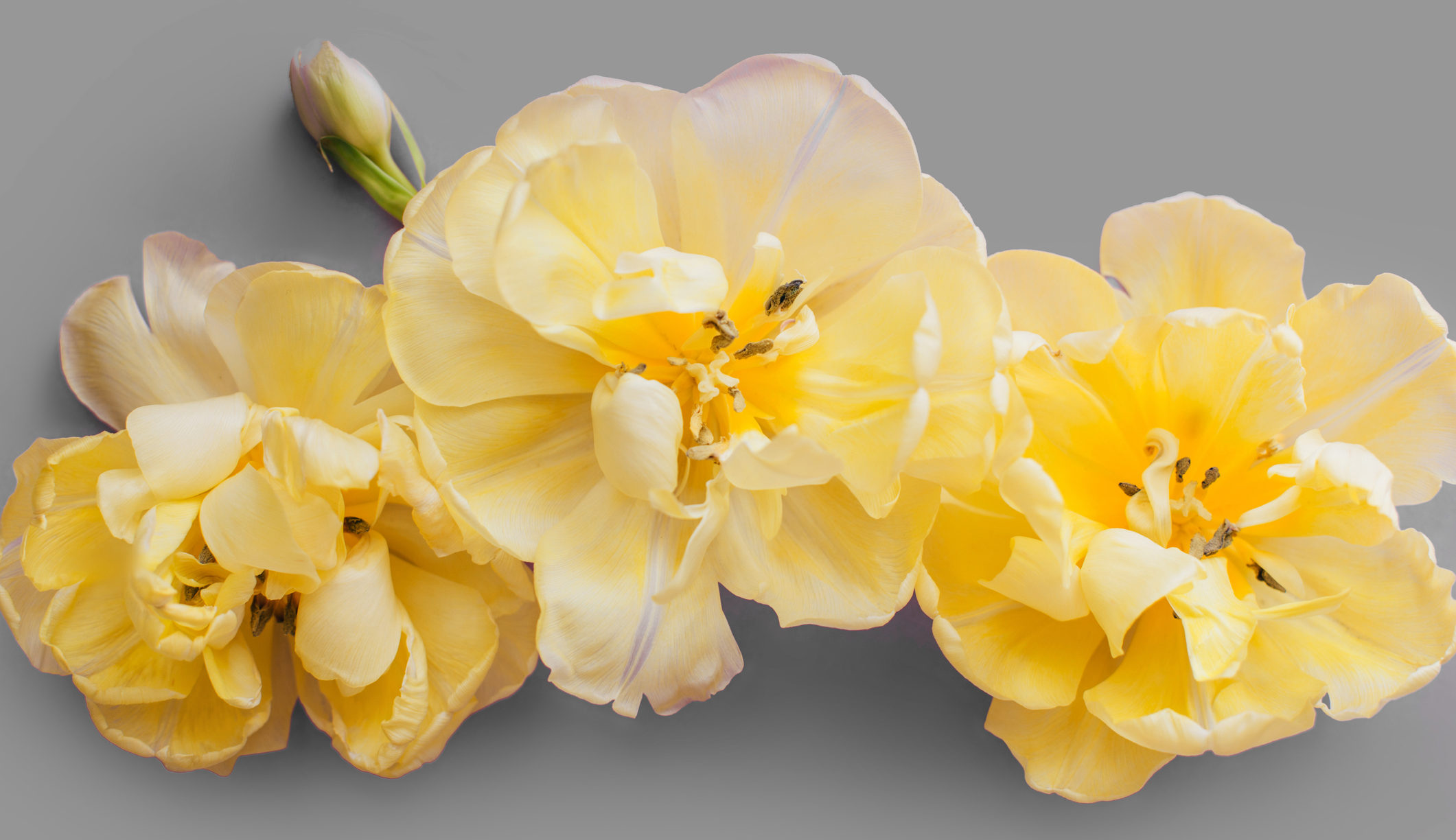
Not so for 2021. This year, Pantone once again opened the field for two Colors of the Year, choosing “Ultimate Gray” and “Illuminating” as its ambassadors for our post-COVID palette, an unusual combo of electric yellow and stony granite symbolizing “a message of strength and hopefulness that is both enduring and uplifting.” And OK, maybe they don’t flow into each other as seamlessly as their pink-and-purple older cousin. But in a year spent mostly on our own, in a current of undulating extremes, they certainly give us something to relate to.
“They’re difficult colors to incorporate into the home, that’s for sure,” says Karen Giffel of Karen Giffel Interior Design. “The yellow reminds me a bit of colors that were more popular when I was a kid, and it may not look so current now (I certainly wouldn’t recommend painting a whole room yellow), but gray is always timeless, and yellow works fine as an accent or as flowers in a vase.”
Giffel recalls suggesting yellow for a quirky front door, for example, or as décor items on a shelf or coffee table. Gold and silver also take on the qualities of Pantone’s duo, and can work as a more subtle interpretation.
View this post on Instagram
David Coco with Dixon Smith Interiors also takes a tentative approach, noting that a bright, green-leaning yellow can often be read as an anxiety-inducing hue, and—in what I imagine to be a hilarious emergency tactic for any introvert looking to prevent the overstay of party guests—can even be used in a room not meant to entertain company or create a feeling of peace.
“As a bit of detail in an office or a power room, it might work,” he says. “Somewhere your eyes won’t be lingering for too long where it can act as a one-and-done pop of color.”
A more warm-toned mustard or goldenrod color, however, is much easier to integrate, he says, and works well against deep jewel tones like emerald green, or to brighten upholstery on items like pillows.
So, OK. Pantone’s choices for 2021 look a little “early 2010s,” its true. A bit comic-book super hero. A bit strange. I may be leaving yellow to the canaries and gray to my work-from-home sweatpants, but no one can argue that we can’t use a little more light and an extra dose of resilience in the colorful months ahead.
What do you think of Pantone’s 2021 Colors of the Year? Let us know in the comments below.

