Farrow & Ball joins forces with fashion designer Christopher John Rogers for a vibrant collection
When it comes to interior design, there are three types of people: those who want simple, light neutrals, those who love bold colors and loud patterns and those who like to fuse both minimalism and maximalism. Luckily, Farrow & Ball’s new line caters to all three. And, it even has a Baton Rouge tie.
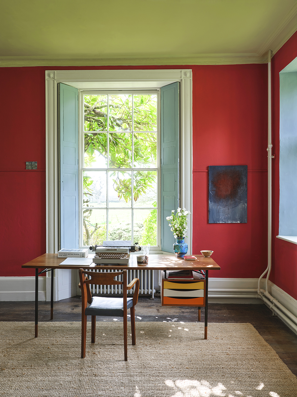
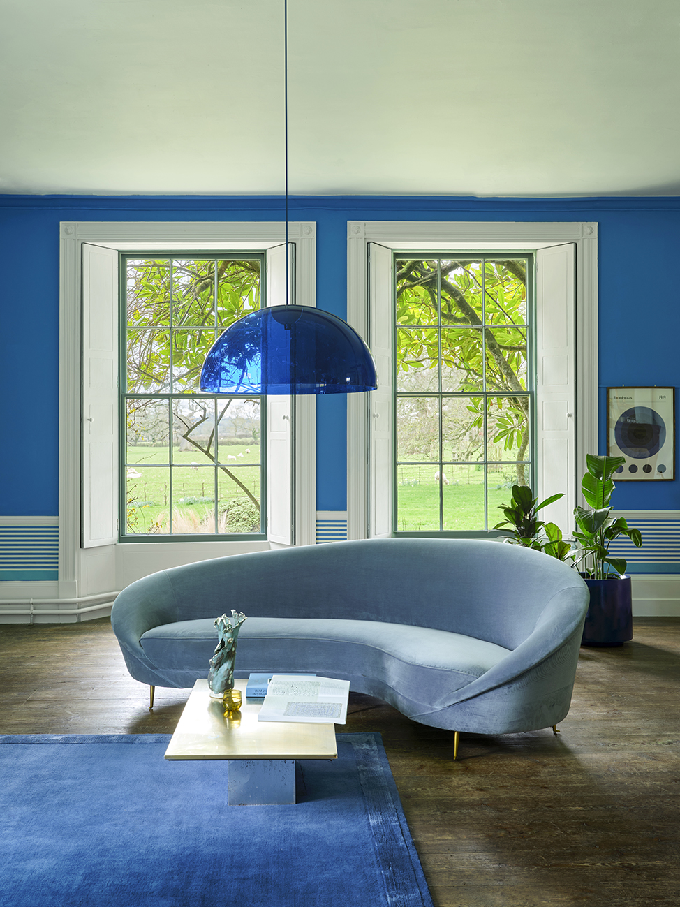
The British paint and wallpaper brand has teamed up with Baton Rouge-born fashion designer Christopher John Rogers for a collection, titled Carte Blanche, that includes a selection of 12 paint colors and three wallpaper patterns offered in different colorways.
When designing the new capsule collection, Farrow & Ball wanted to collaborate with someone who was no stranger to pattern mixing and was unapologetic about their use of color. With an inventory of flashy motifs, interesting silhouettes and bright designs worn by big names like Vice President Kamala Harris, Hoda Kotb and Adele, Rogers seemed like a perfect fit.
“It’s been incredible to work with Christopher because craft and attention to detail are intrinsic to both of our processes,” notes Farrow & Ball creative director Charlotte Cosby in a press release about the collection, “so I always knew this collaboration was going to be something special.”
Rogers says the same about Farrow & Ball.
“With their emphasis on quality and longevity, and my emphasis on artful, declarative design, I think this partnership has created something incredibly exciting by mining the space between both feelings,” he says.
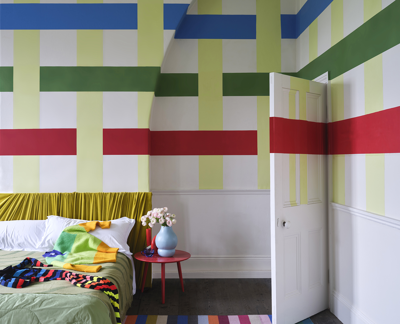
The Carte Blanche palette includes four neutrals and eight statement tones. Though all different, the 12 hues complement each other in a way that makes any combination mesh well.
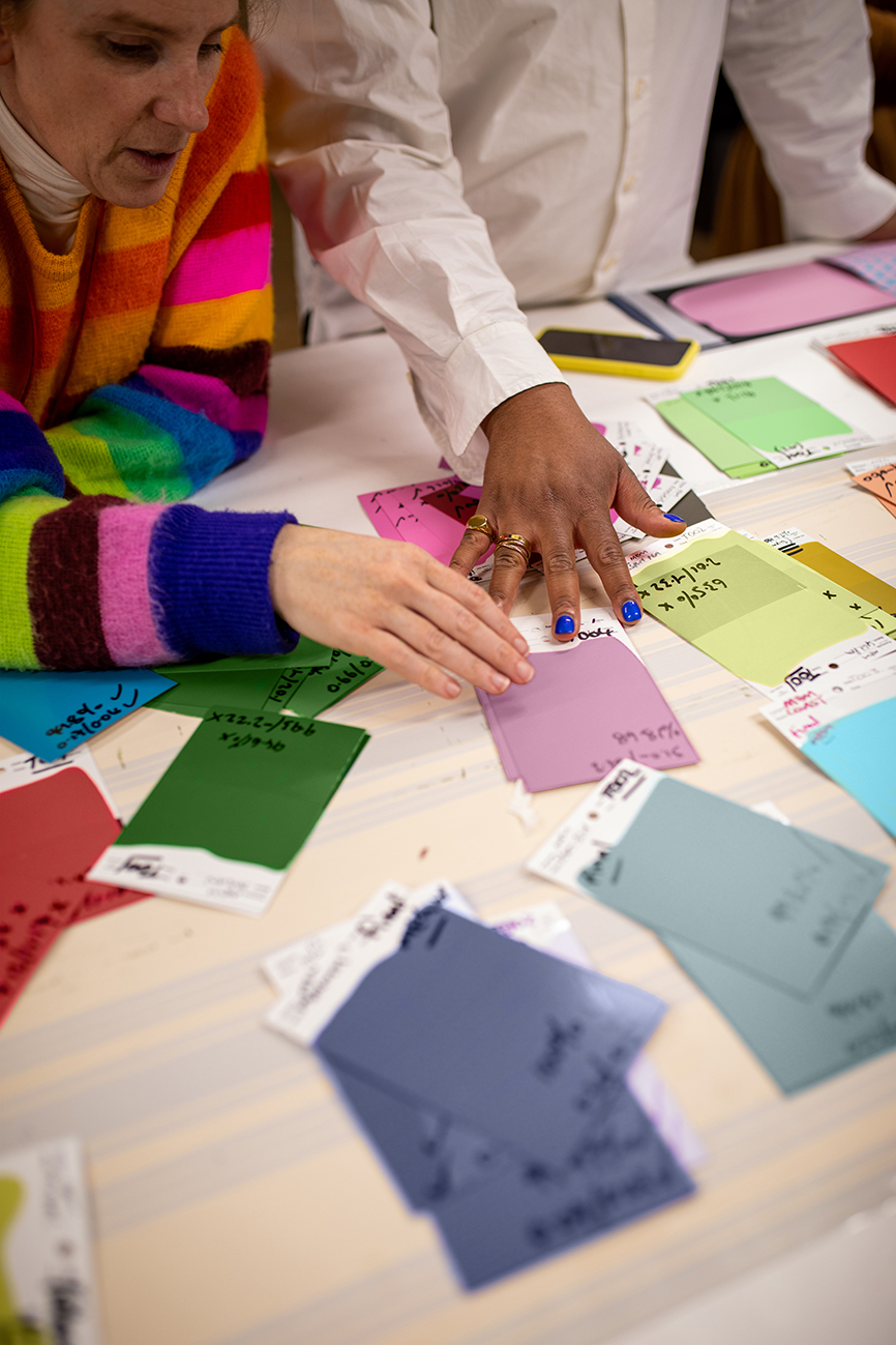
Each shade is uniquely named, with some inspired by Rogers’ childhood in Baton Rouge. There’s “Sardine,” which is reminiscent of his grandfather’s favorite afternoon snack, and “Raw Tomatillo,” named after the crispy, tangy fried green tomatoes his grandmother used to prepare.
Drawing upon Rogers’ use of patterns in his textile work, Carte Blanche also features three wallpaper patterns: “Dot,” a mix of large and small circles that Rogers has used throughout his fashion career; “Check,” a geometric block pattern that celebrates the work of textile artist Anni Albers; and, “Stripe,” a sprawling design of uniform lines that can be used vertically or horizontally. All of the patterns use Carte Blanche’s signature colors meaning they can be effortlessly mixed and matched with the wall paints.
The boldness of the colors is central to the mission of Farrow & Ball, Rogers and the entire collection, which aim to inspire individuality by pushing designers and homeowners alike to engage their own creativity to create spaces that feel personal, intriguing and, best of all, original.
“Carte Blanche is all about finding freedom to create a personal look and enjoying the process,” Cosby says. “Whether your scheme leads with color, neutrals or pattern, there are so many possibilities, and I’m excited to see how people bring it to life in their homes.”

