Color rush: Designers dish on statement hues for fall
Spring might be synonymous with home refreshes, but we’re arguing that this fall is the time to take the leap into a new look. In inRegister’s October issue, we spotlighted several hues that are trending this fall. From warm yellow to dark navy, these colors are not for the faint of heart. However, for those who are willing to take a chance, these colors have the potential to take an average space and elevate it to extraordinary.
Since these colors are so standout, we enlisted the help of the professionals. Read on to see how local designers would integrate the colors into their own designs:
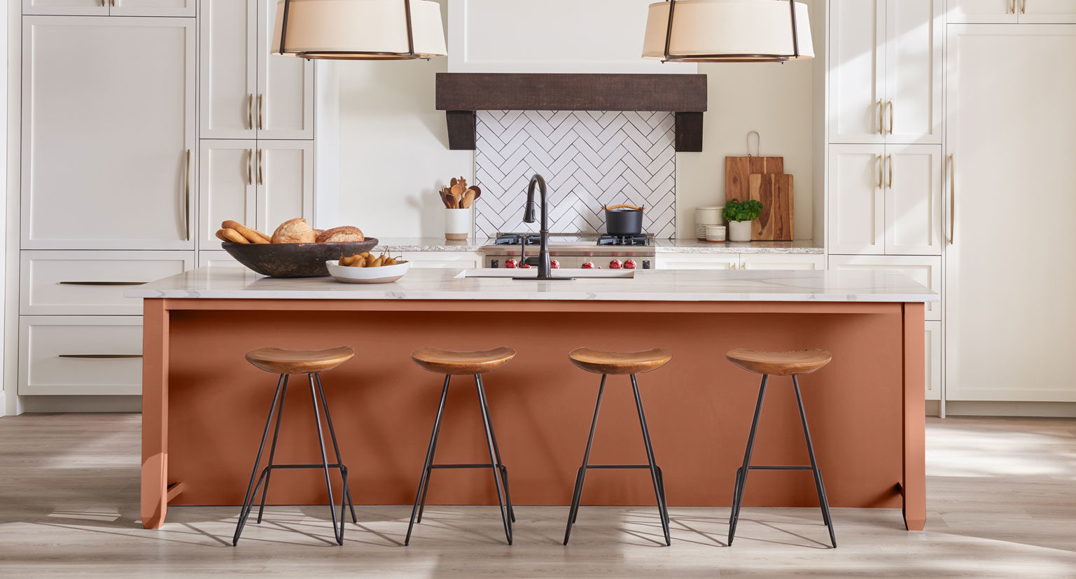
“For so long, we’ve used white or a version of it for everything. Now, we are seeing and using more and more color. We’re using greens, blues, pinks, black and even colors like this one–not always in paint, but definitely in rugs, pillows, vases, artwork and more,” explains Cherith Craft of Cherith Craft Interiors. “My encouragement on a color like this would be to use it in a small way such as a front door, or you could update an old furniture piece and add interesting hardware.”
“This warm, inviting neutral would be great on lower kitchen cabinets or in a high gloss to make a special fireplace standout against a lighter neutral color,” advises Carrie Griffin or Carrie Griffin Design.
“Green is lively, fun and refreshing,” explains Brinley Barkurn of The Design Studio. “It is a color that is perfect for brightening up a space and creating energy.”
“This soft, pretty color would be really fun to use in a guest room as the wall color,” explains Griffin. “Then mix it with more masculine elements.”
“Yellow is not an in-between color–you’re either all in or you’re not,” says Karen Giffel of Karen Giffel Interior Design. “It makes a bold statement, and it scares some of my client base for that reason. But it plays nicely with all the neutral color palettes that I choose to bring into a project.”
“Navy is sophisticated, masculine and classic,” says Barkurn. “It is best suited for a formal study or similar area where focus and solitude is needed.”
 Verdigris Green, Farrow & Ball
“I envision a study with classically styled wall panels and built-in bookshelves, lacquered in Farrow & Ball’s Verdegris Green,” explains Rachel Cannon of Rachel Cannon Limited. “I would accent the room with brass library lights, a vintage Persian rug, and comfortable seating upholstered in rich velvets. The vibe of the space would invite you to come in, curl up with a great book, and unplug for a few hours.”
How would you use these colors in your home? Let us know in the comments below, or by tagging inRegister on Instagram or Facebook.

