On the Case: Go-to tips for bookshelf styling
We’ve all been warned not to judge a book by its cover, but what about the bookshelf on which it sits? A beautiful balance of items on your built-ins serves to elevate even the lowliest tome to five-star status. But like a fill-in-the-blanks test that you forgot to study for, the empty spaces on a bare set of bookshelves can look a little daunting at first.
“I think people are often super afraid of tackling it,” says Southerly owner Brandy Veazey. “It’s almost like they become paralyzed by having too many options. There’s also a tendency to keep adding new items to the shelves over time but never taking away. They can get overfilled really quickly.”
Veazey and her team have a unique perspective on tackling the bookshelf brainteaser. With a multi-faceted focus on real estate, staging and interior design, they have been inside enough houses to know what works and what doesn’t—not just for potential buyers of a home but also for people seeking a new look for their existing dwelling.
“When COVID hit, the design side of the business exploded,” Veazey says, adding that in addition to herself and the four members of her design team, many of Southerly’s real estate agents are also passionate about decorating and staging.
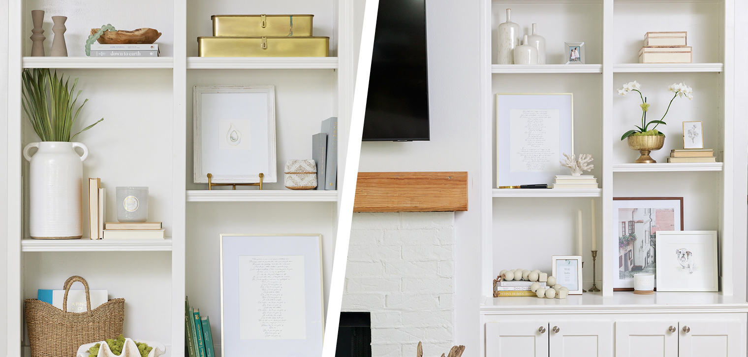
Count Katy Caldwell, a self-professed bookshelf styling enthusiast, among that number. The layout of the built-ins flanking the fireplace in her own Carriagewood Estates home had seen numerous iterations during her family’s eight years here—all in keeping with her coastal-inspired style. In pursuit of a refresh, Veazey stepped in to help and added a number of new touches that serve as a chic new chapter in Caldwell’s styling saga.
Keep scrolling for more details on this design project, along with tips from both Veazey and Caldwell on making the most of these blank spaces. Then find even more words of top-shelf wisdom from other local designers. Time to hit the books!
Read the Room
Scroll over the photo below for bookshelf styling tips from Brandy Veazey and Katy Caldwell.
Book Smart
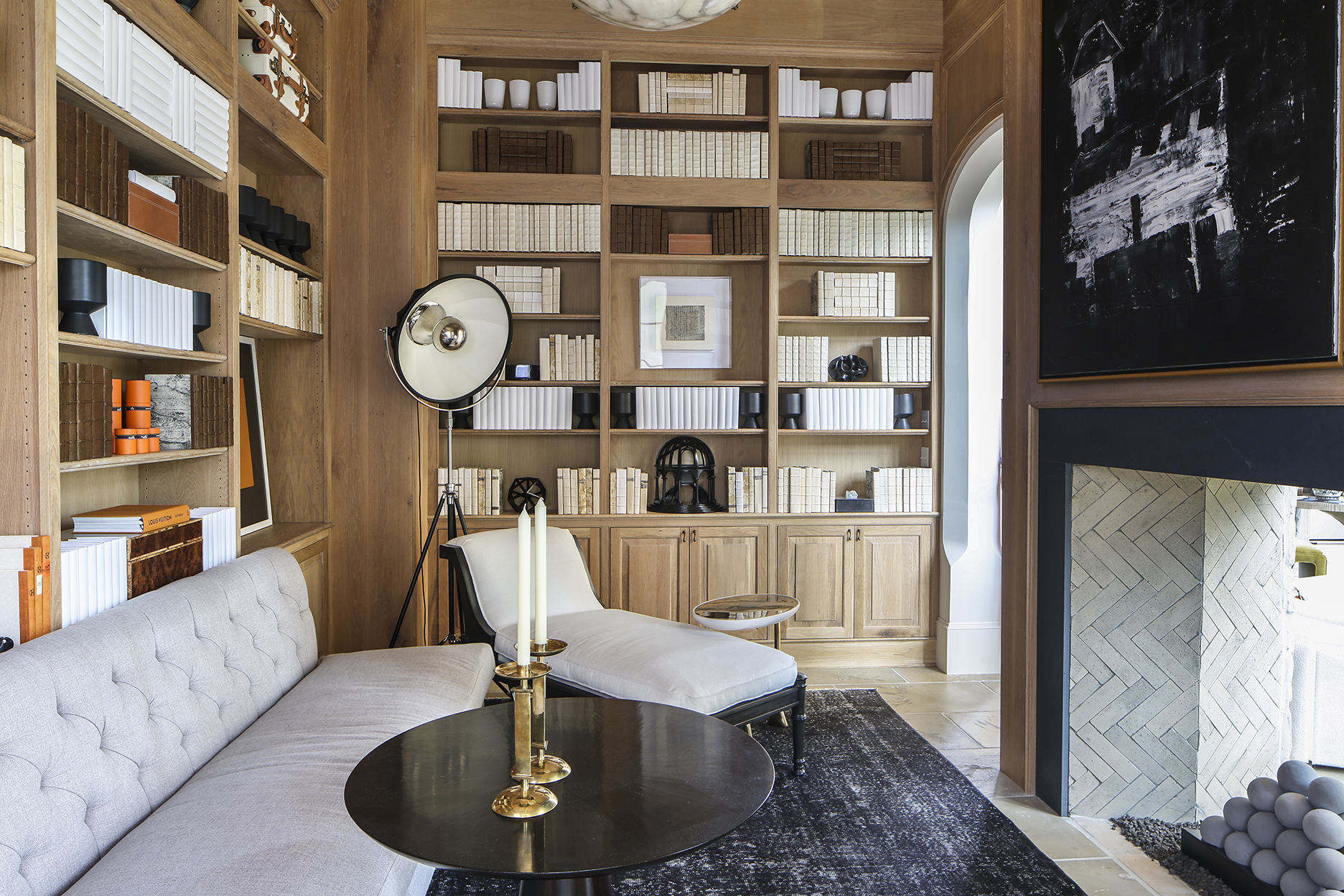
For this library space, designer Ty Larkins kept the color palette clean and dramatic with shelves full of only white, cream and brown books, arranged in pleasing and symmetrical patterns. He completed the neutral look with accent pieces in black and allowed only a single vibrant shade—orange—on one wall to break up the serene scene.
True Blue
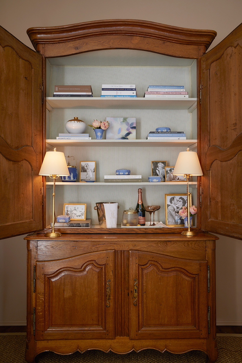
No built-ins? No problem, proves interior designer Erin Mixson with this elegant repurposing of an antique buffet à deux corps. Mixson made the most of an upholstered interior by highlighting a collection of small Wedgwood blue covered dishes interspersed with stacked coffee table books and petite flower arrangements. She even turned a portion of the bottom shelf into a makeshift celebration station complete with Champagne. We’ll toast to that!
Fine Print
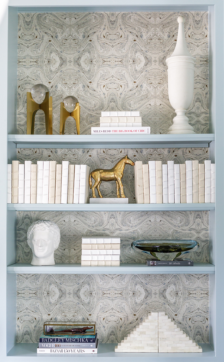
Tucked within a room bathed in the softest shade of robin’s-egg blue, this bookshelf vignette by interior designer Rachel Cannon provides its wow factor with a whisper rather than a shout. Cannon lined the back walls with a pretty paper designed to resemble marbled end papers from antique books. “It adds just the backdrop this space needed to keep things visually interesting,” says Cannon.
Quick Study
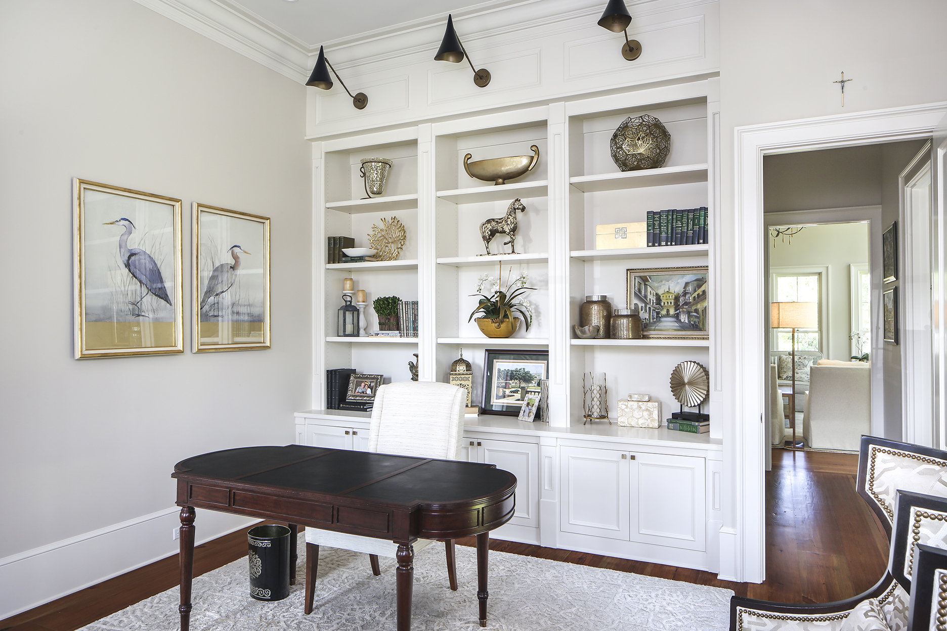
For this sun-filled home office, interior designer Laura Cedor started from the top—the very top—when planning the built-in bookshelves behind the desk. A trio of shaded sconces points down at triple-wide shelving filled with the homeowners’ treasured keepsakes and decorative items. Each of the top shelves contains only a single large item, and all of the accessories hew to a neutral palette with a touch of shimmer that catches the morning light.
