[Sponsored] A peek inside a breathtaking local renovation
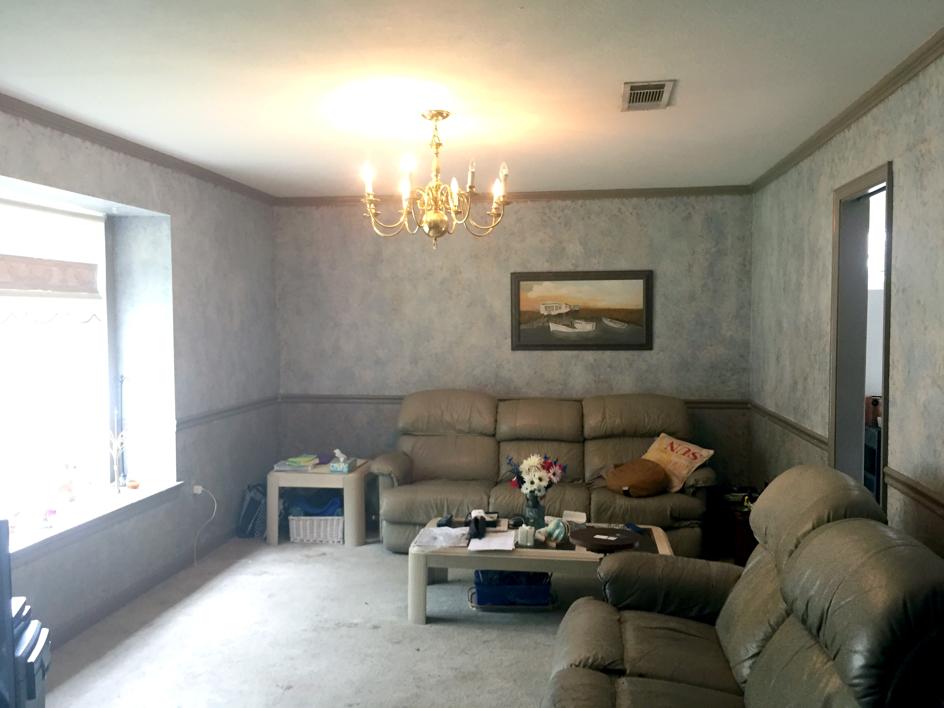
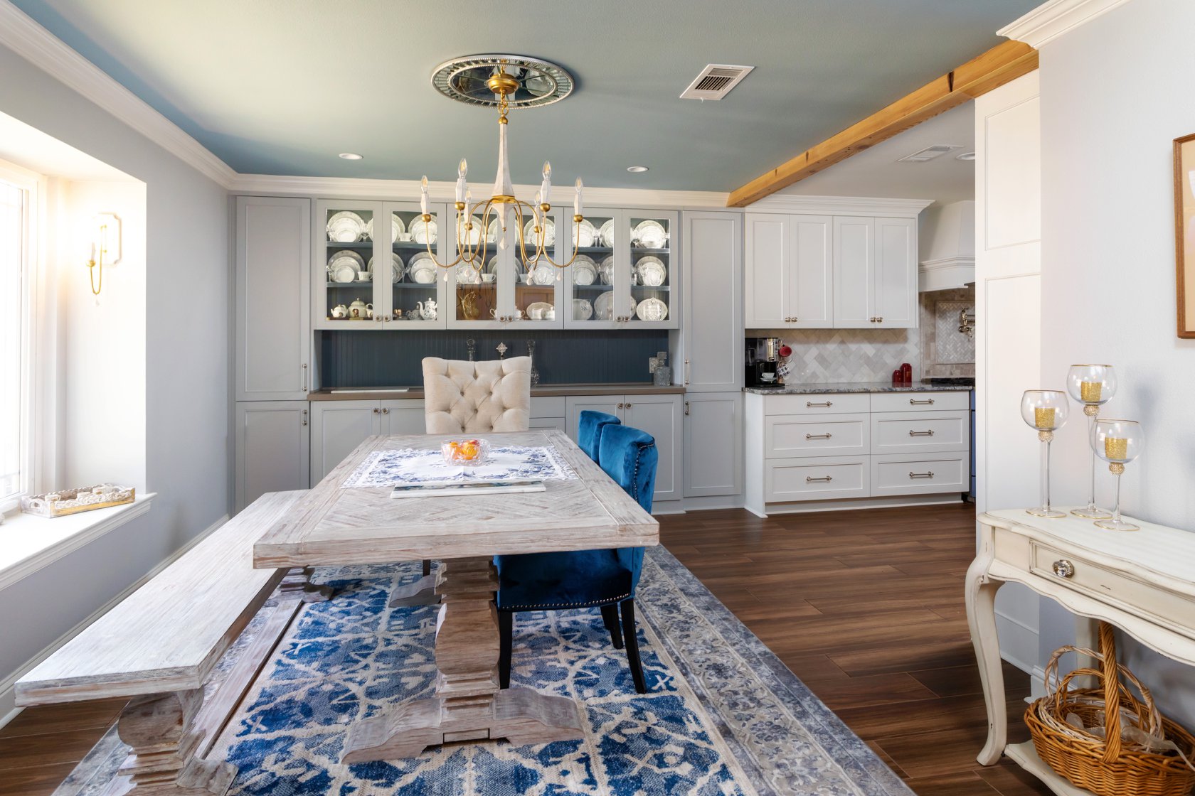
Any remodeling project can seem overwhelming, but it’s guaranteed to go more smoothly if you partner with the right designer and builder. Ourso Designs treated us to a look at one of their latest projects. The space was originally very compact and compartmentalized. The new floor plan was designed to open up communal spaces for entertaining a large family of four children and grandchildren on the way. This incredible before and after makes it easy to see why the dream team of Richard Ourso and Logan Wheeler Ramirez are so highly sought after—providing incredible custom features that make a home both beautiful and functional.
Visit oursodesigns.com to learn how to create your own inspired space.
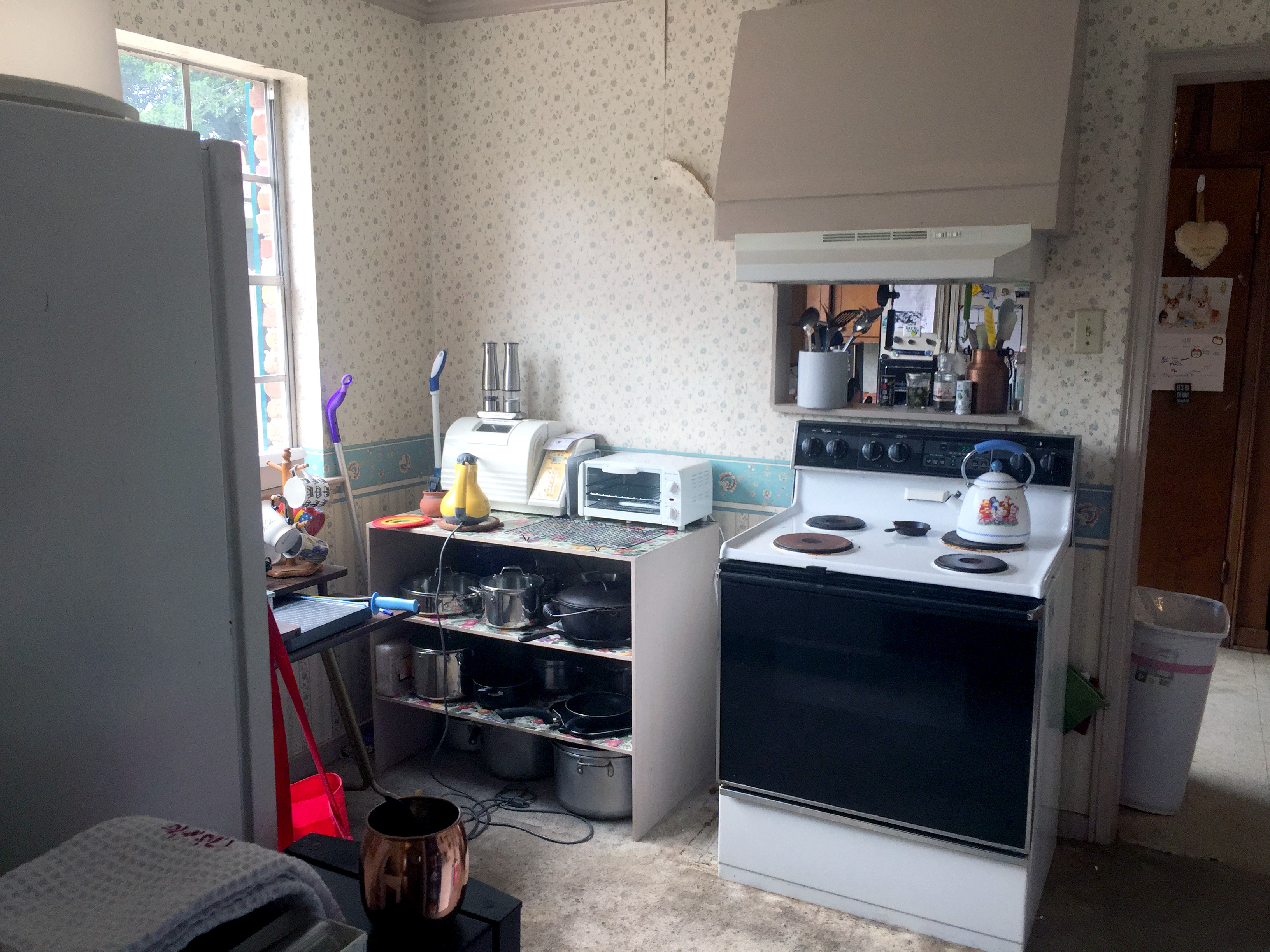
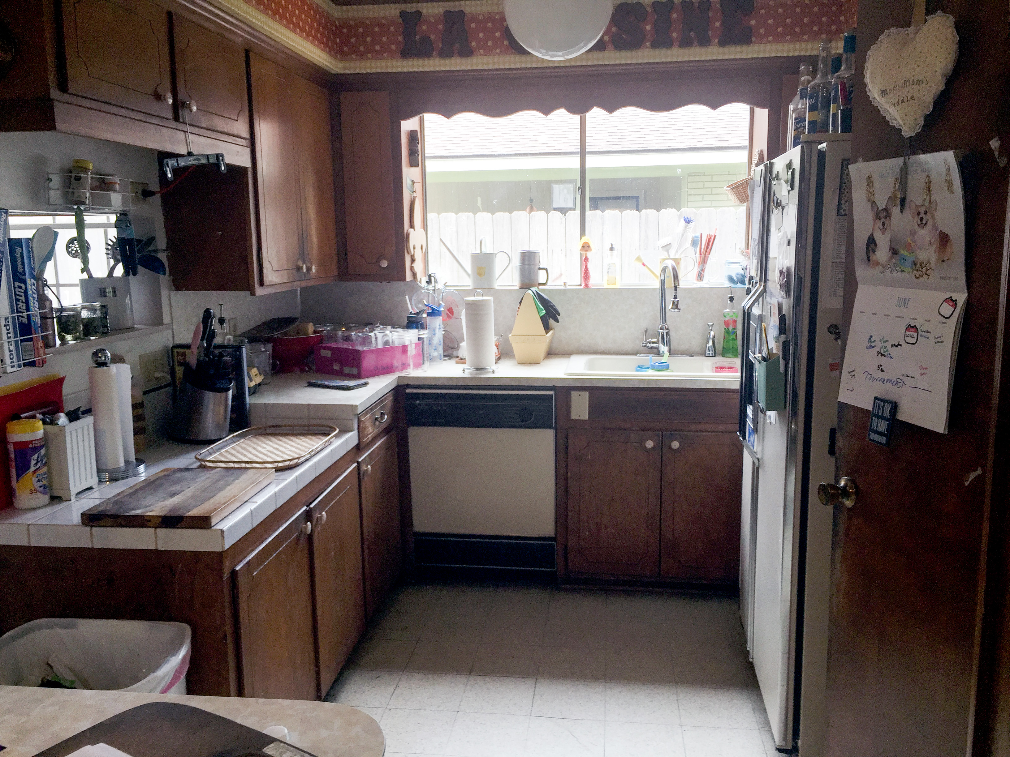
Design Mission: BEFORE
—Open up a 1963 ranch style home and make the space more efficient.
—Give the space more of a flow between the kitchen and dining room.
—Allow more room for cooking and entertaining by adding lots of counter space and a large kitchen island.
—Blend the client’s French country and glam style to create the perfect space.
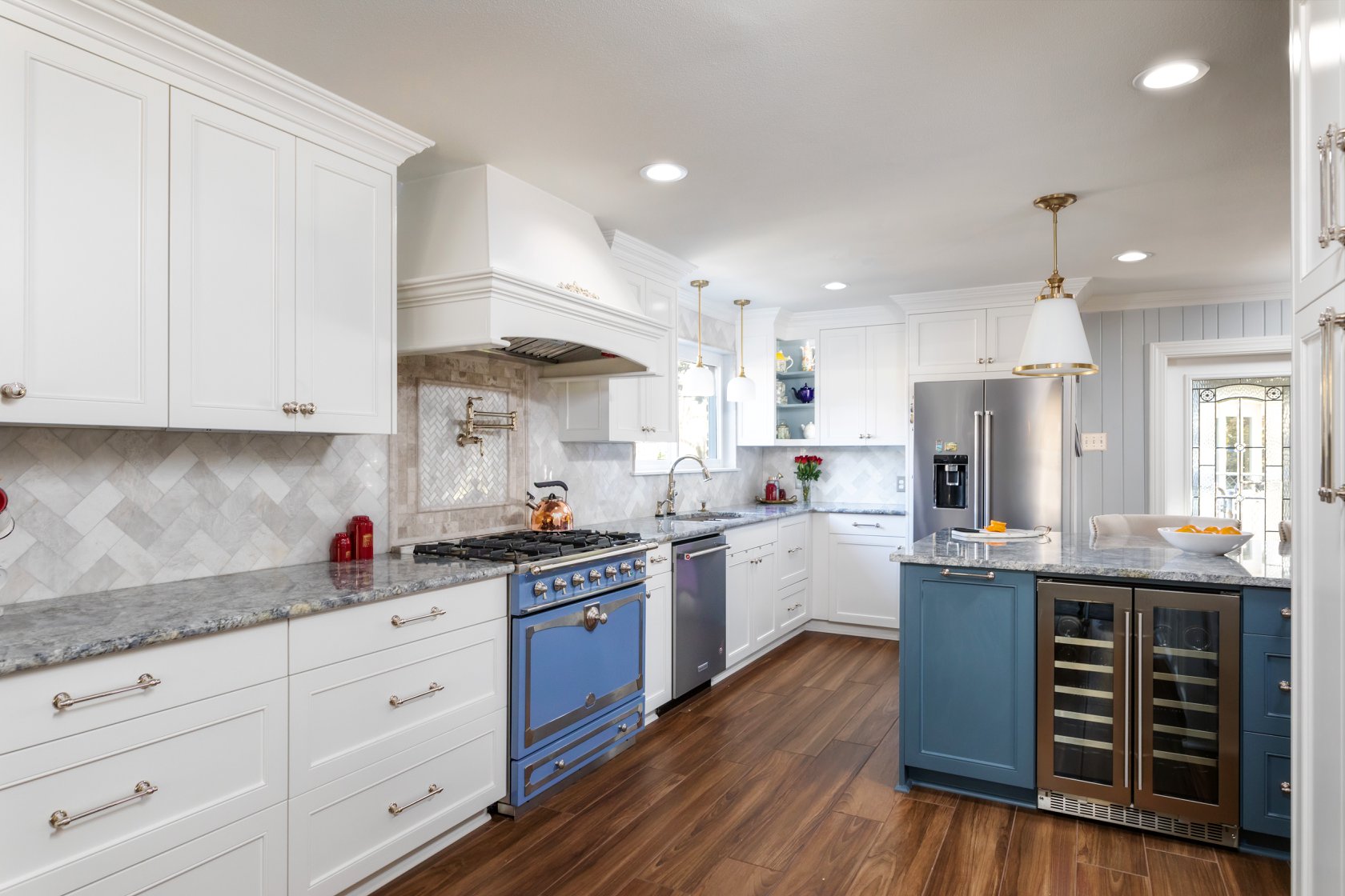
Design Solution: AFTER
—The countertops and stove were a favorite of the clients and set the color palette for the home. They mimicked the shape of the knobs on the stove in the cabinet hardware.
—Rich blues are woven throughout the ceiling of the dining room and in the back board of the china cabinets. This was a really subtle way to bringing out the blues in the client’s white plate wear—a great example of how each design can be personalized for each client.
—The rich and dramatic wood beams, and other wood accents like the fireplace mantel and the laundry room door add a rustic warmth to the space.
—The marble backsplash and the lighting fixtures help bring the glam to the space. Storage is limited in the home, and with the new layout, Ourso Designs was able to enlarge the laundry room and add plenty of tall pantry storage to the kitchen, with lots of good interior cabinet accessories like pullouts and rollouts.
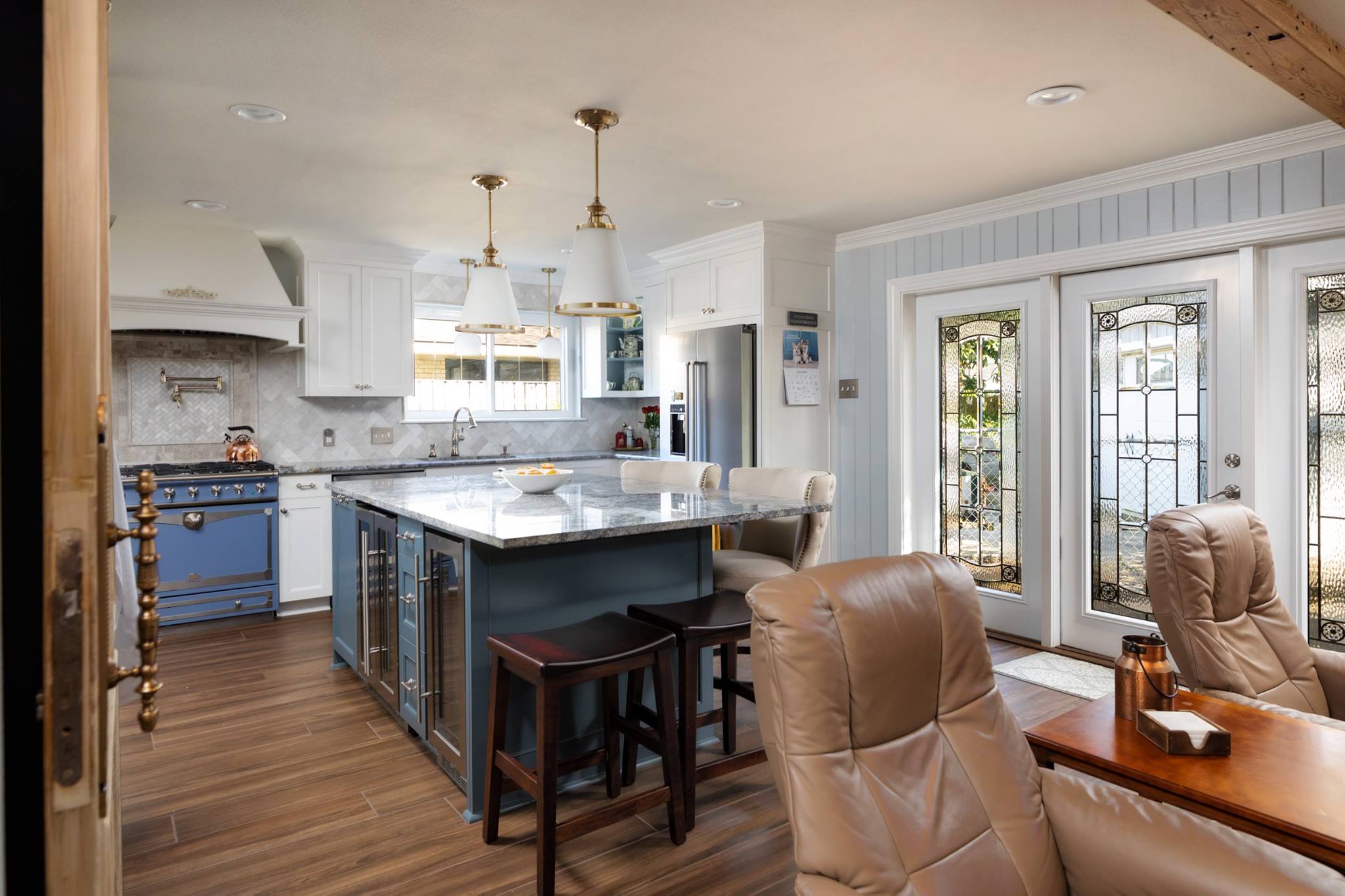
We took the client’s china set colors into consideration when picking the backdrop color in the china cabinet, then we matched the island to that, and in many of the furnishings. If you are not careful, a heavily blue palette can become cold. We were able to counter that with the warmth of the porcelain tiles that look like wood—but are much more durable.
—Logan Wheeler Ramirez
Designer, Bachelor of Interior Design
