Meghann Landry on mastering a monochromatic color scheme in your space
The primary, and perhaps most important, step in decorating a space is choosing a color scheme, but not since elementary school art class have many of us explored the proper color categories and their complements. Consequently, when it comes to choosing a color scheme, the seemingly simple subject leaves us with lingering questions: What colors pair well together? Which ones will work in the space? Wait, what’s a primary color again? Instead of getting stuck on a spinning color wheel, we’re looking into a more simple solution: decorating simple and opting for a singular shade in your space. Done right, monochromatic rooms are effortlessly chic and cohesive. To help us master a solo-colored space, we reached out to Meghann Landry of McMillin Interiors for insight into her own design methods.
“Layer elements of a similar color for a dynamic space that feels pulled together,” advises Landry, who often implements monochromatic color schemes in her designs. “It allows you to play with different shades, patterns and textures, and creates an inviting and visually restful result.”
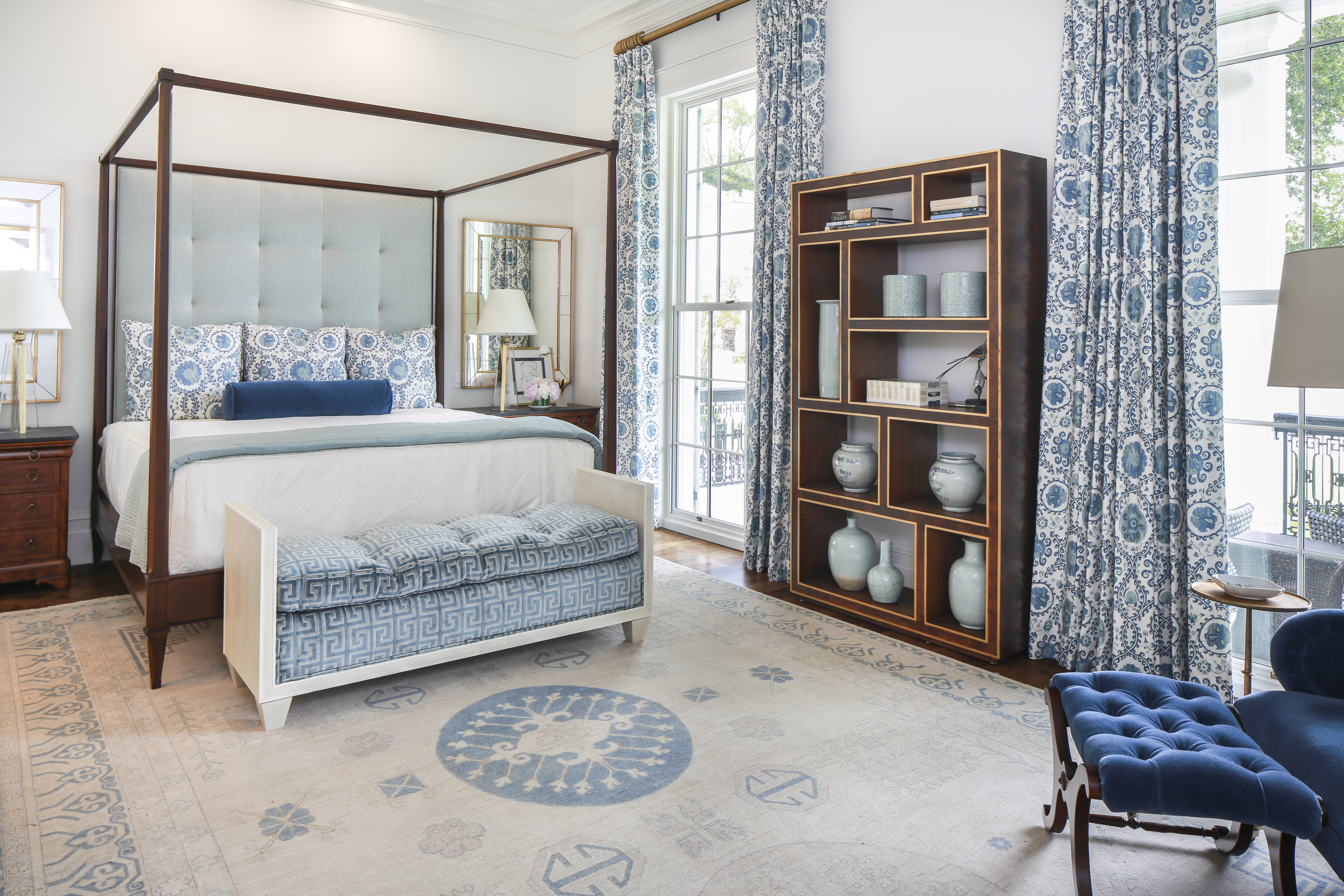
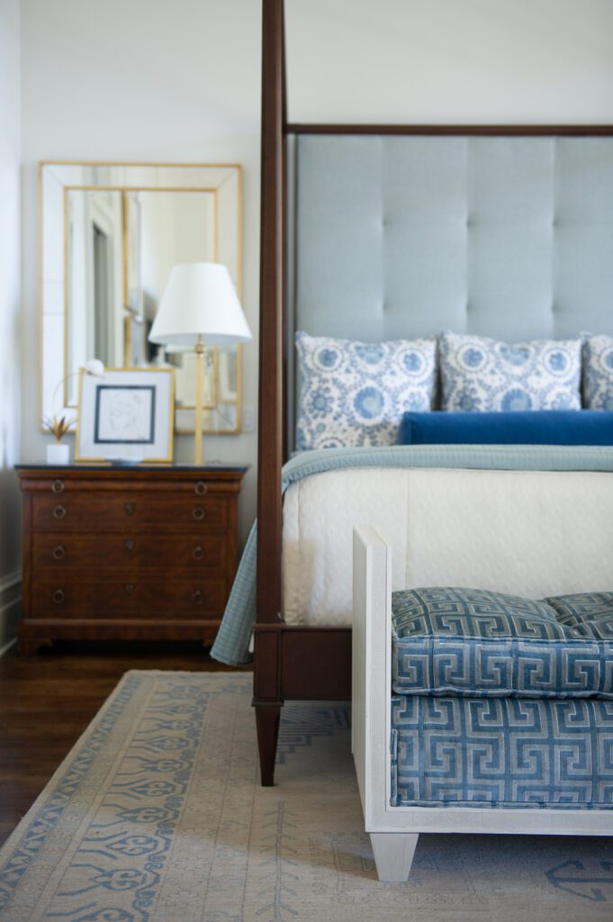
When a client requested a bedroom based in blues, Landry began the design by layering fabrics in various tones of sky, robin’s egg and cobalt. However, committing to a monochromatic palette does not mean committing to make every item in the room the same color. Landry also mixed white and neutral materials into the space to make the primary pigment pop.
View this post on Instagram
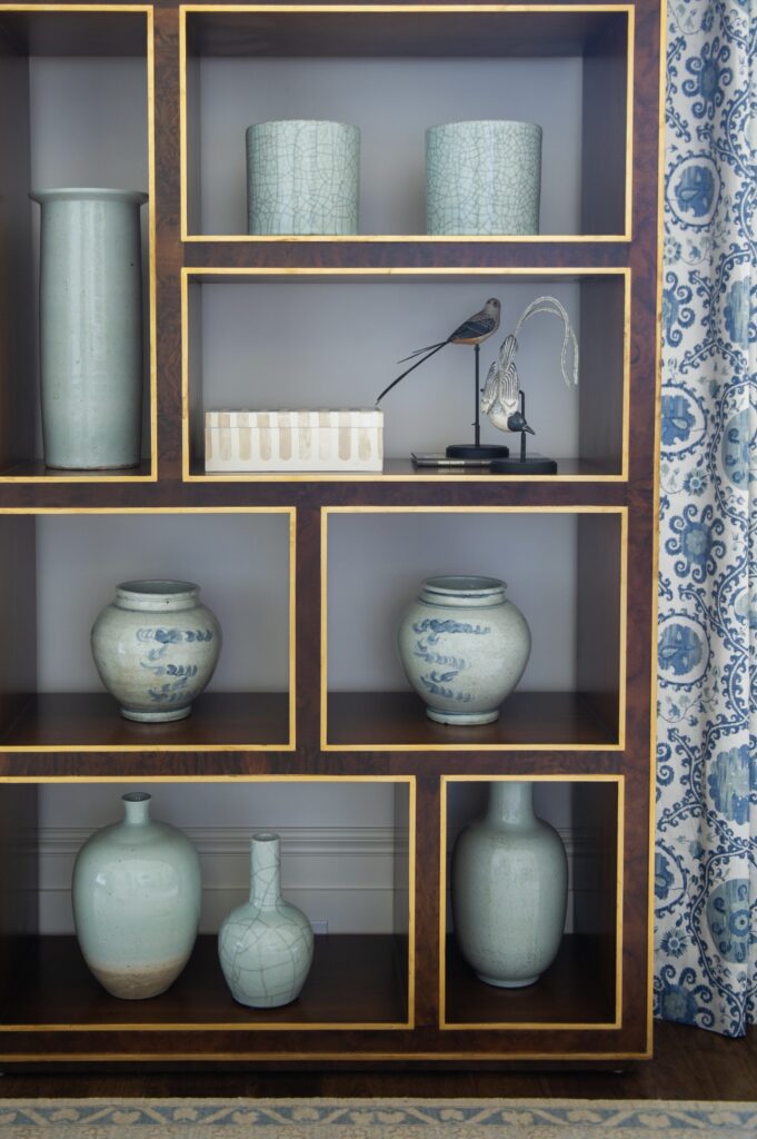
Of course, color is not confined to only bedding and fabrics. Landry says to carry your chosen hue into accessories and other elements in your space. For instance, her blue-themed assignment presented the perfect opportunity to showcase a collection of celadon trinkets. In the final design, azure-patterned curtains framed a display of the complementary blue-green vases.
Landry also stresses that texture and pattern are key in ensuring your monochromatic scheme does not become monotone.
“Different textures like the cut velvet on the shagreen bench at the foot of the bed give it variety and add interest,” Landry says of her design. “With a monochromatic scheme, contrast and varying the scale of patterns gives you a cohesive design that never falls flat.”
OK, so now we know how to execute the perfect monochromatic-schemed space. But the paramount question still remains. What color do I choose? Knowing just one hue will surround you in your space can make this an intimidating decision. To this, Landry provides us with simple solution: stick to what you love.
“Color inspiration can come from anywhere—a fabric, a piece of art, maybe even an accessory. Anything you’re drawn to can serve as inspiration for a design and a great starting point for a space,” she says. “You’ll never tire of classic elements that you love!”
To see more of this house, check out this story from the inRegister archives.


