A tale of two kitchens
Peek into a pair of posh cooking spaces in homes at The Preserve at Harveston. These kitchens, which were featured on the Junior League of Baton Rouge’s recent Kitchen Tours, were devised by two different designers in two very different styles. See how simple choices can dramatically change the dynamics of spaces with similar layouts.
Pictured above
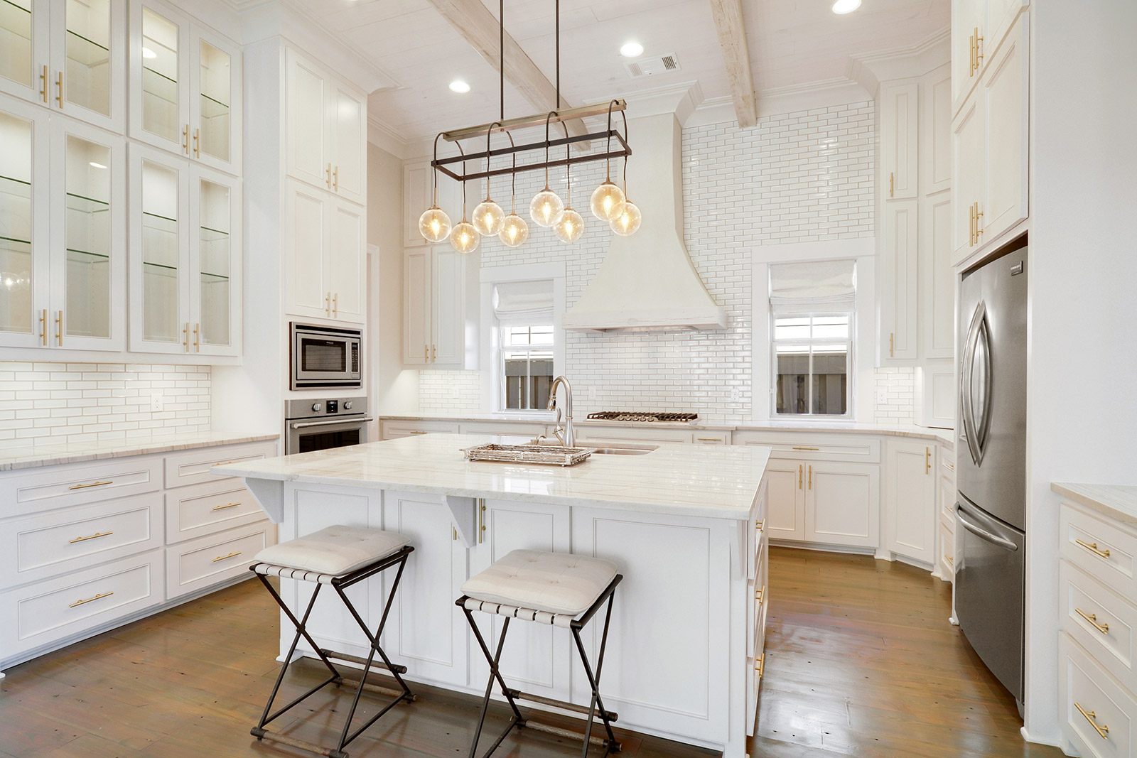
• Carrying the white subway tile backsplash all the way up to the ceiling emphasizes the height of the space while also giving the kitchen a completed look that pairs well with pale quartzite countertops from Stone Baton Rouge.
• In choosing the iron light fixture that hangs above the bright white island, designer Anne McCanless said she was inspired to add a vintage touch. “I think the piece adds an old and interesting element to the new construction,” explains McCanless, who also chose iron barstools.
• Glass-front cabinets not only allow for the display of fine china, but also give the side counter a bar feel.
• McCanless chose to whitewash the beams and hood to preserve natural texture while adding softness. She used a floor stain that combines both greys and browns to give the floor the same washed, texturized feel.
• Despite the farm sink hype, McCanless opted out of the popular style for practical reasons. “A lot of times people with belts or things like that will scratch the sink,” she says, “so I decided a simple two-sided sink would be a better fit for the island.”
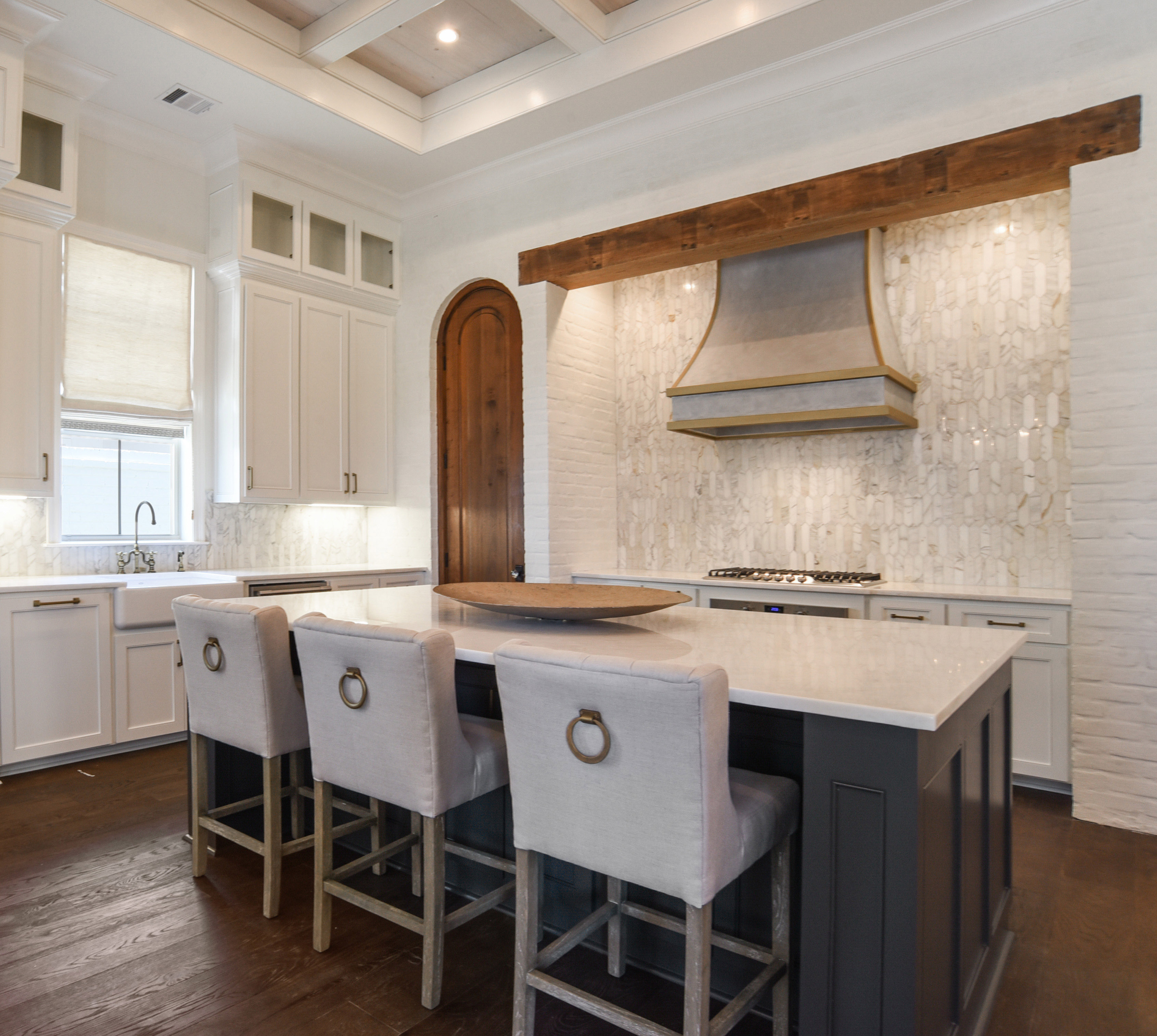
• Touches of dark wood are spotlighted against a background of white plastered brick walls.
• Drawing the eye upward, a mixed-metal hood adds an industrial edge. “We wanted to do something different than the typical painted hood,” says designer Shane Griffin.
• The hexagonal shape of the tiles on the backsplash is large enough to create an impact but subtle enough to remain cohesive with the rest of the space, including marble countertops from Stone Baton Rouge.
• Upholstered barstools are a favorite for Griffin, who says the fabric adds softness to a kitchen. These stools were a local find from McMillin Interiors, and Griffin had the rings on the back refinished to achieve a brushed gold look.
• The dark color chosen for the island was a no-brainer for Griffin. With the kitchen immediately visible upon walking through the front door, the contrasting cabinetry creates a dynamic focal point.


