Epicurean odyssey: A kitchen tour close-up
Step inside the sizzling spaces featured on the Junior League of Baton Rouge’s recent Warm Welcomes Kitchen Tour
That’s amore!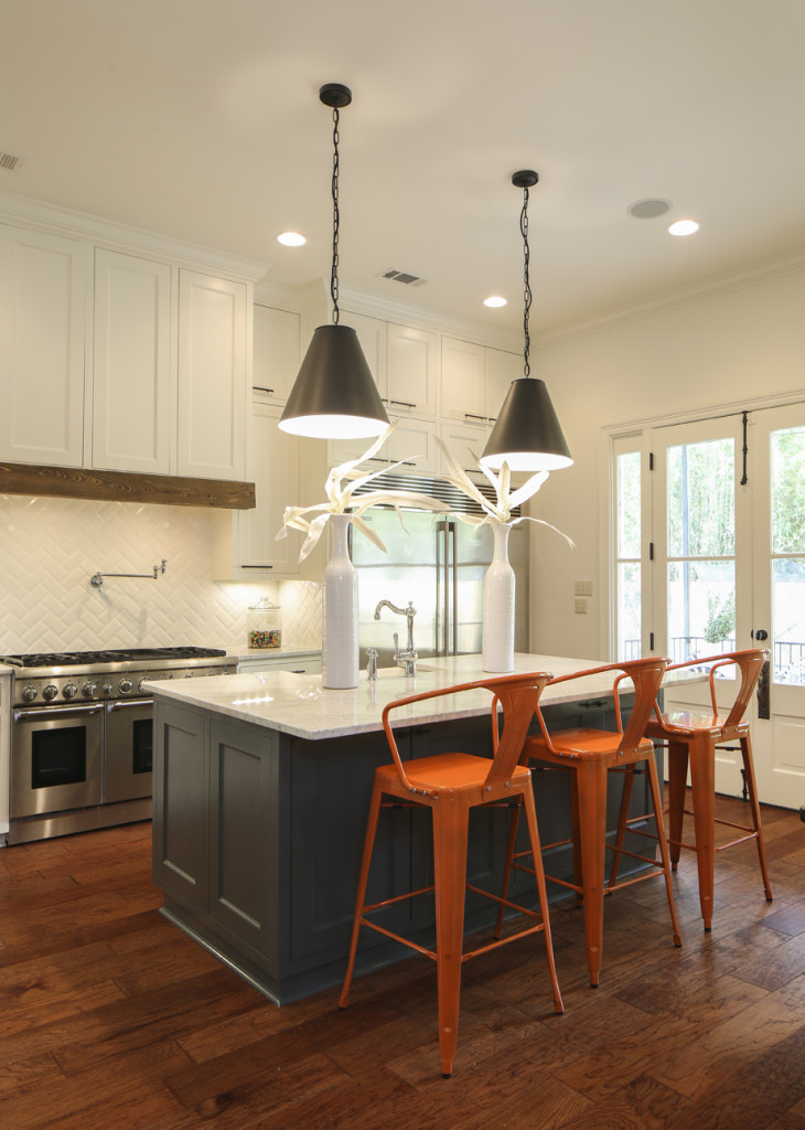
Katie and Matt Shoriak’s new kitchen is part of a larger renovation project that transformed their 65-year-old house in Old Goodwood with help from architect Michael Hogstrom of Onsite Design & Development and Katie’s father, Frank Culotta, a retired contractor. “My goal was to have a functioning space that would be comfortable for my very large Italian family,” Katie says.
 1. “My favorite thing has to be the griddle,” Katie says. “I cook everything on it.”
2. Katie’s one regret is using Carrara marble on her countertops. “It’s absolutely beautiful, but it has been a constant battle to keep hot items off, clean up water spots quickly, and watch for scratches.”
3. Bird Custom Cabinetry designed the storage spaces throughout the room. “They came up with the style and created pieces that are more like furniture than cabinetry,” says Katie.
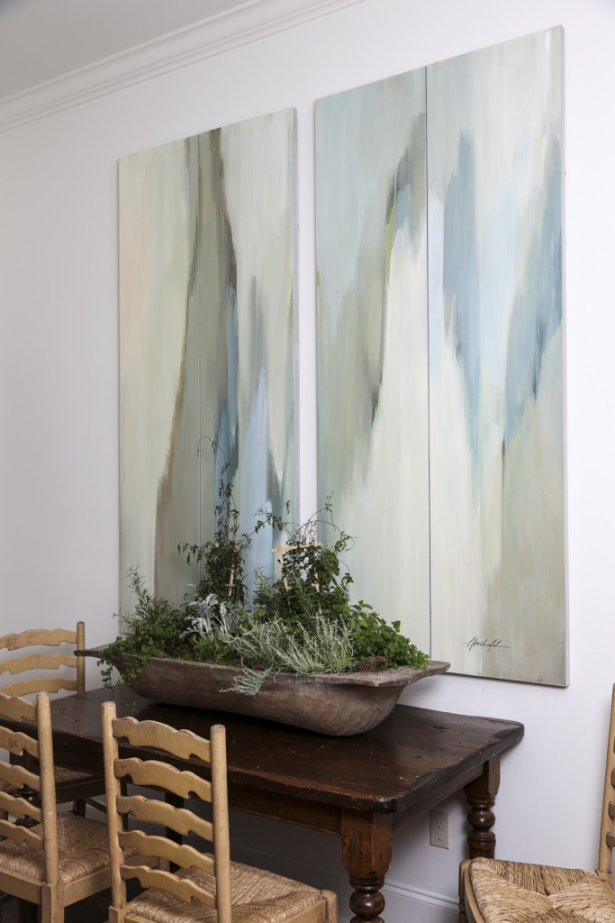
4. A painting on divided panels by Lauren Barksdale Hill hangs above the breakfast table.
Setting things straight
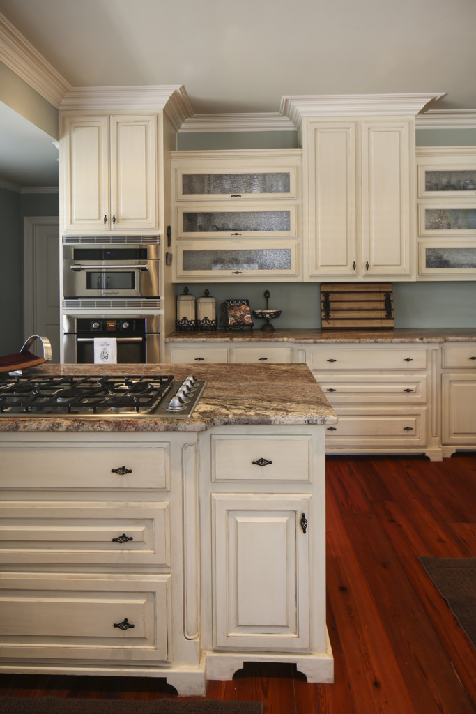
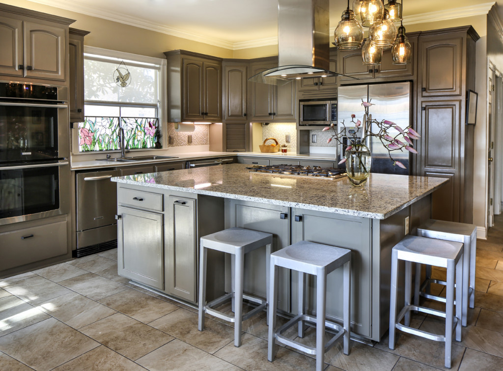
An awkwardly angled island prompted DeLisa Arnold to renovate her kitchen. “It just felt uncomfortable,” she says. All she originally wanted was to rotate the piece to make it parallel to the refrigerator, but “of course it was not that simple,” she says. Flooring had to be replaced; new lighting and an air vent were installed. “It was a very messy ordeal.” But all’s well that ends well: DeLisa hosted her first large-scale gathering in the space last Thanksgiving. “I feel like big get-togethers are so much easier now,” she says.
 1. The Electrolux vent hood gives a sleek look to the room. The vent had to be precisely located to go up through the ceiling joists and out the roof, DeLisa says.
2. DeLisa opted to keep the existing Corian countertops along the wall but introduced a Gallo Fiesta granite counter on the island.
3. Cabinets were repainted using Sherwin Williams’ “Downing Earth” (SW2820).
4. DeLisa’s mother created the stained-glass botanicals that are displayed in the window above the sink. “They’re a great reminder of her,” DeLisa says. “We both loved to cook and spent many hours in the kitchen together.”
Material mix
Finding the right design to fit a long and narrow space was the goal of Alana and Ryan Haynie’s kitchen revamp. “We just wanted it to function and work well,” says interior designer Anne McCanless, who worked with the couple to create a space that’s both pretty and practical.

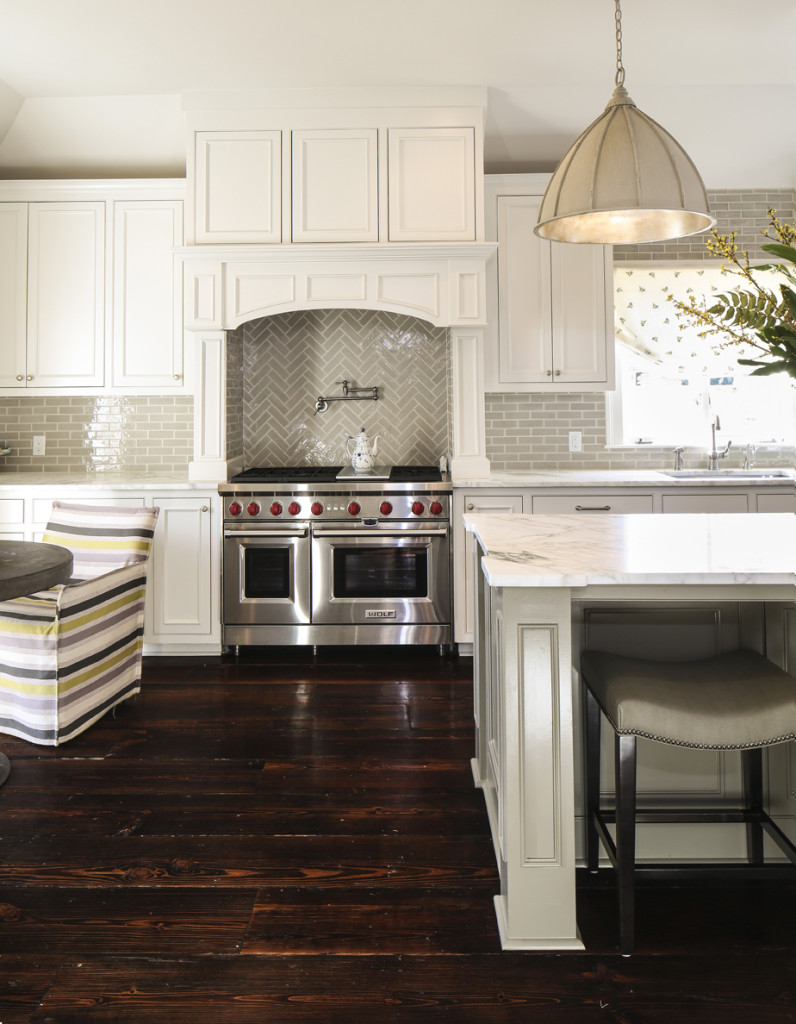
 1. Pendant light fixtures are silver-leafed on the inside to reflect the glow.
2. The countertops are Calacatta marble, known for its dramatic veining.
3. The island was painted in a specially mixed color that brings out one of the hues in the marble above it.
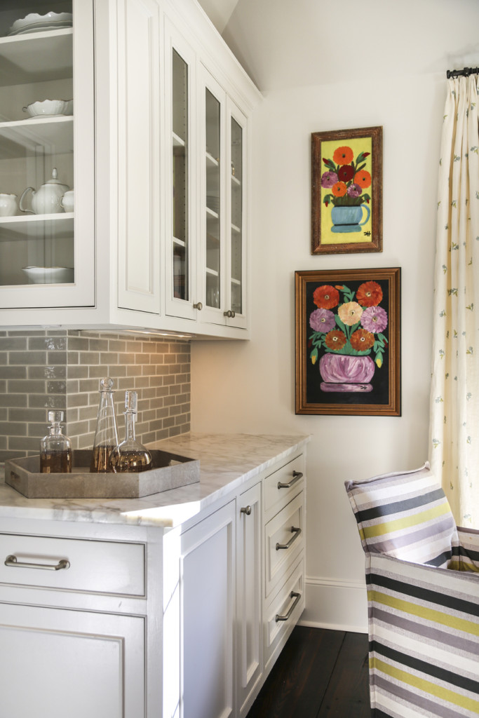
4. Brightly colored original Clementine Hunter paintings were culled from Ryan’s family art collection and hung in a corner near striped slipcovered chairs.
 Inside and out
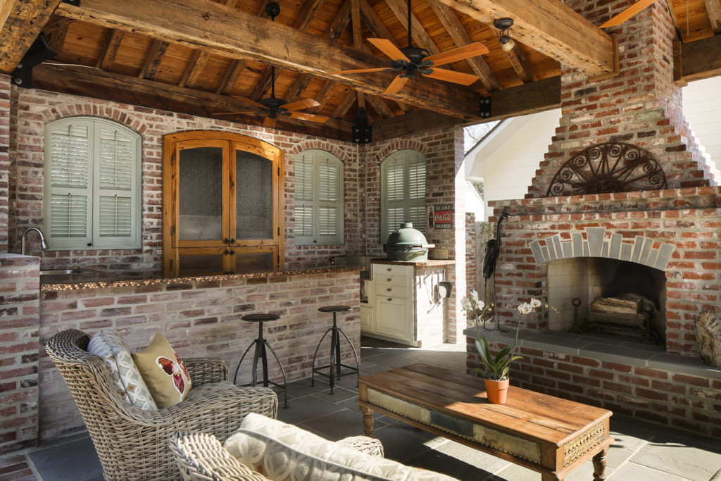
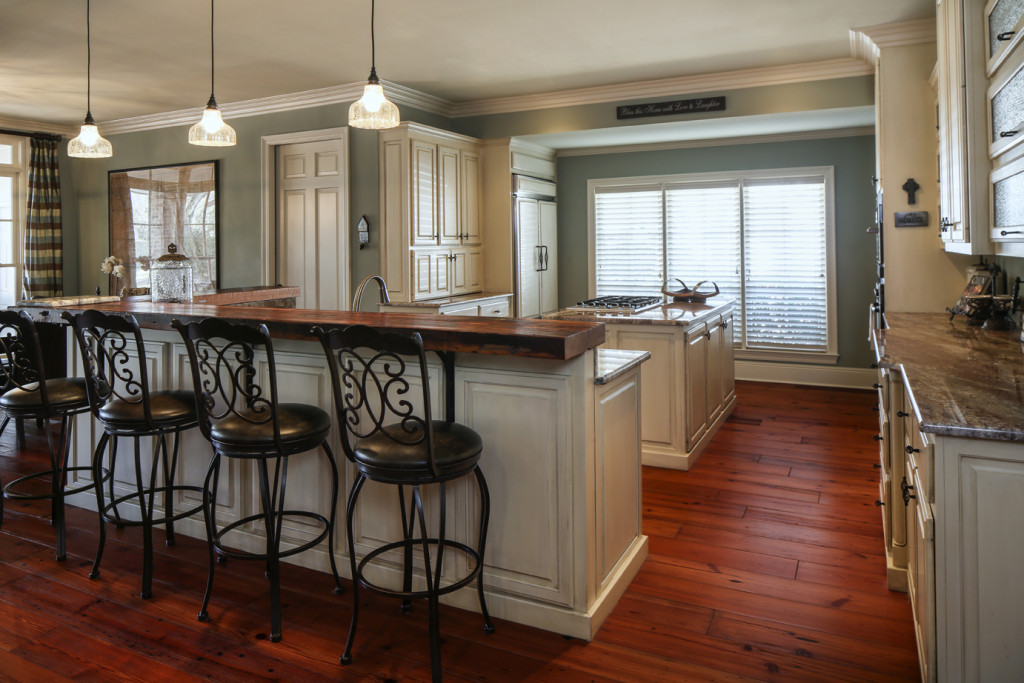
Tina and Drew Gaudet’s kitchen remodel was seen around the world, thanks to the couple’s appearance on the HGTV show Bang for Your Buck. The program’s experts gave the thumbs up to the Steele Place project, but the real winners are the family members, who now have an open kitchen and living area in which they can all spend time together. Tina admits, however, that most of the cooking takes place in the new outdoor kitchen, which along with a pool replaced a basic grass backyard.
 1. One of the most difficult structural changes was moving the sink from along an exterior wall to the bar area. “We had to tear up the slab to move the plumbing,” Tina says.
2. The new bar top is suspected to be a cypress floor joist from a warehouse in New Orleans in the 1800s. “We believe it was a floor joist because the nail holes are on the side of the beam,” says Tina. “We believe it was from the 1800s because of the way the saw marks are in a linear pattern rather than a circular pattern as is seen in most ‘dirty-top’ counters that are not as old.”
3. The floors are pre-engineered 7-inch old pine planks. “We needed something thin because the original floors are terrazzo, and we did not want to have to pull them up,” Tina says.
4. Tina’s favorite appliance is her Electrolux Icon, a combo microwave/convection oven that’s also good for grilling and roasting. “I learn how to use a new function on it almost every day,” she says.
1. The ceiling beams are long-leaf pine from a textile mill in North Carolina.
2. Tina got the idea to create a penny countertop on Pinterest, and the couple spent many hours placing thousands of old coins and coating them with epoxy. Eagle eyes will spot a few English and Canadian pennies and even Euros among the mix.
3. Blue stone flooring provides a cool surface underfoot in the outdoor kitchen.
4. “The best time of year is when it’s cool enough to light the fireplace,” Tina says.
Chef’s showcase
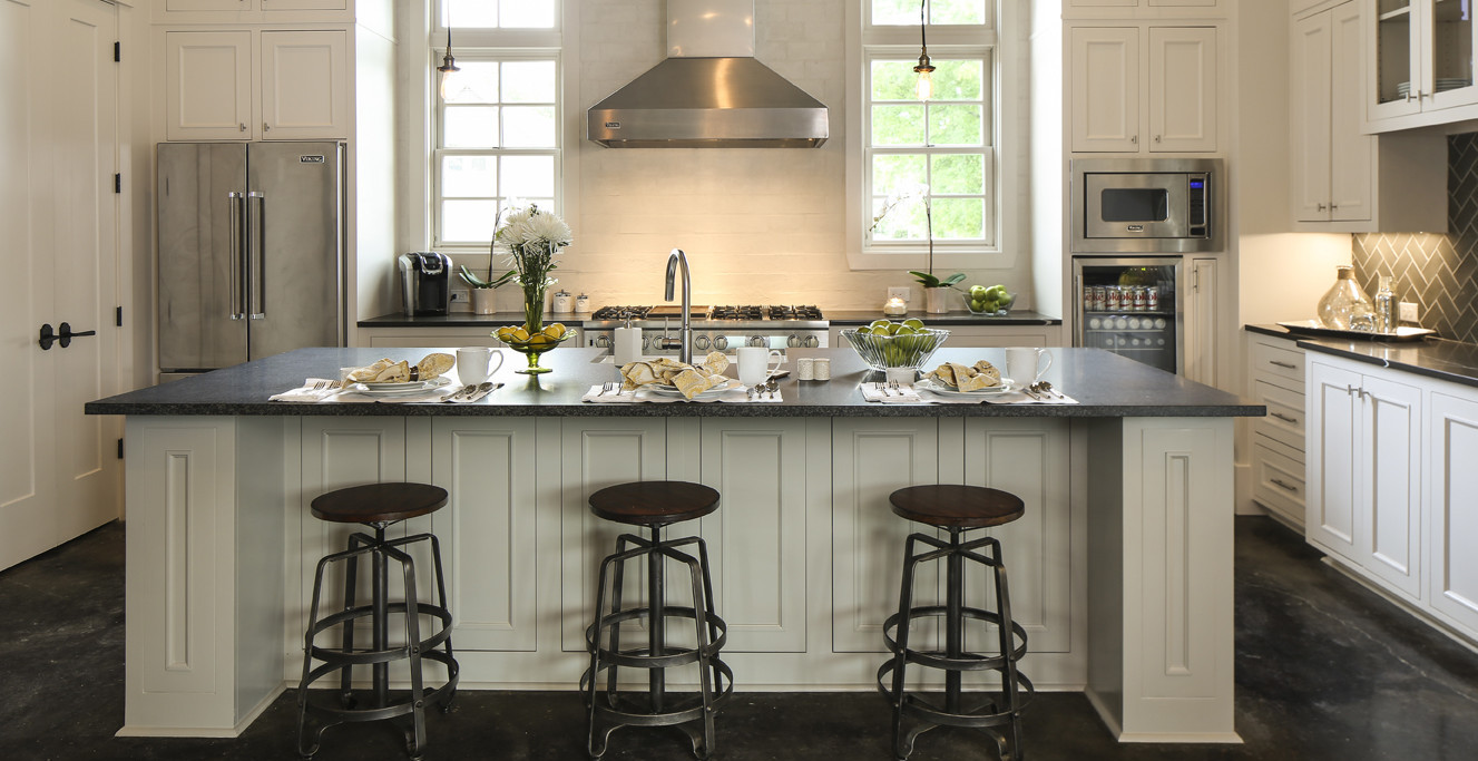
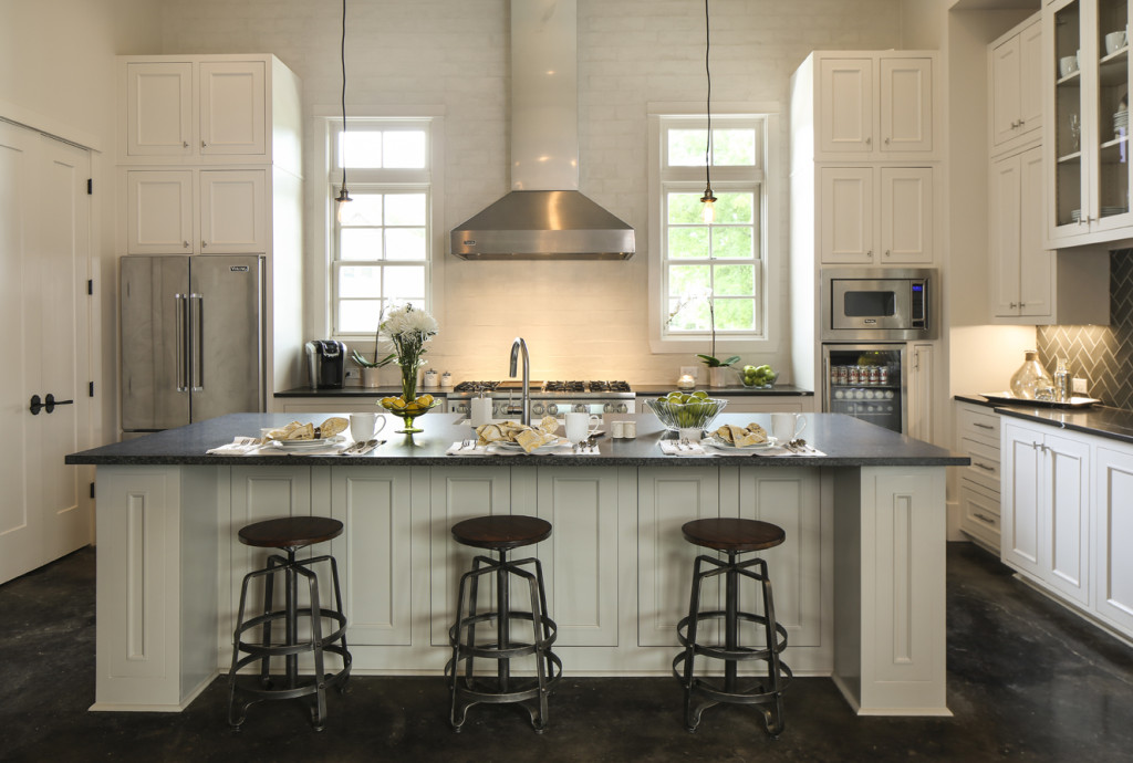 As a residential designer and developer, Michael Hogstrom has a passion for building and selling beautiful homes. So his wife Lacey knows not to get too comfortable in the kitchen of their new home in Étage Gardens, the small neighborhood he carved out off Government Street. “It’s designed to be appealing for resale,” she says. But she’s enjoying the light and airy space in the meantime, with its amenities including 14-foot ceilings, pot drawers, and Viking appliances.
1. A stainless-steel vent hood and exposed-wire lighting give the space an industrial feel.
2. A beverage fridge is tucked into the corner. “We found that waters and other drinks take up a lot of space in the regular refrigerator, so this gives them their own spot,” Lacey says.
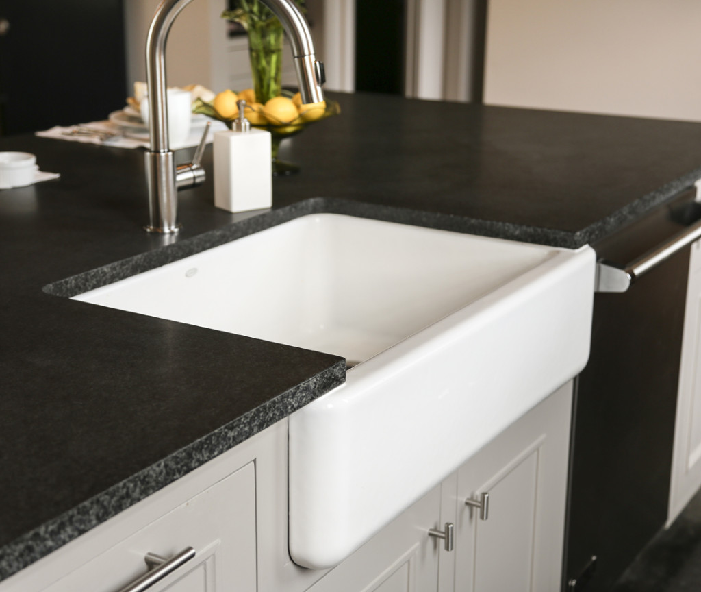
3. The countertops are all quartz, but the island has a matte finish that contrasts nicely with the polished surface against the walls.
4. A farmhouse-style apron sink is a nice departure from the norm.
Not-so-hidden gem
When your kitchen is in the center of the house, you want it to look as warm and inviting as any other room. That was Susanna McCarthy’s mindset as she partnered with interior designers Helaine Moyse and Patrick Tandy to make this Steele Place space special for her family, including husband Terry and son Will. “I wanted a little jewel,” Susanna says. She loves to cook and often pulls ingredients from the herb garden and citrus grove just outside in the yard.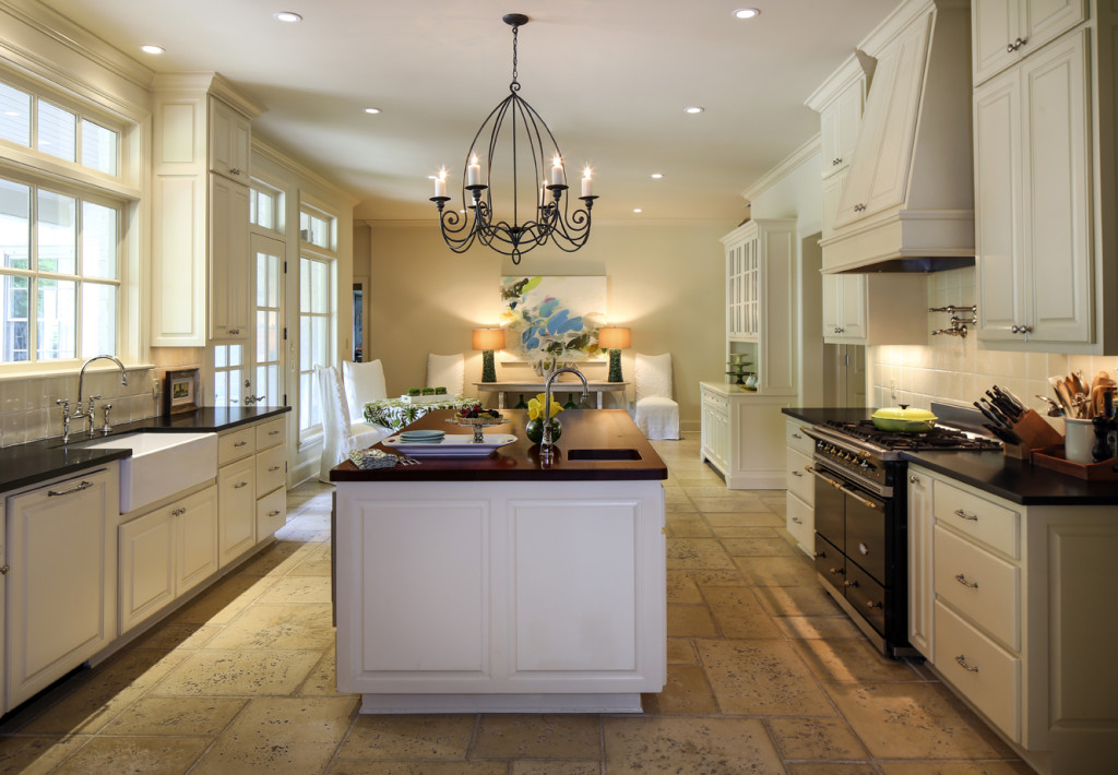
1. The Niermann Weeks chandelier appears to hold beeswax candles but is infinitely easier to maintain. “It’s traditional but it’s clean as well,” Susanna says.
2. A mahogany countertop on the island makes it “look like a piece of furniture,” Susanna says.
3. The floors are handcrafted Peacock concrete pavers that give the look of Italian travertine.
4. Built to order in France, the Lacanche range features chef-friendly details including double ovens and a five-burner cooktop.


 1. “My favorite thing has to be the griddle,” Katie says. “I cook everything on it.”
 Inside and out