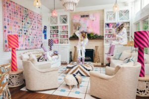
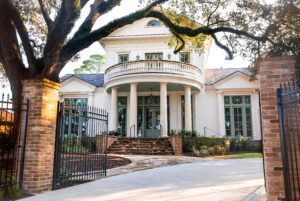
A look at the public spaces of this year’s Ivy House Designer Showhome
‘This one is a little different,” says Ivy Residential Concepts co-owner Jewel Centanni of this year’s Ivy House Designer Showhome. Along with her husband Vincent, with whom she operates the concierge-style design and construction company, the pair brought the second iteration of their annual showhome event to Baton Rouge this past December. And while the exterior of the house in the Bocage subdivision speaks to a traditional English style, what lies inside its steel and glass front door is anything but.
“The inside is a little more transitional. We mixed styles and it is a little more moody and masculine,” Jewel says. “But I think, overall, that made for a better canvas for the designers.”
Adopting a more traditional, sectioned-off floor plan—“2020 was the death of the open floor plan,” Jewel notes—12 designers from Baton Rouge and New Orleans came together to transform 15 of the home’s spaces in a way that spoke to both the potential of the house—which is currently listed for sale—as well as their own personal aesthetics. This month, we’re showcasing the home’s public spaces, each tailored equally to family life and extensive entertaining. Read on to see it all, and stay tuned for the February issue of inRegister to get a glimpse at the home’s private spaces.
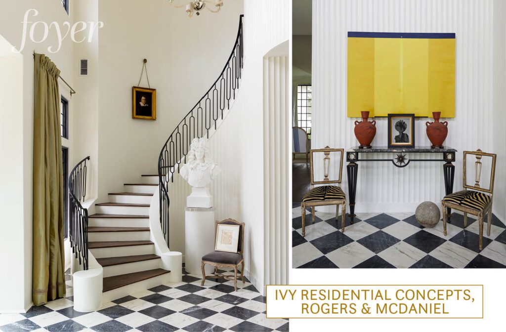
With a focus on elevated materials—including marble floors from Stafford Tile & Stone, ironwork by Broussard Iron Works, and fluted walls made to look like plaster—the foyer sets the tone for the home’s marriage of modern and traditional elements. And as a distinct space, leading to but not openly flowing into the dining and formal living spaces, the area lent itself to a design transformation by Gary McDaniel of Rogers & McDaniel.
“I saw the space, metaphorically, as a portal to a new, post-pandemic era,” McDaniel explains. “As a society, I believe we are ready to pull back the curtains and move through a portal to a better place—a place certainly drawing from history and all its aesthetic delights, but also one of individuality where people want to explore and express their ideas for today and the future with more of an uninhibited flair.”
Since limited furniture is needed in a foyer, McDaniel made the most impact through a selection of artworks. A large yellow expressionist work by Ed Pramuk, whose art McDaniel first saw on display at LSU in the 1980s, was sourced with the help of Ann Connelly Fine Art. Titled “Portal Flare,” the piece brings a dose of color to the space and helps to translate McDaniel’s vision of a bright, post-COVID world. To juxtapose the minimalist work, portraits in a range of styles are dotted throughout the room, from an oversized bust to black-and-white photography.
“The space reminded me of how, in the 1920s and ’30s, some of the avant-garde Parisian patrons of modernism updated the interiors of their own 19th-century homes to reflect a more innovative flair,” McDaniel says, noting other details like a vintage Angelo Donghia Venetian glass ‘Stellare’ chandelier and star motifs on the drapery hardware that speak to the ’20s influence. “I wanted to embrace the idea of these more open-minded individuals who took an unorthodox and experimental approach to culture and the arts.”
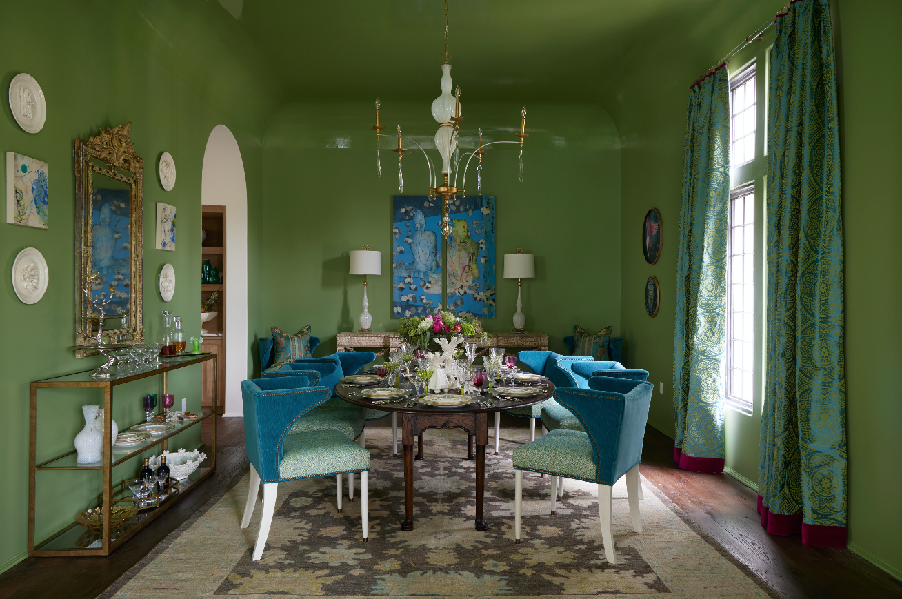
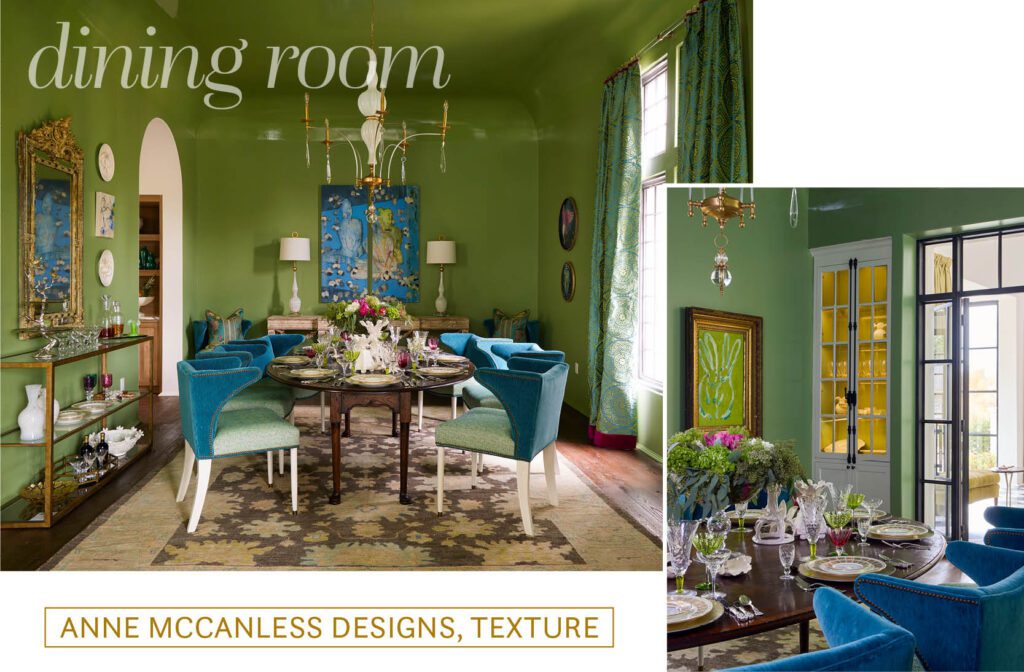
Atop an oval dining table sourced from England, a collection of designer Anne McCanless’ family heirlooms, antiques and new finds come together to create a table setting that sets the tone for the entire room. Vibrant in color but steeped in tradition, the delicate pieces marry formal and fun.
“I feel like color is so important for lifting moods,” McCanless says. “Color is back, so why not use it everywhere?”
Perhaps the most notable use of color is in the bold green that covers the walls and ceiling. The satin finish of the Fine Paints of Europe paint on the walls turns to gloss to emphasize the curvature of the ceiling while reflecting the other pops of color throughout the space.
“The large work by George Marks in the back of the room is from my personal collection,” McCanless explains. “When I saw it, I had to have it because—this might sound crazy—I saw my girls’ faces in it. It’s so special to me because of that.”
Flanking the painting are two Murano glass lamps that pair with a Murano glass chandelier. “I love the Murano glass used like this because it’s something old that’s made modern with a new perspective,” McCanless says.
Underfoot, an antique Oushak rug borrowed from Samir Oriental Rugs draws on the room’s colors in a more muted way. And on each of the walls, everything from small canvas works to a statement mirror to the bold bunnies of Hunt Slonem finish the design and give it a collected feel.
“I wanted the space to feel current but still have that old, cozy feeling,” McCanless says. “The room is interesting and inviting. Guests would never forget a dinner at your house.”
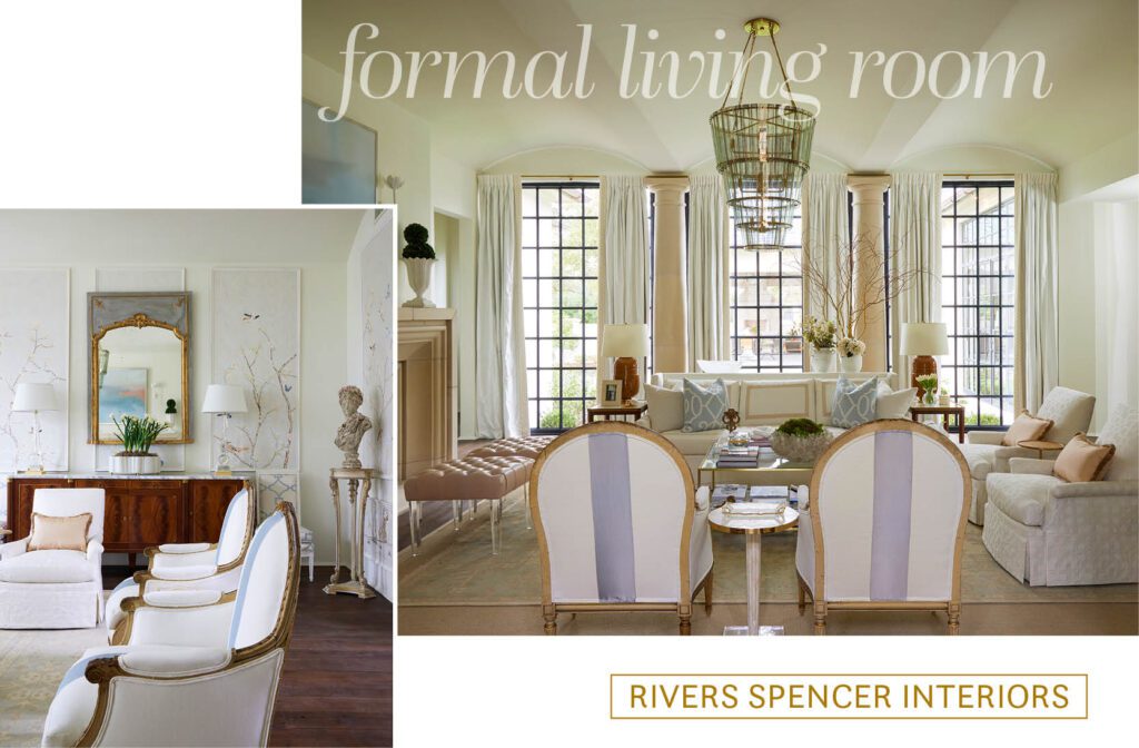
A barrel ceiling and a clear line of sight from the front door through steel windows overlooking the backyard make the formal living room a unique canvas for furnishings by New Orleans designer Rivers Spencer. Her soft color palette of white and blue with touches of ginger give the space an ethereal glow, drawing the eye upward as natural light fills the space.
“Formal living rooms have always been my favorite type of room to design,” Spencer explains. “Because this room is the heart of the home, I felt it was necessary to make a room that was functional yet elegant.”
Starting from handpainted Chinoiserie mural panels that were applied throughout the space, Spencer brought in fabrics including custom silk and furniture styles that speak to a romantic and feminine version of elegance. However, the space is grounded with antique pieces like a one-of-a-kind Danish console that sits behind the sofa.
“I also love playing with modern pieces and mixing them with beautiful antiques,” Spencer says. “The mini Maggie ottoman was so much fun to do! It was my first time doing a twist on my Maggie ottoman, which is a part of my collection made in New Orleans.”
The acrylic legs on the tufted ottomans that sit in front of the fireplace give that necessary dose of modern without looking out of place in the room. The clean lines of the coffee table speak to the same goal, while an abstract work over the fireplace drives home the effortless coexistence of the two styles. “Kevin Gillentine is one of my favorite artists,” Spencer says. “The piece we used added a contemporary take above the mantel, which is to die for.”
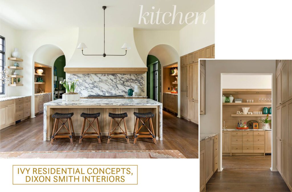
Since the kitchen is the heart of the home, it’s no surprise that Jewel says the space is the one she feels the strongest connection to. Statement-making Calacatta Viola marble sourced from Triton not only creates an expansive backsplash, but waterfalls over the custom-stained white oak island. “I didn’t want the typical, modern waterfall, though,” Jewel explains. “I designed a framed ogee edge to create some interest on the sides of the island. I think it speaks to the traditional and modern coming together as it does throughout the house.”
The layout of the space was designed with entertaining in mind. A hidden-away scullery kitchen aims to keep the mess out of the party, while another countertop area with a sink acts as a wet bar. Sub-Zero and Wolf appliances sourced from Ferguson and fitted with white oak façades match seamlessly with the cabinetry. Overhead, an iron light fixture by Visual Comfort was chosen by Jewel with the help of Capital City Lighting owner Bridget Tate.
But it’s the eye-catching brass light switches from Forbes & Lomax that are the bow on top of this kitchen. “I saw them and I had to have them,” Jewel says. “They’re timeless, but also edgy.”
The room’s open shelving was styled by the Dixon Smith Interiors team of Hilary Kennedy, Joel Fazende and David Coco. “The kitchen really allowed us to highlight collected items such as small pieces of art, vases and other items,” Kennedy notes.
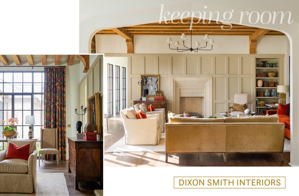
An archway leads from the kitchen into the keeping room, giving necessary separation while maintaining connectivity. “I wanted there to be a real coziness,” Jewel notes. “I can just picture a family spending time together here.”
Antique pine beams, paneled walls painted in Farrow & Ball’s “Drop Cloth,” and a cast-stone fireplace keep with Jewel’s cozy vision. Décor by the Dixon Smith Interiors team continues that goal, with bold, warm colors that draw inspiration from the holiday season during which the showhome event took place. “We wanted to do a subtle homage to the colors of Christmas without being blatant,” designer Hilary Kennedy notes. “The entire color scheme for the den was drawn from our drapery fabric, which has what we consider an updated Christmas colorscape, and the dark background made it moody.”
The inspiration colors make their biggest statement in a pair of custom paintings by Lynn Sanders. “She took our fabric selections and generated these gorgeous, large-scale pieces just for the showhouse,” Fazende says. “They are showstoppers.”
Other fabric selections throughout the room make just as much of an impact as the curtains, despite being more muted. A mixture of animal prints, velvets and more on the many seating options here make the space feel both elevated and comfortable. “Texture was also a huge element we considered for the den,” Coco explains. “We have leathered wing chairs, a mohair-like velvet on a sofa and a bouclé textile on the ottoman. Everywhere you look, you see a rich new texture.”
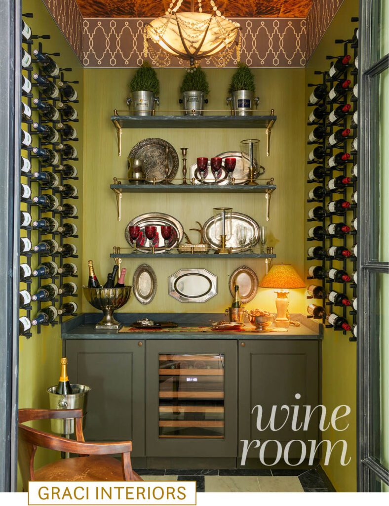
“We knew in a house this size, we had to have a wine room,” Jewel notes. This space, just off of the dining and formal living rooms, functions as more than just a temperature-controlled storage space but also a wet bar and tasting room, adding another layer to the home’s entertaining potential.
The marble flooring from the foyer is carried into the space, this time with a custom design by Jewel herself. Design touches including the green walls, painted in Benjamin Moore’s “Turning Leaf” with a custom finish hand-applied by Ivy J. Mabius, and a wallpapered ceiling in a faux tortoiseshell were chosen by Chad Graci of Graci Interiors in New Orleans.
“I knew I wanted chartreuse,” Graci explains. “I was inspired by my trip to Venice in the summer. I was moved by the way exotic finishes and materials all came together there.”
A Cole & Son wallpaper border and a 1940s Maurice Dufresne chandelier with an alabaster bowl finish off the space. And, of course, the room wouldn’t be complete without a full stock of wine from Martin Wine & Spirits.
“I think that the unexpected spaces bring out more creativity,” Graci says. “One must rely not just on what is in the space, but how the materials all come together.”
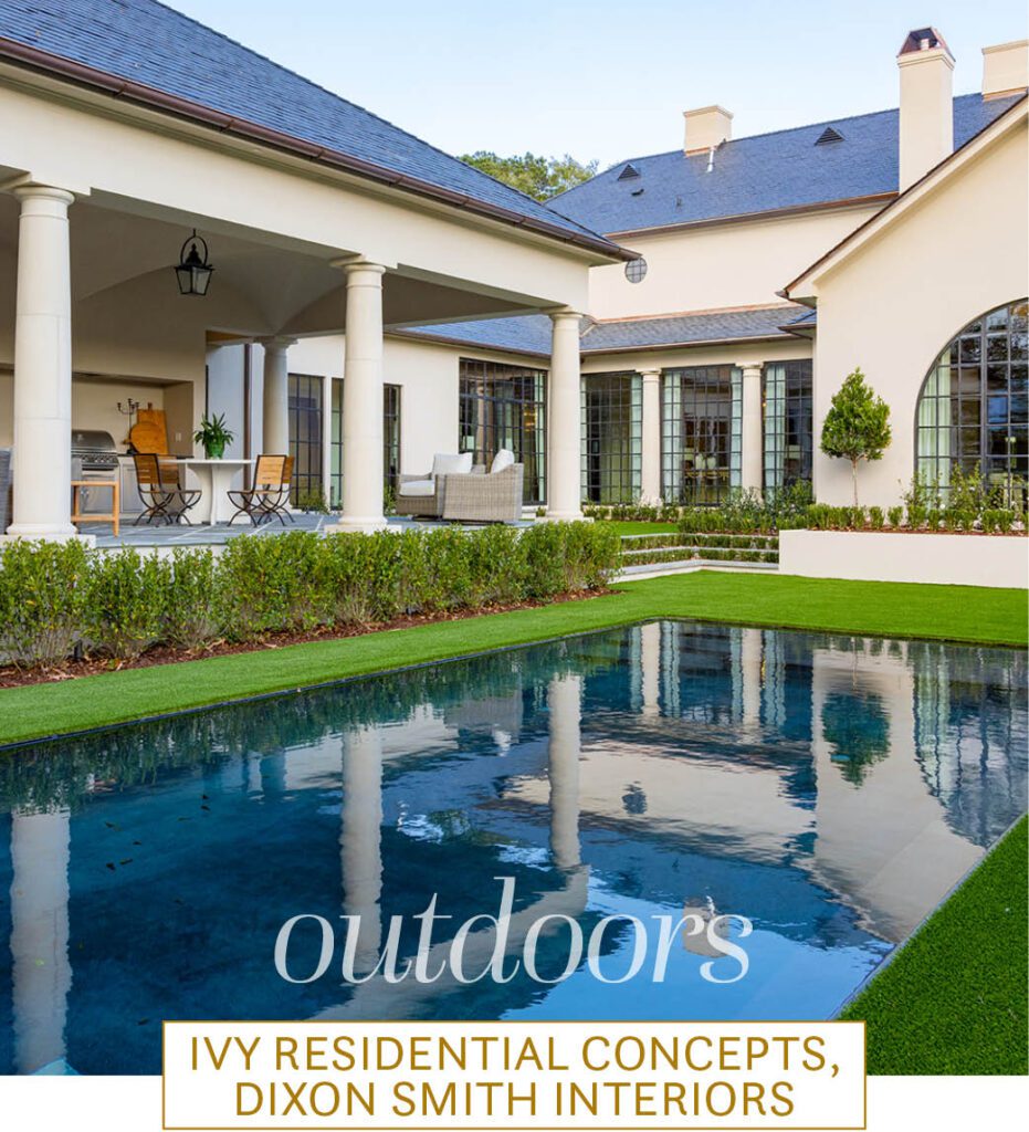
The main indoor living spaces flow seamlessly into a two-tiered outdoor living and entertaining area. Turf takes the place of grass both for the sake of maintenance and to make Jewel’s vision of a knife-edge, contemporary pool possible.
“It’s more of an art piece,” Jewel says of the cocktail pool by Edge Contractors. “It looks like a reflecting pool.”
Overlooking the yard is a veranda grounded with Pennsylvania bluestone from Jim Stone Co. and furnished by the Dixon Smith team to keep in mind both the scale of entertaining that would happen within the space, as well as the durability necessary for outdoor living in south Louisiana.
“We loved the concrete dining table—talk about durable and beautiful all in one package,” Coco explains. “We also love the more natural colors on the seating frames that will last forever and hide the dust and pollen that are a natural element for Louisiana outdoor areas.”


