New perspective: A decade-old home is revitalized with fresh colors and plenty of texture
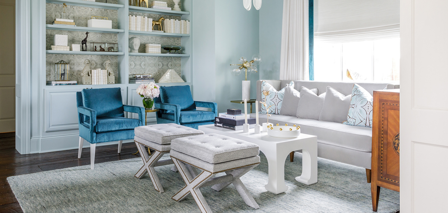
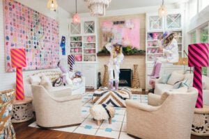
Like closing your eyes and falling backwards into a friend’s waiting arms, designer Rachel Cannon knew the decision to cover an entire room—molding and built-ins included—in robin’s-egg blue required a vote of confidence from her clients. While her love of color was what drew these homeowners to Cannon in the first place, the bold choice was one that the interior designer knew would stretch their comfort zone. However, she had a feeling it would be worth it in the end.
“When you have clients who trust you, it allows you to be more creative,” Cannon explains. “That’s when magic happens.”
And while the blue-hued space doesn’t resemble anything that would likely make an appearance in a Disney park, the magic is undeniable, as is the case with the rest of the home, which was overhauled by Cannon and her team mid-pandemic as a result of the homeowners’ quarantine-induced disillusionment with the previous interior look.
“At first, we just talked about one or two things that they wanted to change,” Cannon explains, “but it turned into a complete redo.”
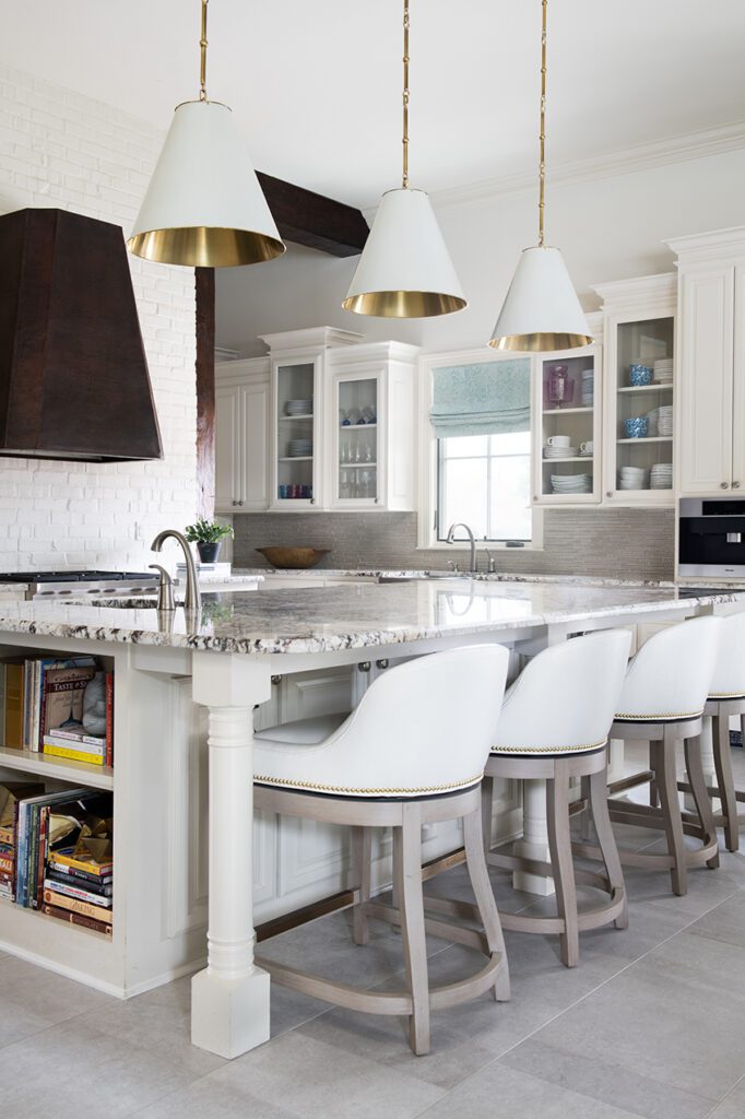
The project started with the floors. Peach-hued travertine that was laid during the house’s original construction in 2010 was replaced with wide slate tiles to establish the ideal cool-tone canvas for a slew of new furnishings. From there, Cannon took inspiration from those existing items—including a large painting by Meredith Pardue in the living room that was sourced from Ann Connelly Fine Art—that the homeowners wanted to keep.
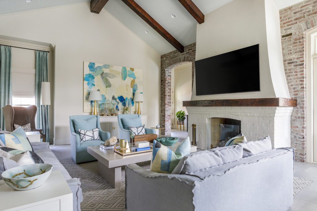
“They had a lot of great things,” Cannon says. “They had been trying it their own way and they weren’t happy with how it was working for them both visually and functionally. They recognized that they needed someone like me to help pull it all together.”
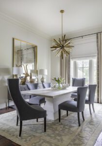
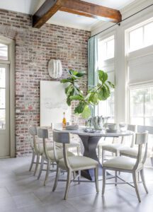
A new breakfast room table was ordered—and rebuilt by the homeowners’ construction company—to perfectly fit the space both in size and aesthetic. Lamps were moved from bedroom to dining room. And custom drapery was commissioned to add extra interest and texture in each room. However, for Cannon and the homeowners, it’s the little details that make the design so successful.
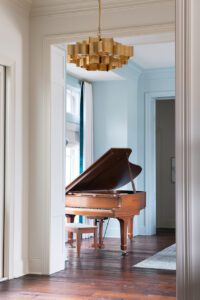
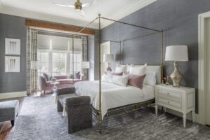
One of those details is the wallpaper that appears throughout the home. Each selection is a choice by Cannon meant to evoke a certain feeling from anyone who steps into the spaces. A marbled pattern that mimics the inside cover of a vintage book lines the built-ins in the blue music room, drawing on the old-world feeling created by not just the look of the family’s heirloom piano, which is proudly displayed in the space, but by the act of sitting around a room listening to music be played. Down the hall, a grasscloth wallpaper in a charcoal shade covers the walls in the master bedroom, contrasting a new brass four-poster bed and giving the impression of a more intimate space.
“In the master, we really wanted to create something cozy,” Cannon says. “The feeling that the grasscloth brings is not something that could be achieved with paint in the same color. The texture elevates the entire room.”
In every space, layers of velvets and linens, antiques and lacquered pieces help to achieve the polished-yet-approachable look that Cannon and the homeowners envisioned. Take, for example, the music room. While the individual details might not scream effortless, the entire look together seems natural, light and airy, and that comes, Cannon explains, from finding depth in colors, fabrics and finishes.
“Most people are comfortable doing something entirely neutral, but when you do monochrome, the color becomes a neutral in a way,” she says. “Once you find the right shades, it’s as simple as adding different textures and other touches to keep it interesting. It really is, while it might not seem like it, an easy way to experiment with color.”
This colorful vision is now being brought upstairs as Cannon and her team embark on phase two of this project. That’s the logical result, Cannon says, of a successful and fulfilling design experience. It becomes impossible to leave any space untouched.
“These homeowners were so laid back and cool. They were always open to ideas to go further, and now it’s about making everything match and flow,” she says. “Our core values really aligned, and the result shows just how rewarding a design relationship can be.”
See more from this home in our gallery below:

